All Posts in Personal
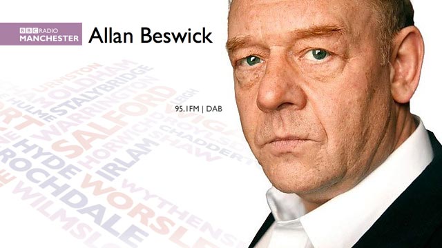
Yesterday afternoon I received a random request from someone on twitter that I follow them so they could DM, curious for more details I followed away. A couple of DMs followed before I received a phone call from Kirsty at the BBC, wanting to know if I'd be up for being interviewed on the radio about cycling to work.
It turns out the tweet she found was 14 months old, but nevertheless the next morning at 7:50 is was interviewed for 5 minutes or so on the perils and benefits or cycling verses driving to work.
A bit of random start to the day, but if you want to listen to the show again its on iplayer for the next 7 days: www.bbc.co.uk/programmes/p0195vtk
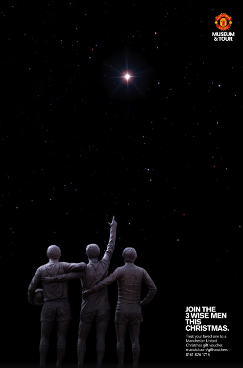
It was good to see the ad I designed (concept by Adam & Becci) win a silver in the '6, 4 or Smaller Sheet' category at the Roses Creative Awards last night. This was amongst several awards scooped by TBWA\Manchester which included: two golds, three silver and three bronze. Well done everyone involved.
Client: Manchester United
Agency: TBWA\Manchester
Art Director: Adam Richardson
Copywriter: Becci Tyrell
Designer: Ben Topliss
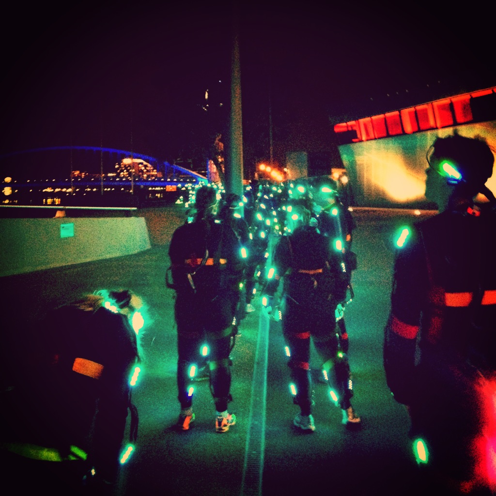
This week I was back in Salford Quays after my recent photography workshop, taking part in NVA's Speed of Light Salford.
Speed of Light was a centrepiece of the Edinburgh International Festival and recently staged an event in Yokohama Japan. The night-time work uses light, intentional movement and sound to change the way we see and feel about a chosen environment.

Speed of Light Salford features one hundred runners in specially commissioned LED light suits will create beautiful, choreographed patterns of light flowing through streets, over bridges and around public spaces and buildings. Free and non-ticketed for the watching audience, it can be seen as a piece of abstract art on the grandest scale: monumental but surprisingly quiet and reflective.
The most important part of taking part as a runner was to maintain an even gap between the participant in front and behind you especially as gaps were extended and reduced on the fly.
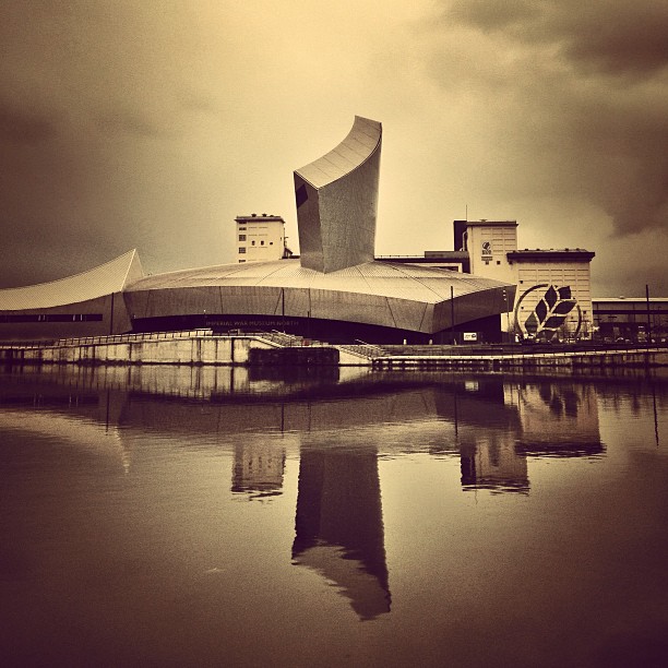
For Christmas I was given a photography workshop and tour of Salford Quays, which I finally was able to take on Saturday. It consisted of 2 hours with photographer Dan Tyack, and a small group of other participants, as he took us around Salford Quays and the newly completed Media City. He provided us with some advice on how to take better photos in manual mode by understanding the settings better as well as providing some tips on composition and pointing out some potential shots around the Quays.
As a designer I feel I have a good grasp of composition, but it is always helpful getting tips from experts in their field and getting to discuss different ways of doing things. As someone who pretty much always shoots in semi-auto mode (AV = Aperture Value or TV = Time Value/Shutter priority), it was helpful in having someone explain whilst being out using the camera how to best manage all the camera controls and settings instead of adjusting one.


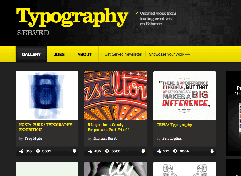
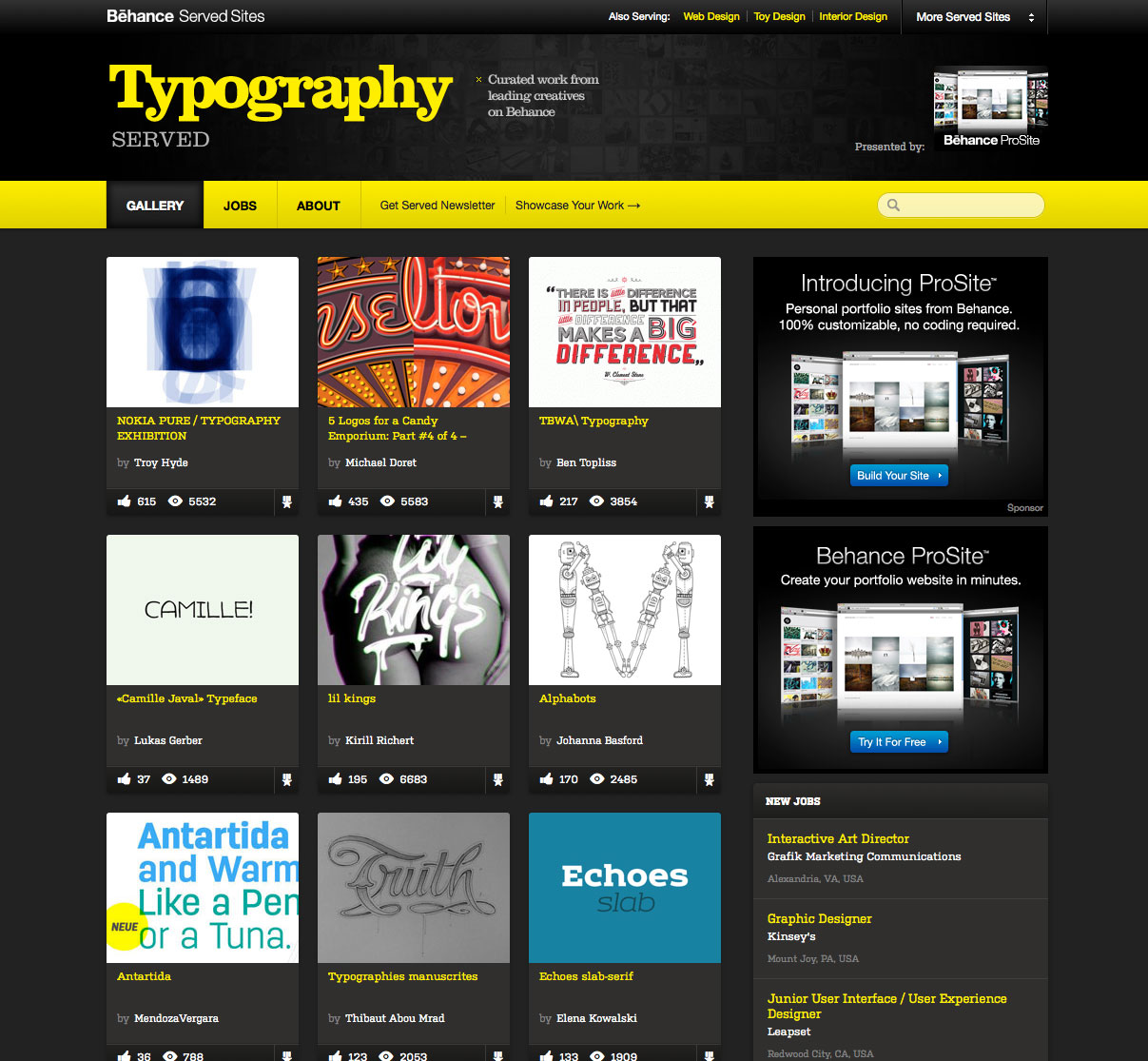
Back in February, I was lucky enough to have some work featured on the front page of the curated type gallery on Behance, Typography Served.
Since then I've had a load of new followers, appreciations and views which has been amazing. Its funny how big a difference a tiny amount of exposure has done for my stats. I used to barely get a single view to my profile and 6 weeks on I'm still getting at least 40 every day. It is also interesting to see how the traffic flows throughout a week, with the obvious low points over the weekends, and then building up gradually throughout the week.
Check out the work.
You can follow me on behance, and thanks if you already do.
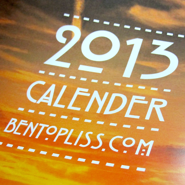
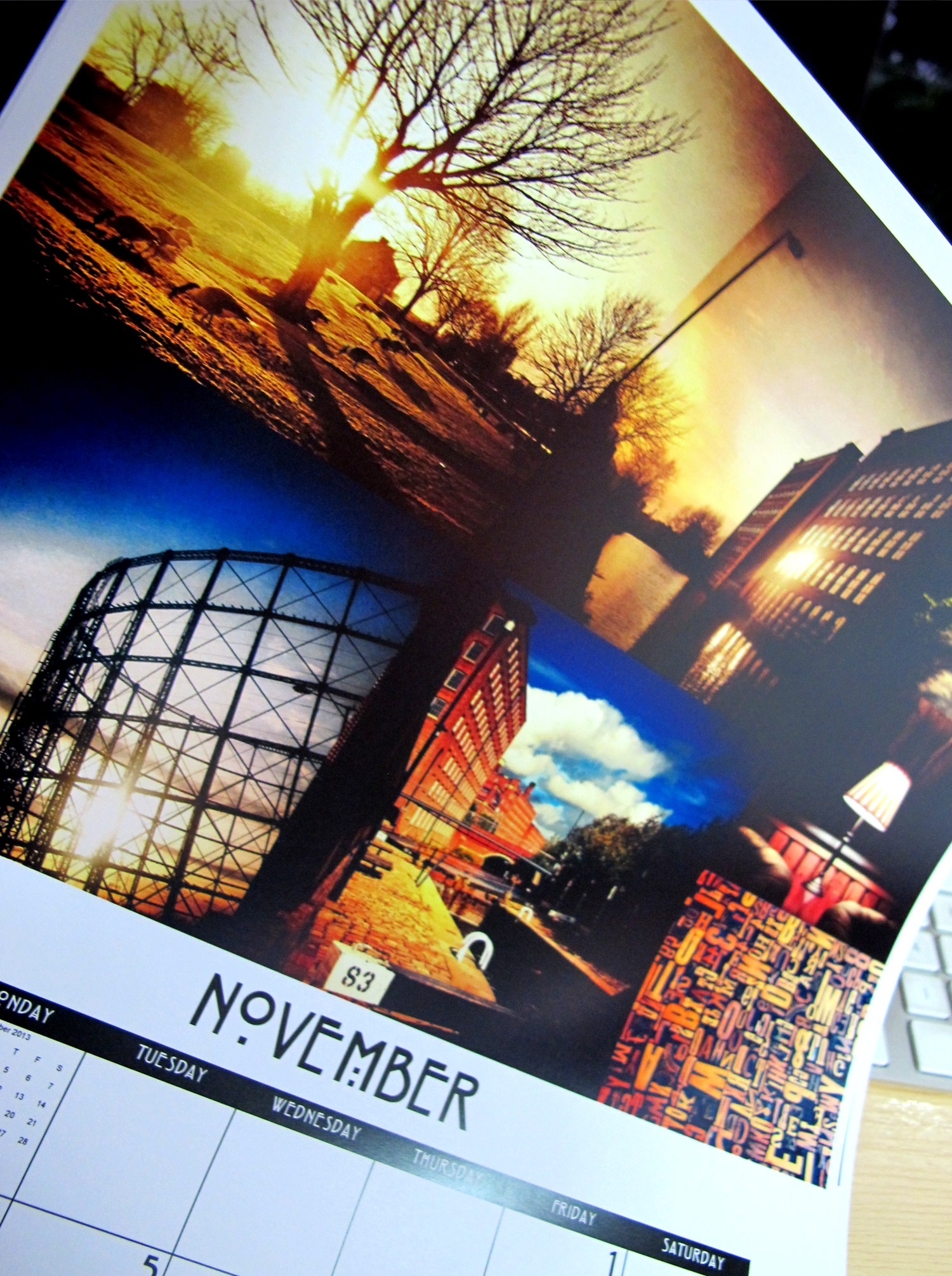
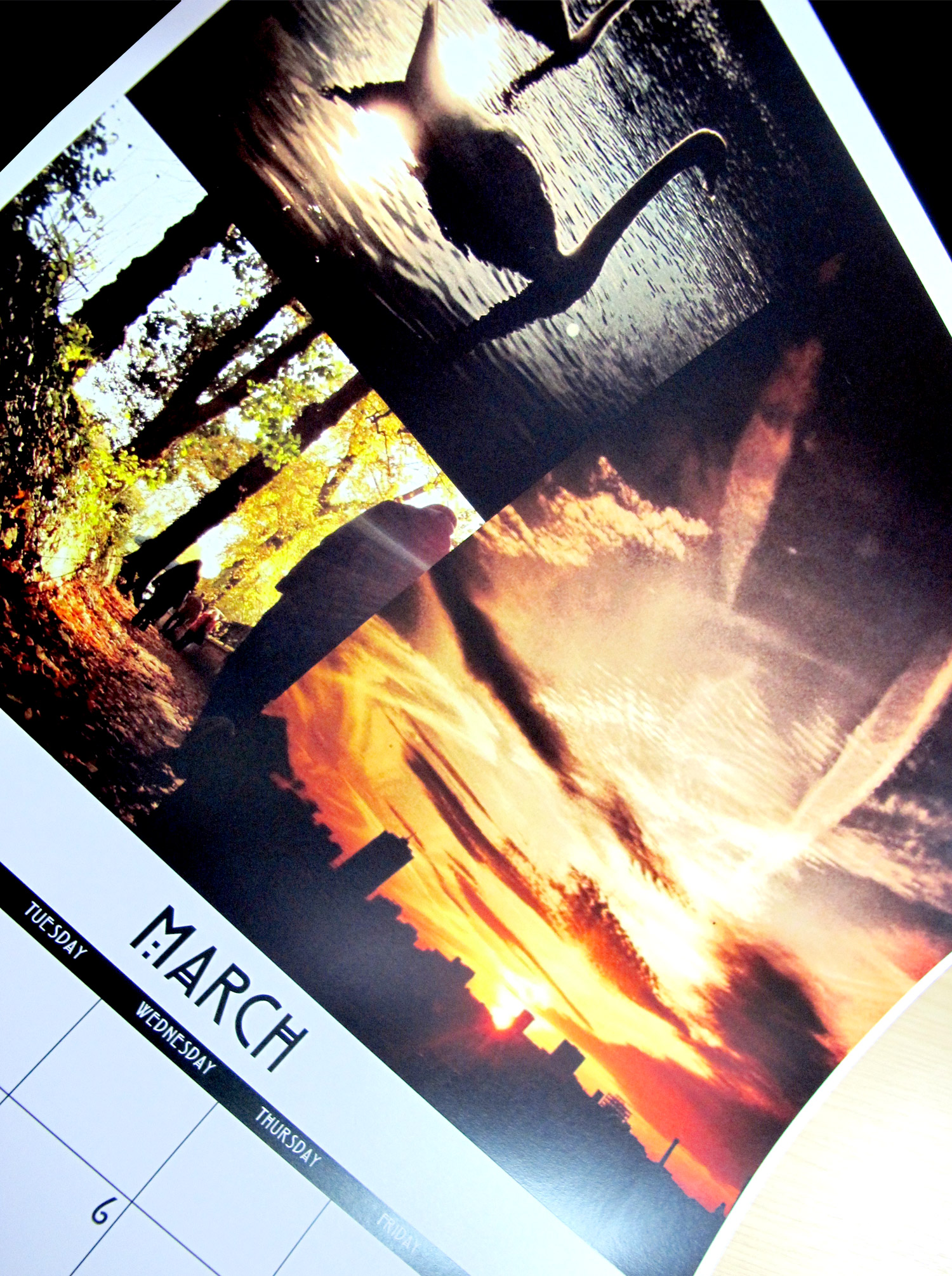
Most years I get given a calender for the upcoming year by my family for Christmas. With this year the first time for as long as I can remember when that hasn't happened I decided to make my own using photographs from the previous 12 months. Fortunately last year was pretty good, with loads of great shots/memories to choose from - I now just have to plan some equally cool stuff so that I don't get too depressed in 2013 looking back on last years trips.



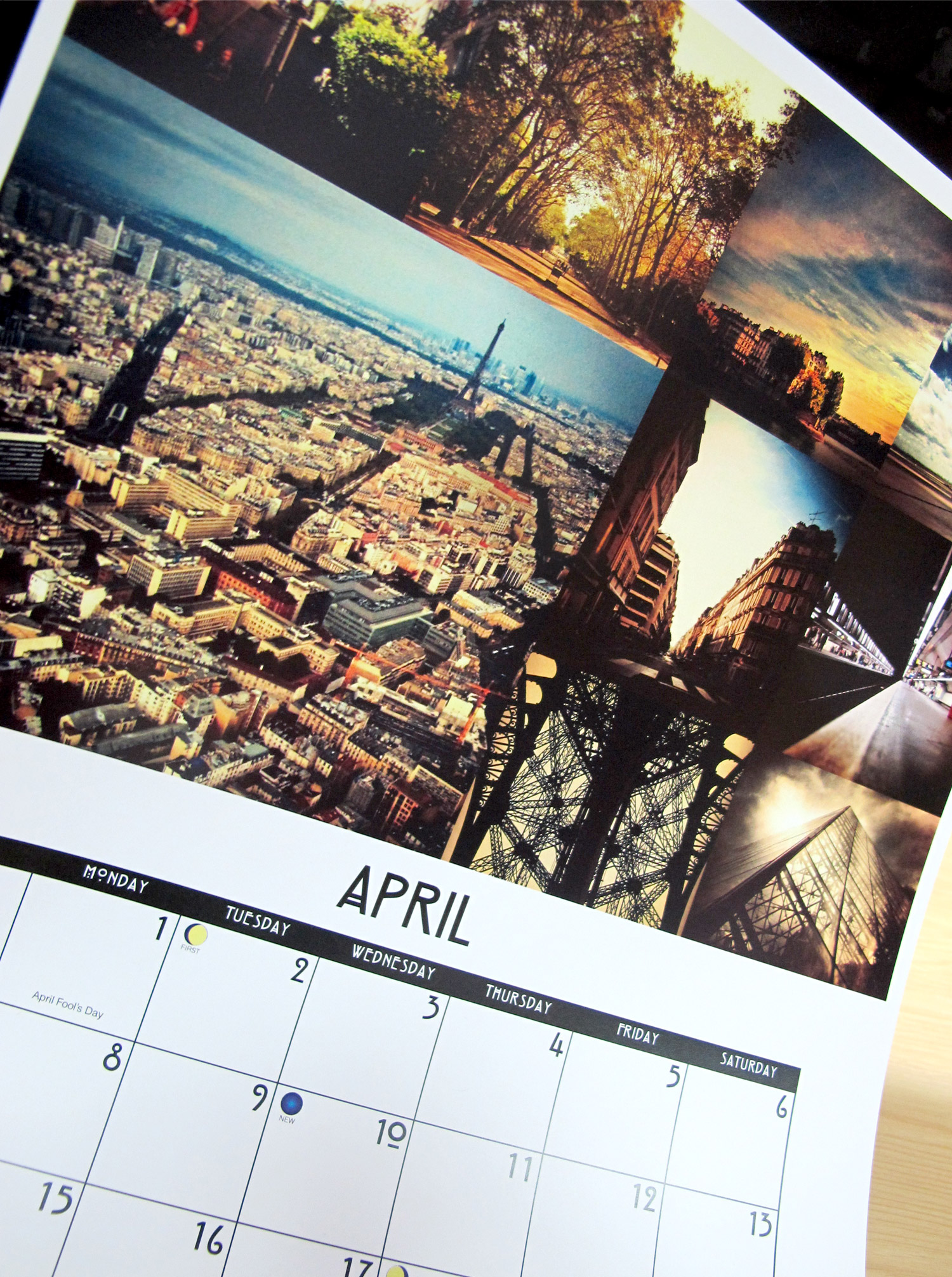
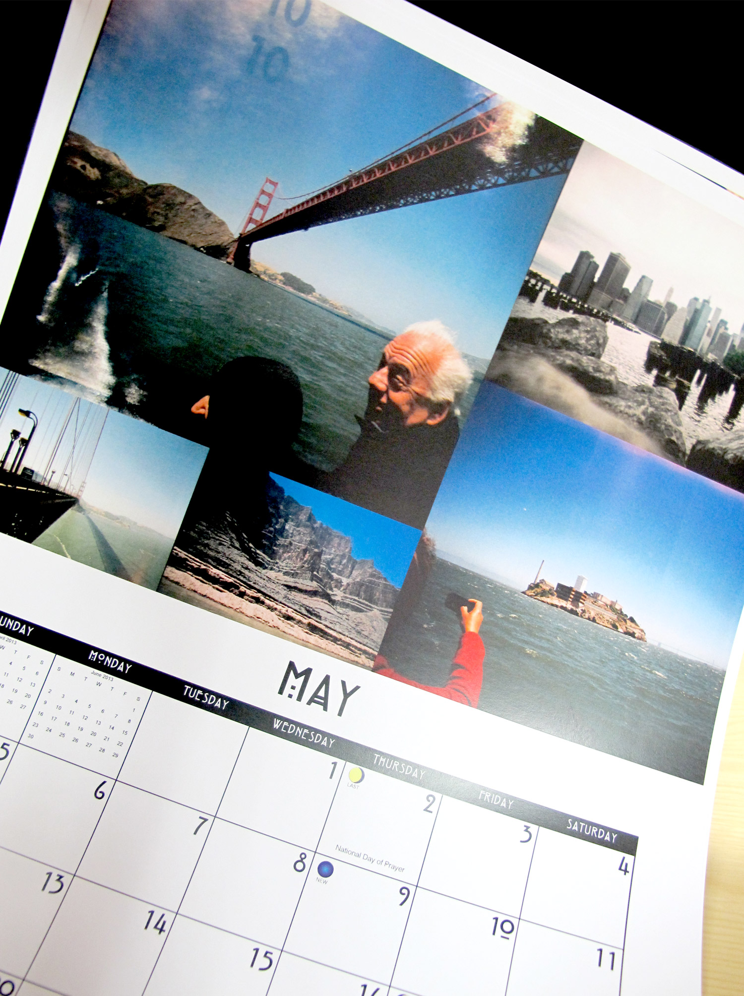
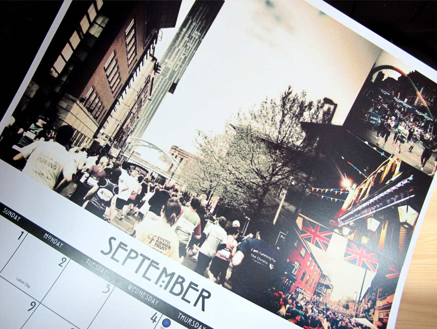

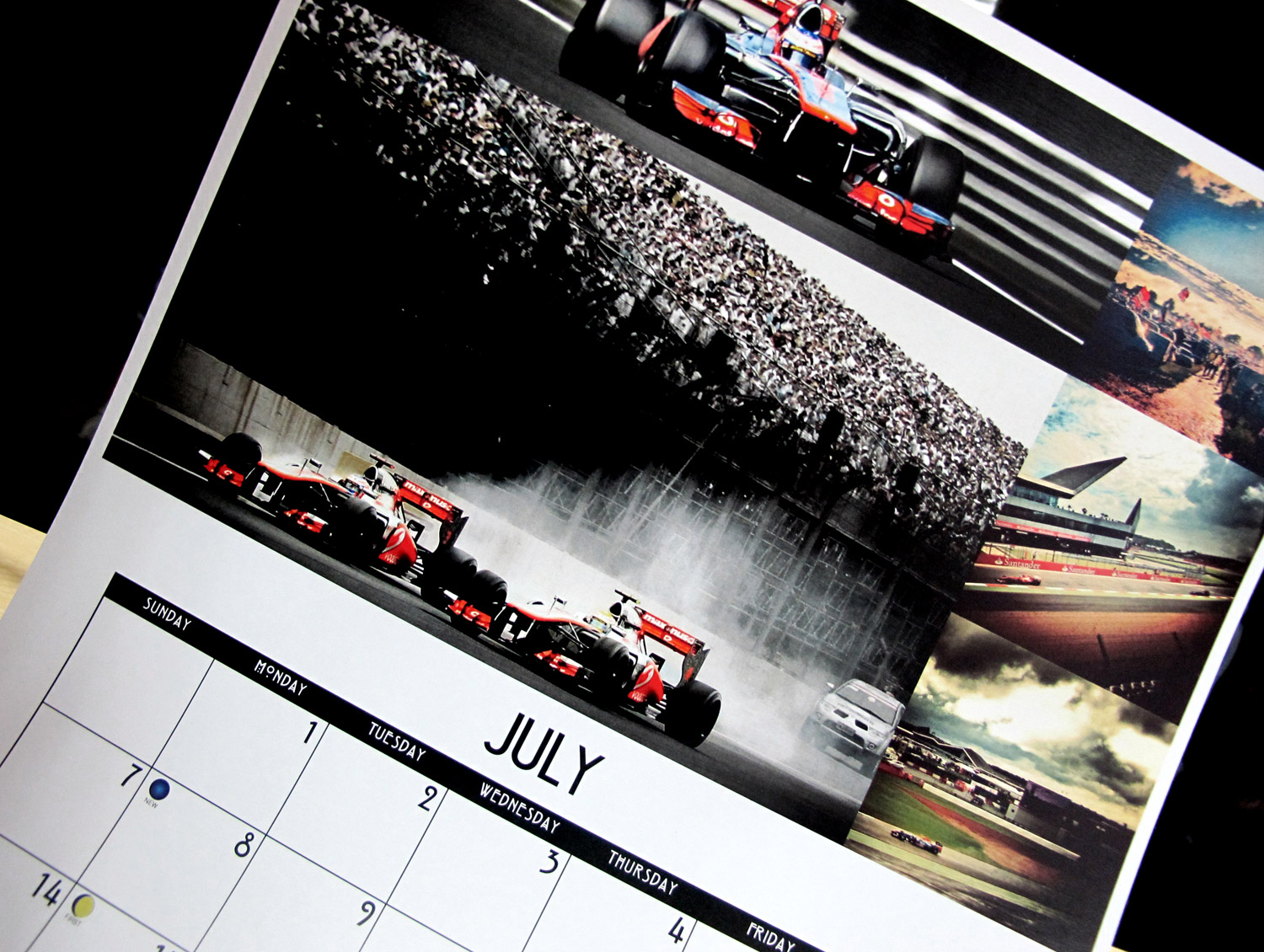
During the summer, in downtime we redecorated the agency. Initially the design department and swiftly followed by all the other departments in the agency once they saw what we had achieved.
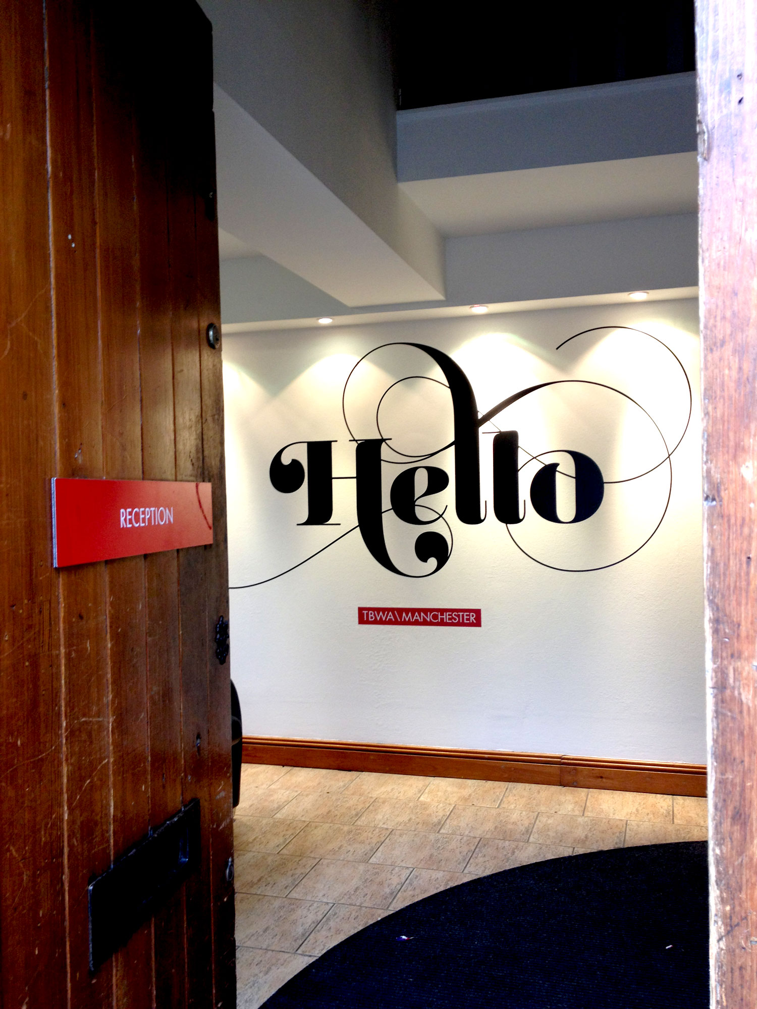
There where massive clear outs and tidying sessions and St Paul's has been transformed into an even more inspiring workplace. The transformation was finally completed a week ago with the installation of some wall vinyls placed around the building. I designed a couple of pieces, an organic and flowing welcome as you enter the front door and typographic treatment of a famous pangram in the studio.
I'm going to create a proper portfolio page for it all, but I'm still working on a colour version of the pangram statement, but in the meantime here are a couple of snaps.
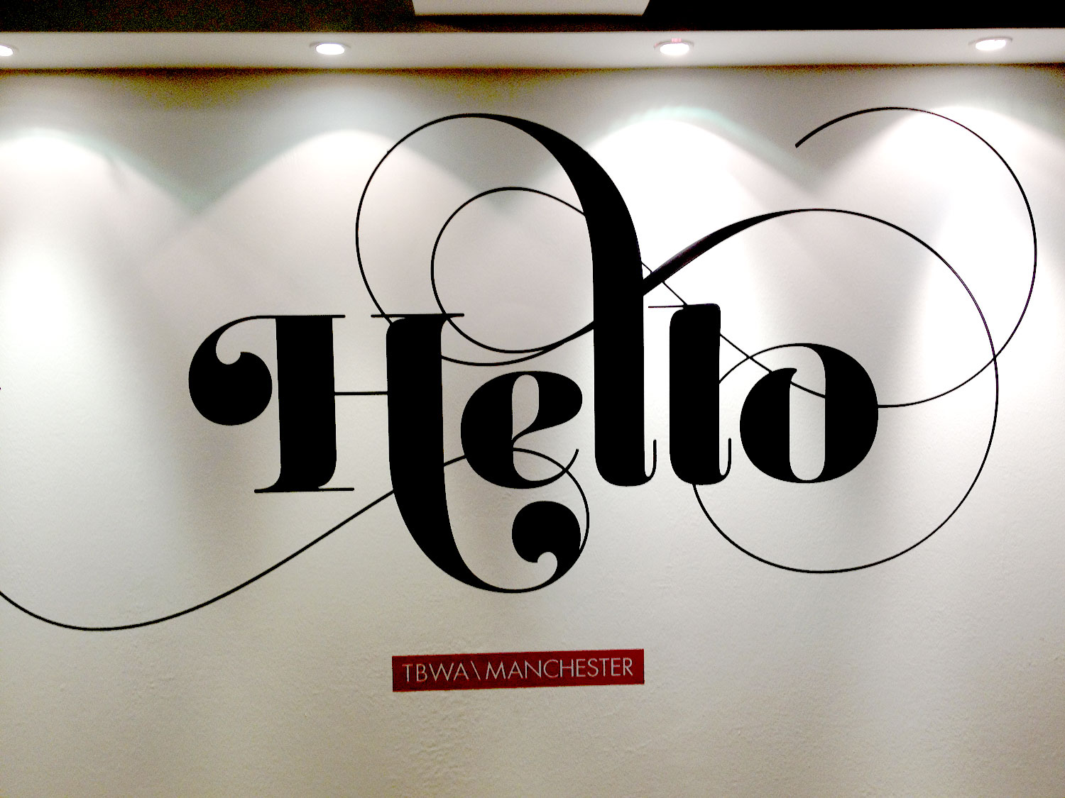
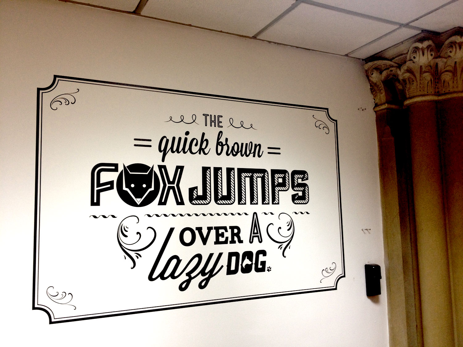
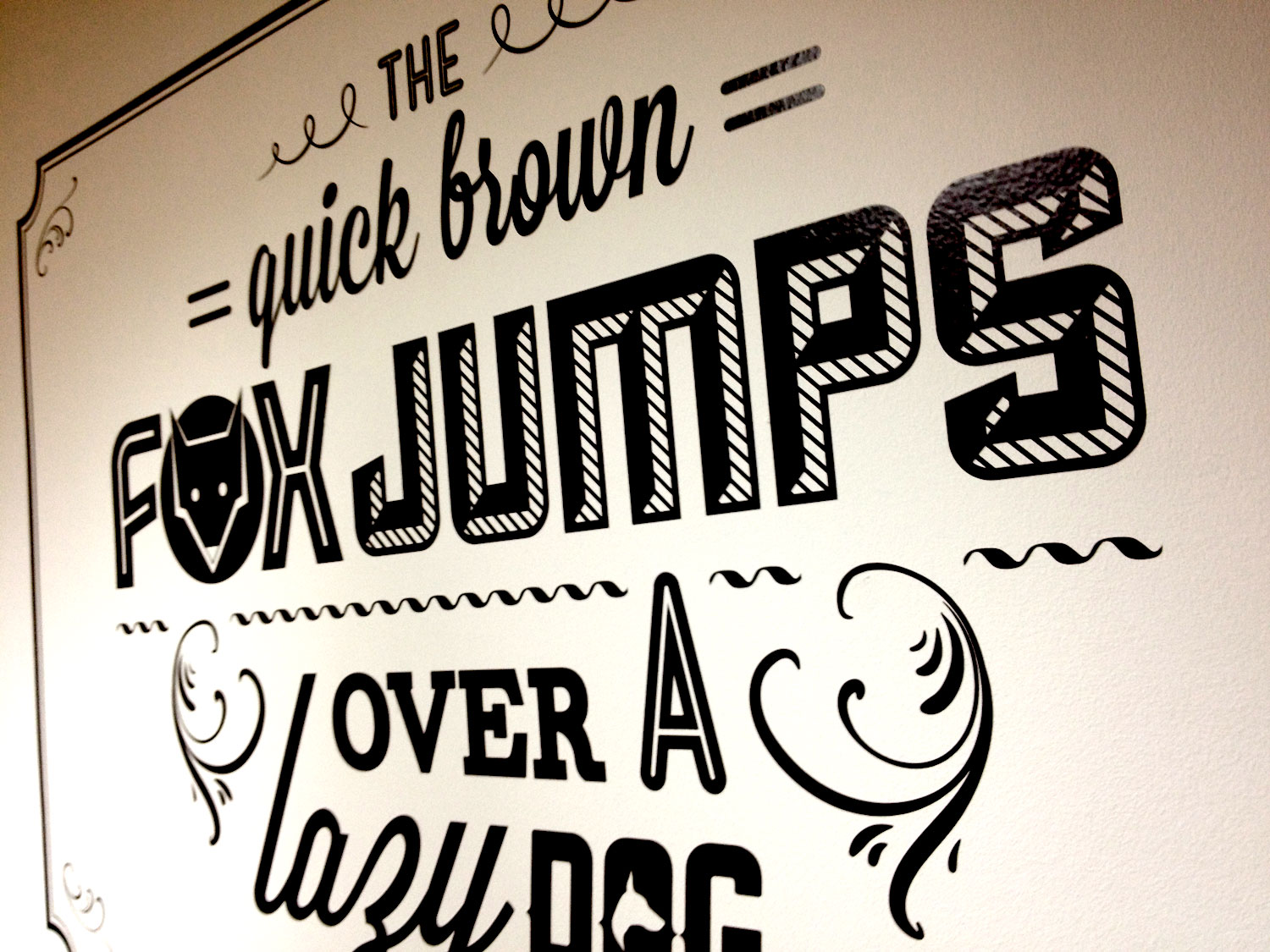
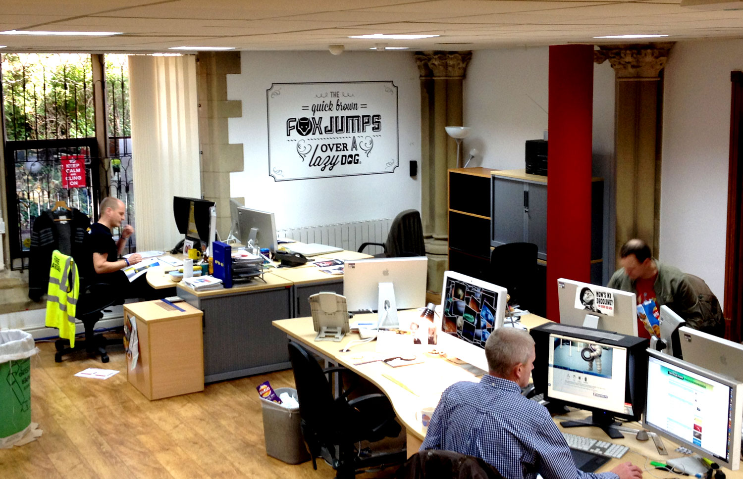
Here are some more shots of the entire agency.


Along with most of the people at TBWA\Manchester, my summer was consumed pitching for Tesco. We were up against the great and the good of advertising, beating off competition including JWT, VCCP, McCann Erickson, SapientNitro and WCRS, before finally losing out to W+K..
Now that Wieden & Kennedy's work is starting to see the light of day, I thought I'd share the little case study I put together on the evolution of the Tesco marque, and its possible future evolution. Please bear in mind this was a single afternoons work, and it is nowhere near as comprehensive as the brilliant microsoft rebrand done by Andrew Kim. This is meant as more of an evolution in the style of recent high profile rebrands like Starbucks.
Please click on the images below to enlarge.
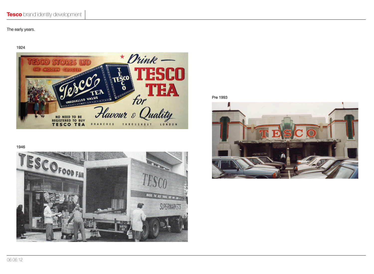
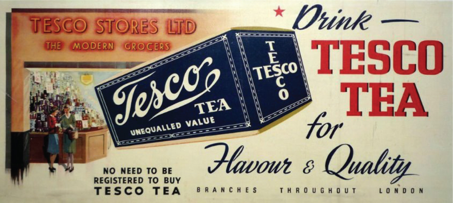
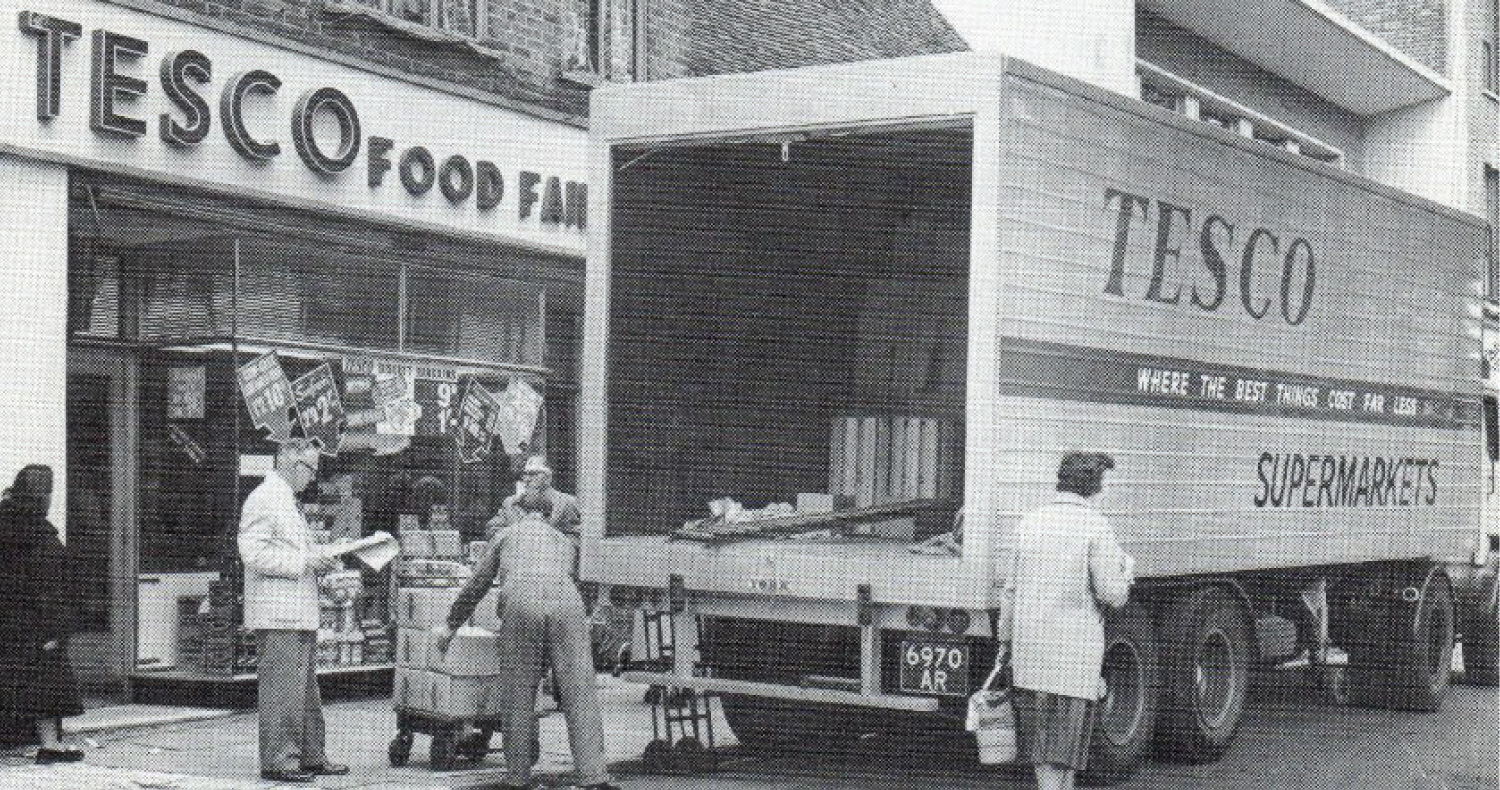
As you can see from the page above Tesco's branding early on was quite inconsistent, particularly with the advert from 1924 displaying 'Tesco' in 3 different faces and styles. On the image below from 1946, you can still see serious inconsistancies, with both serifs and sans being used in branding.
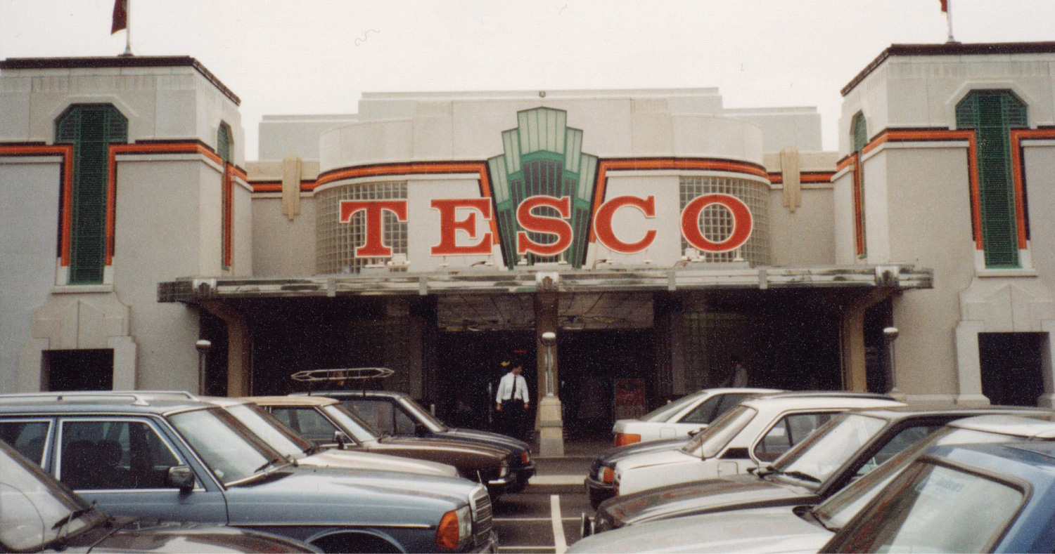
A branch of Tesco built inside the Hoover Building in Perivale, London (now a listed building)
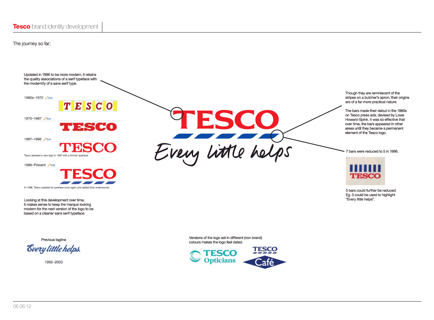
As you can see on the above image, since the Tesco has gradually refined the logo over, moving from a slab-serif, with the most recent incarnation from 1996 becoming almost a sans-serif.
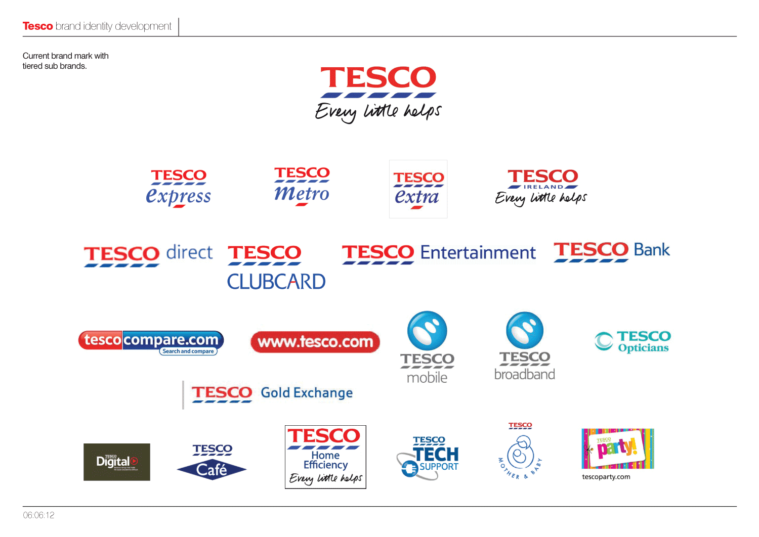
However, with Tesco's rapid expansion into many other areas and sectors, the various sub-brands lack a visual consistency and cohesion.
The blue stripes, which are reminiscent of the stripes on a butchers apron, made their debut in the 1980s on Tesco press ads, devised by Lowe Howard-Spink. It was so effective that over time, the bars appeared in other areas until they became a permanent element of the Tesco logo. But they are used differently by different parts of the business which I feel is confusing.
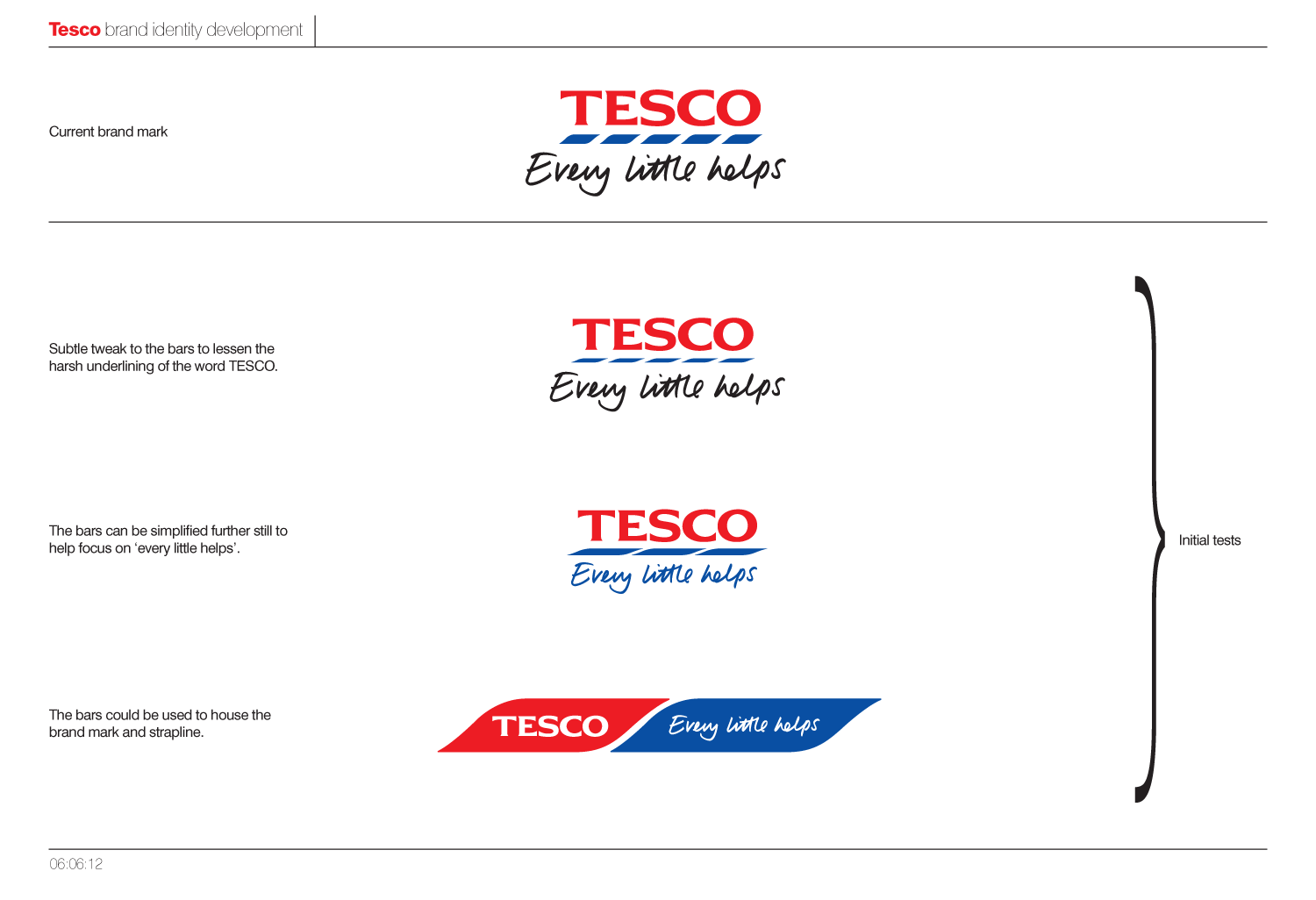
Exploring the best way to make that next refinement of the logo can be seen over the next few images.
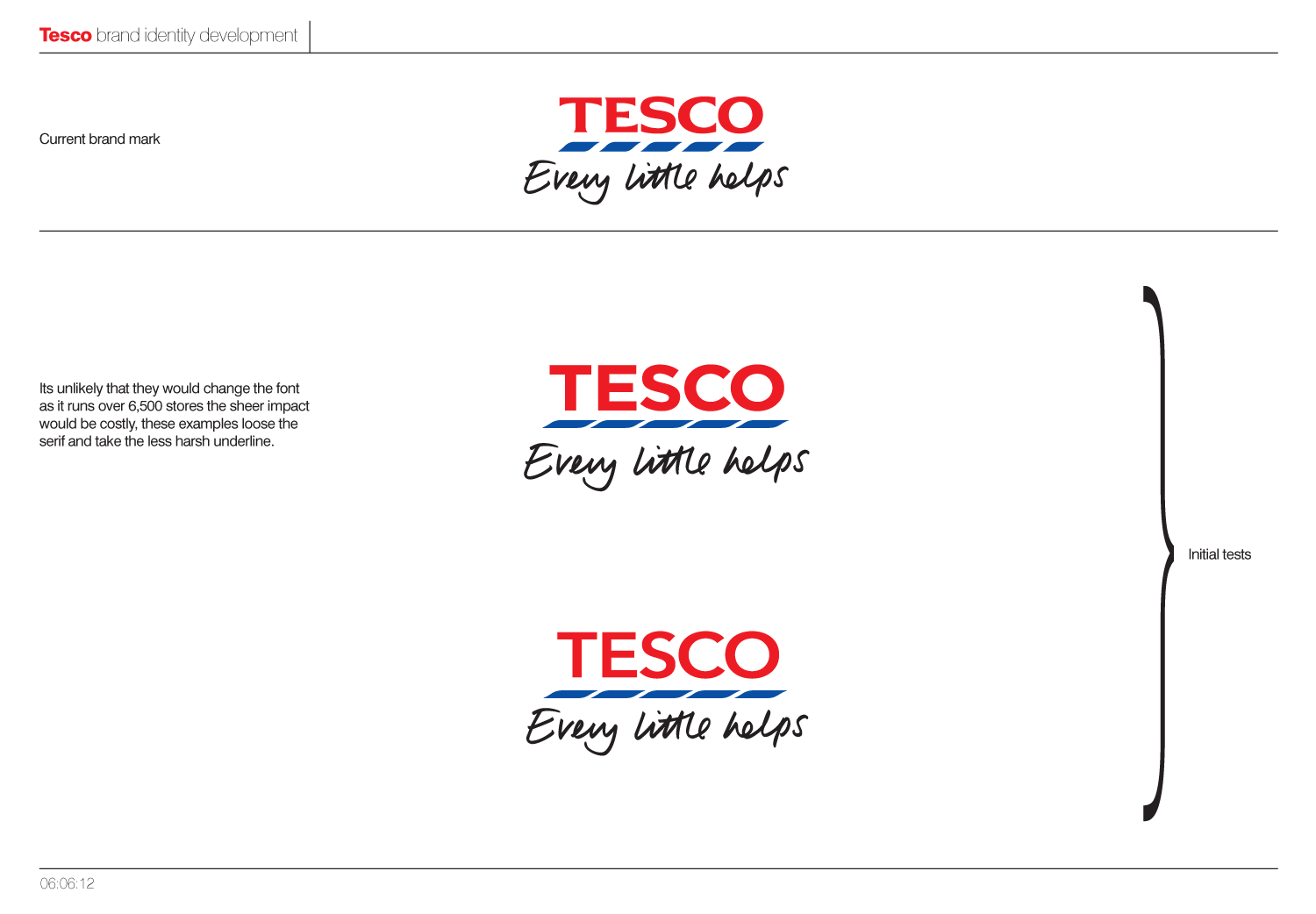
Should the number of stripes be reduced, or the size of them modified? Looking at the options below, moving to a completely sans typeface seems like a step too far. Getting the level of compression in x-height right, is also a tricky so as with not enough compression it doesn't look like Tesco, and too much and the logotype just looks squashed. Until actually having a look at it, I hadn't fully appreciated just how squashed it actually is.
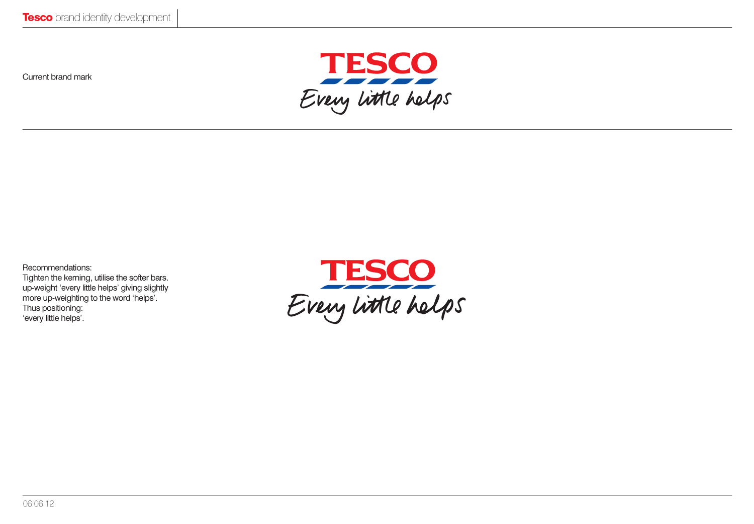
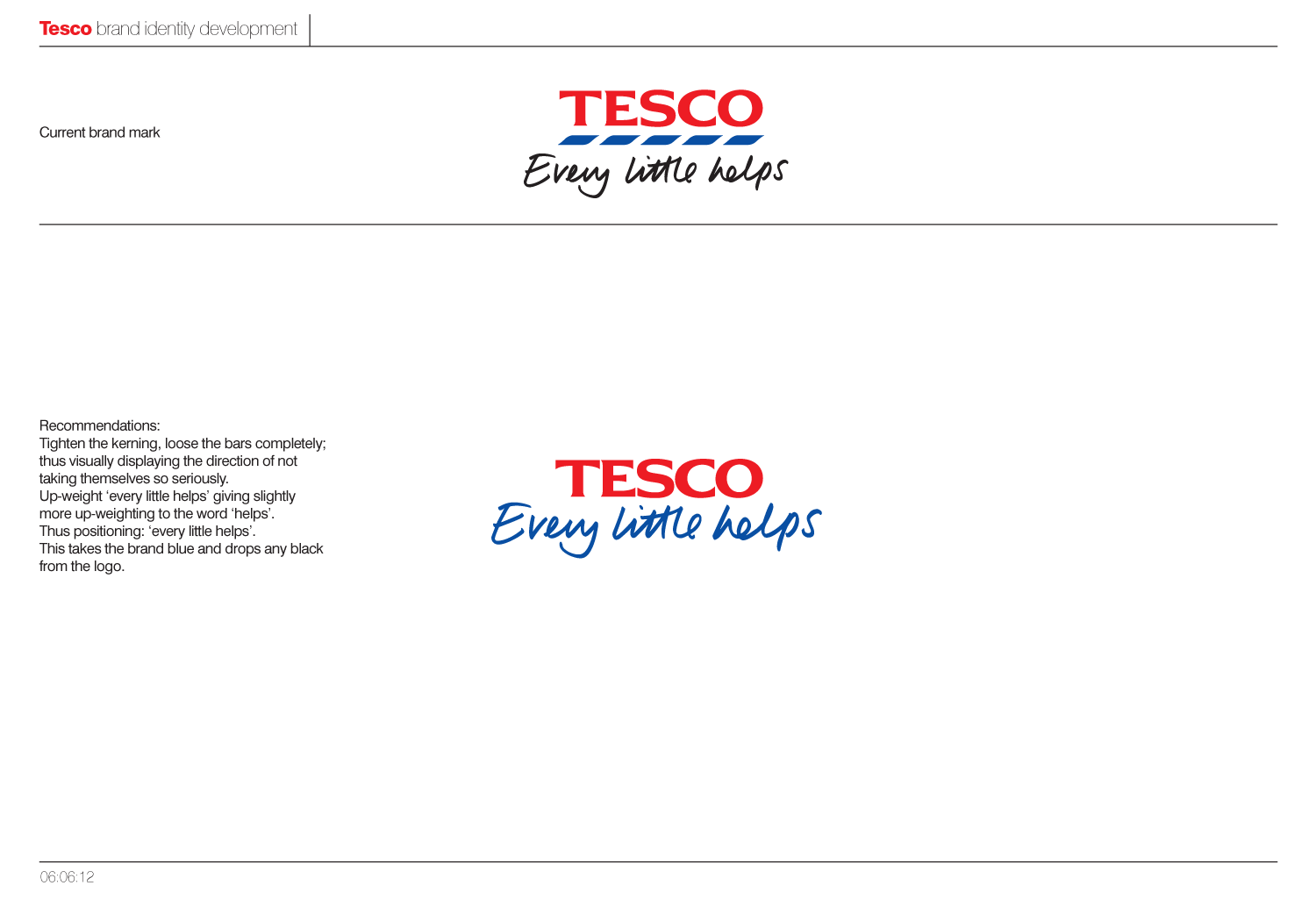
In the end, we would recommend to lose the bars completely, as they don't actually represent anything. Black as a colour is then completely lost from the logo, with "every little helps" taking on the Tesco brand blue and thus aligning it closer to the master brand. Further to this "Every little helps" has been upweighted, with extra emphasis being placed on "helps", as this was one the core aspects of the pitch strategy.
Below you can see how this would be applied on an individual basis and across the various sub-brands, with each sector taking a slightly different colour.
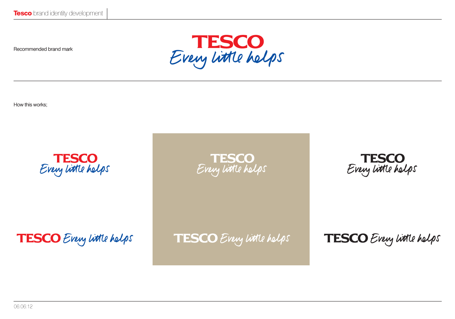
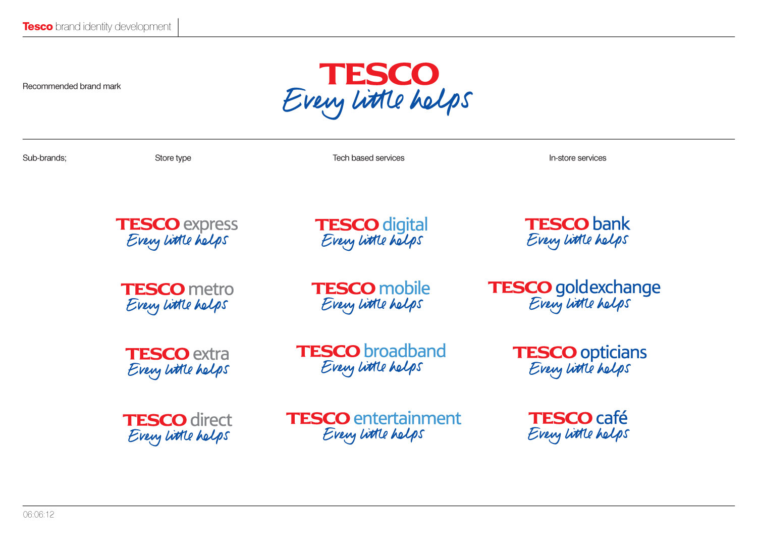 As I said at the beginning, this was only a quick brand overview and would have been great to get to delve deeper into the details and across the huge range of sub-brands. On a another note its interesting to see W+K's take on "every little helps" in their current ads, and how it wasn't too far away from our own.
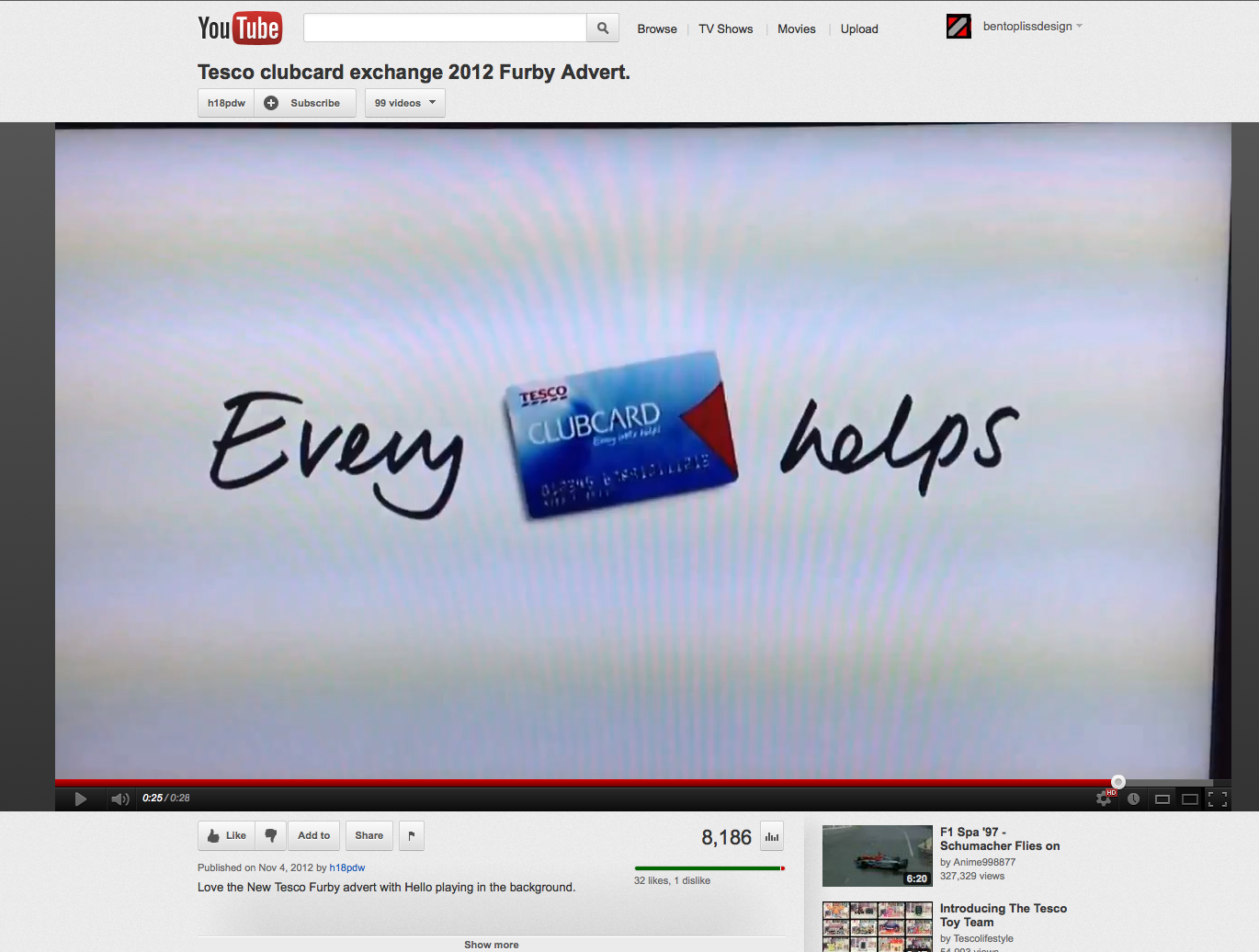

www.youtube.com/watch?v=CLPxDZtNMJ0
www.youtube.com/watch?v=3CPs_BnFbqM
en.wikipedia.org/wiki/Tesco
telegraph.co.uk/foodanddrink/9188573/Every-little-hurts-Tescos-new-budget-brand-lacks-snob-value.html
logos.wikia.com/wiki/Tesco
prweek.com/uk/news/58019/BELOW-THE-LINE-Tesco-checks-its-corporate-branding
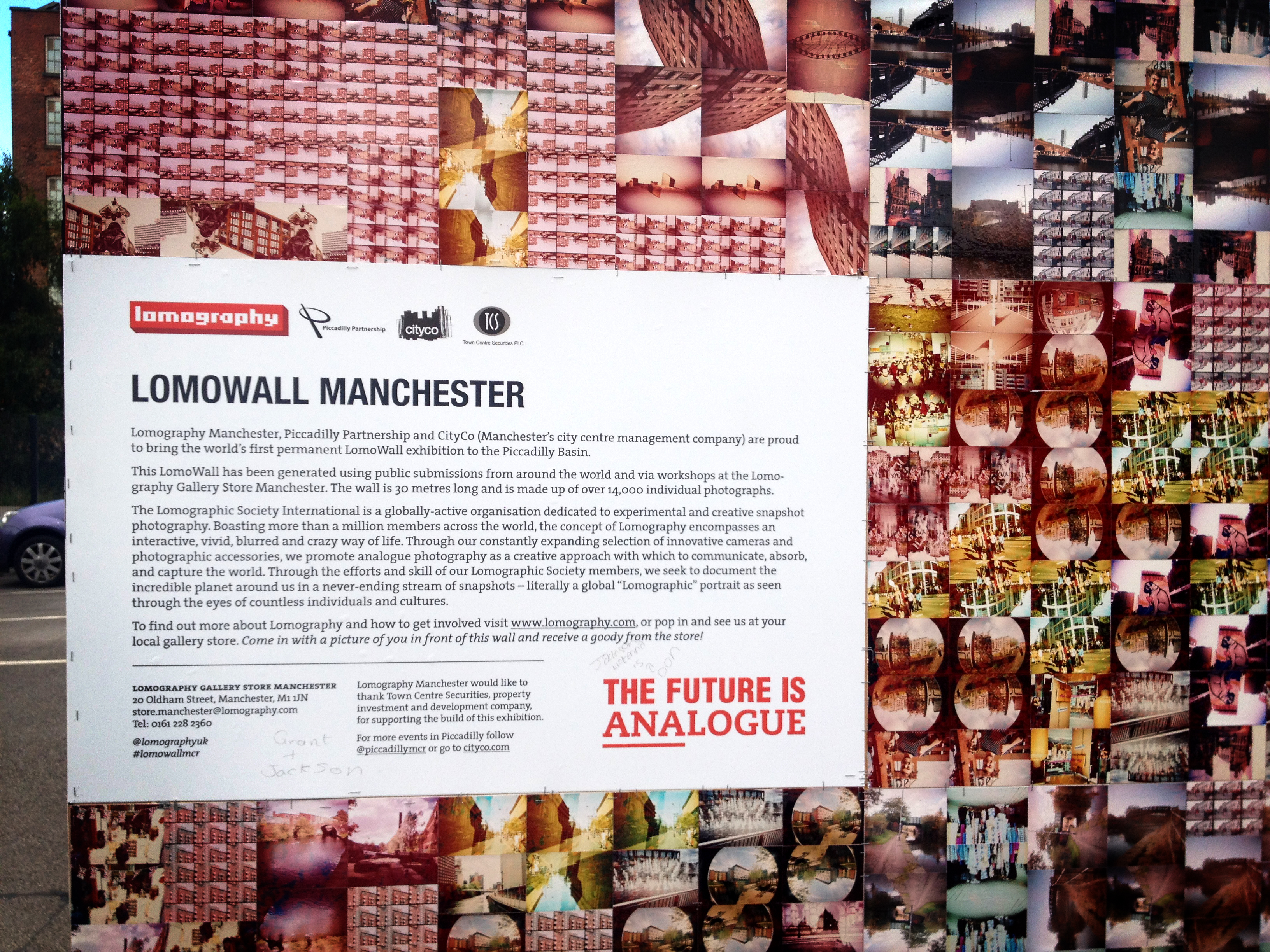
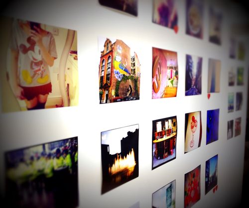
Over the weekend I happened to wander past the recently installed Manchester LomoWall. I'd been meaning to have a look for a while after submitting some shots a few months ago, and being unable to make the launch party.
I was secretly hoping that I'd been able to sneak a few shots in (as they needed 14000!), but I wasn't holding my breath. Slowly moving up and down the wall, I was delighted to find 8 or 9 of my own photographs featured and with each one being used multiple times too. Here are some snaps from my iPhone.
Check out the making of videos.
Billed as the “World’s first permanent LomoWall,” the Lomographic Society’s LomoWall Manchester was unveiled yesterday on Tariff Street. Now open to the public, the LomoWall Manchester is a 30m x 3m long artwork containing 14,000 individual “lomographs.” Alexandra King, Piccadilly Partnership Director said: “This is a new landmark on the Northern Quarter landscape, here in the heart of the Piccadilly Basin. The LomoWall adds to the street art scene in this part of the city centre and will become a visitor attraction in its own right. We are very proud to host it and to have the world’s first permanent LomoWall is a real honour. It’s a welcome addition to the urban landscape.” Lomography Press Release
David Tester of Lomography Manchester said, ”The theme of water was chosen as it fits in well with the 2012 Canal Festival and also as it reflects the surrounding area of the wall. The photos were generated via our online community and through workshops taking place at Lomography Gallery Store Manchester. Every photo that has been used has been taken in and around Manchester. We had a great response, as always, from our community”.
I was however disappointed to notice that the wall had already been vandalised in places, with a section of photographs being torn down and another area being graffitti'd.
If you want to go and have a look, free parking is available at the nearby Urban Exchange (Aldi, Go Outdoors, etc) retail development off Great Ancoats Street, or for more information on Lomography visit http://www.lomography.com or check out shop at 20 Oldham Street.
http://www.lomography.com/homes/bentopliss
http://www.lomography.com/magazine/news/2012/07/20/is-your-photo-becoming-a-p...
http://www.lomography.com/magazine/news/2012/08/02/lomowall-manchester-launch...
http://microsites.lomography.com/stores/gallery-stores/manchester
'ONE OFF’ LEAP DAY INSPIRES NEW SOCIAL MEDIA LED ART EXHIBITION.
To celebrate the ‘one off’ leap year day on Wednesday, four Manchester instagrammers (Kate Towey, James G Brown, Gina Hewitt and Fiona McGarva) organised a social media led collaborative art project to create ‘One Off’: a photography exhibition in Northern Quarter gift shop Incognito’s gallery space, an old bank vault.
[divider top_link="false" autosize="true"]

The ‘People’s Choice’ Vault – photo by instruct.
Entrants were asked to simply take a photo using the hugely popular iPhone photography app, instagram on the theme ‘One Off’ and tag it using the corresponding hashtag. All submitted photos were displayed with the most popular 18 photos being framed and entered into the ‘people’s choice’ competition with the winner decided by those who attended. Checking the tag now, there were almost 350 submitted photos.
I submitted a couple of images, with one being lucky enough to be selected for the ‘people’s choice’ award and being framed and displayed with 17 selected others inside the old vault. Unfortunately I didn’t win, but I think 13 votes was quite respectable (which put me in about 5th place, not that I was counting or anything!)
[divider top_link="false" autosize="true"]
My submission - bentopliss
The exhibition will run until to March 14th, so if you’re in the area its well worth having a look or feel free to follow me on instagram (@bentopliss).

The winning entry – photo by marklloyd68
Incognito, 5 Stevenson Square, M1 1DN. 0161 228 7999
Opening hours Mon - Sat 10am - 5.30pm, Sun 12pm - 4pmIncognito / @Incognito_UK
http://www.instameetmcr.co.uk/
http://web.stagram.com/tag/oneoff/
Yesterday Jenson Button took to the streets of Manchester in his Mclaron MP-23, tearing up Deansgate to Albert Square and back in again whilst 55,000 fans cheered him on.
Glad we got down their pretty early as we got quite good spot at the turning point by the town hall, where we got sprayed with bits of tyre/road as Jenson performed burnouts right infront of us. The Q&A was pretty interesting, especially after we had just been ejected from behind the fanzone by an angry security man for sneaking in with some of Jensons party!
Check out the videos at the bottom, as they attempt to portray the noise and power of it all - like angry elephants smashing their way around Manchester!
This video filmed by my mate @stevo9856 is awesome!
Jenson getting a bit sideways on his final run back towards Deansgate.
Jenson heading to the Q&A session - just after we had been ejected by a grizzly security guard.
Lewis Hamiltons suit and car.
Messing around with with video settings on my new-ish Canon G12 camera at a gig last night, and discovered the "miniature" setting. Basically a tilt-shift setting, which blurs the top and bottom a bit.
What I didn't realise is that it also plays back at x10 speed and with no sound. I'm a bit gutted there's no sound as this was one of the best songs of the night, but then at 10x it would be rubbish - which I didn't realise at the time either. I would also have liked the tilt-shift blurriness to have been a bit stronger, as at the minute its more of a time-lapse video rather than minature or tilt-shift. - more play needed I think. I still think it looks kinda cool being condensed down into 24 seconds - The light show was really good considering the relatively small size of the gig and lead singer Ed Macfarlane dances around like a mad man. Anyway I thought I'd post it up, so hear it is. Let me know what you think.After all the recent fuss on the news and twitter, thought I'd check out where I'd been. Its fun watch the timeline play out and see journeys and trips down to the south or going skiing in the French Alps. As well as to see areas where I've lost signal and my phone has jumped several miles to other areas, which then have no trail to or from. I'm sure my recent trip to Amsterdam would be on there too but I've not synced my iphone in the last week.
If you want to see where you've been check: http://petewarden.github.com/iPhoneTracker/ and for more information Pete Warden has written some interesting points about the who, what and why of it.
Personally I'm not too bothered by it, plenty of other companies track where and what we do, I think its just the unsecured and easy accessible nature of it which is risky. However I'm sure Apple will do something about this soon.
I've just got back from a week in the French Alps, and as usual I've taken loads of pictures. As well as taking loads on my proper camera I also used my trusty iPhone 3GS, and namely the Instagram and Hipstamatic apps. Since I've started using the instagram app, I've barely touched hipstamatic and the multitude of other camera apps I've got installed. But I thought this little trip away would be a good chance to revisit it (it cost me money after all) give them a little head-to-head and decide once and for all if one reigns supreme.
Here are the results:
Instagram.
Hipstamatic.
One point to note, is that all the instagram photos were taken on a sunny day, where as at least half the hipstamatic shots were taken in poor visibility and low light.
Interface
Generally I much prefer the instagram interface, not having to wait for the image to "develop" and the ability to try all the different filters out before selecting the best one. However the randomness of hipstamatic does sometimes produce nice and unexpetced results, but equally there are plenty of shots which could be much improved if there was a better viewfinder or if they could be applied retroactively. I also like the ability to edit the image in another app first (I use TiltShiftGen, quite often to tweak colours, saturation and contrast), before then applying the filters and thats before you even get onto the social aspect of instagram.
I'm not going to talk about the social aspect of instagram (which is great by the way, as you will know if you're familiar with the app), but merely comparing the usability and results as I had limited access to that whilst up in the Alps.
Results
The main difference in the actual shots/filters seems to be the level of contrast, with it being richer in instagram and more washed out and dreamy in hipstamtic. I tend to prefer the results instagram provides - being able to browse the various results means the best filter is always selected, maybe if the same was possible with hipstamtic I'd use it more as too often the results aren't quite what I hoped for.
But then I knew all this before, which is why I hadn't used it for donkeys. But it does produce some nice images, and combining the two apps also gives some interesting and different results. So maybe I will use it a bit more from now on, if only to make my photos slightly different from all the instagram'd ones flying about.
If you want to check out my photos I'm sure I will get them on flickr soon or you can browse my instagram shots here (requires login) or here.
If you want to follow me on instagram my username is bentopliss.
hipstamaticapp.com
itunes.apple.com/us/app/hipstamatic/id342115564?mt=8
instagr.am
itunes.apple.com/us/app/instagram/id389801252?mt=8
artandmobile.com/tiltshift
itunes.apple.com/app/tiltshift-generator-fake-miniature/id327716311?mt=8
Contact.
ben[@]bentopliss.com
+44 (0) 7825 814797
Graphic Design & Creative Direction.
© 2023.
All work displayed remains the property of either Ben Topliss,
the agencies and/or the clients
it was created for.


![Reebok – NBA All Star Event [2022]](https://i0.wp.com/bentopliss.com/assets/2022/03/Project_panel_480x328px__0007_ALLSTAR.jpg?fit=480%2C328)


![Reebok x Jurassic Park [Pitch]](https://i0.wp.com/bentopliss.com/assets/2022/03/Project_panel_480x328px__0006_JP.jpg?fit=480%2C328)


