


![Reebok – NBA All Star Event [2022]](https://i0.wp.com/bentopliss.com/assets/2022/03/Project_panel_480x328px__0007_ALLSTAR.jpg?fit=480%2C328)


![Reebok x Jurassic Park [Pitch]](https://i0.wp.com/bentopliss.com/assets/2022/03/Project_panel_480x328px__0006_JP.jpg?fit=480%2C328)


Along with most of the people at TBWA\Manchester, my summer was consumed pitching for Tesco. We were up against the great and the good of advertising, beating off competition including JWT, VCCP, McCann Erickson, SapientNitro and WCRS, before finally losing out to W+K..
Now that Wieden & Kennedy's work is starting to see the light of day, I thought I'd share the little case study I put together on the evolution of the Tesco marque, and its possible future evolution. Please bear in mind this was a single afternoons work, and it is nowhere near as comprehensive as the brilliant microsoft rebrand done by Andrew Kim. This is meant as more of an evolution in the style of recent high profile rebrands like Starbucks.
Please click on the images below to enlarge.
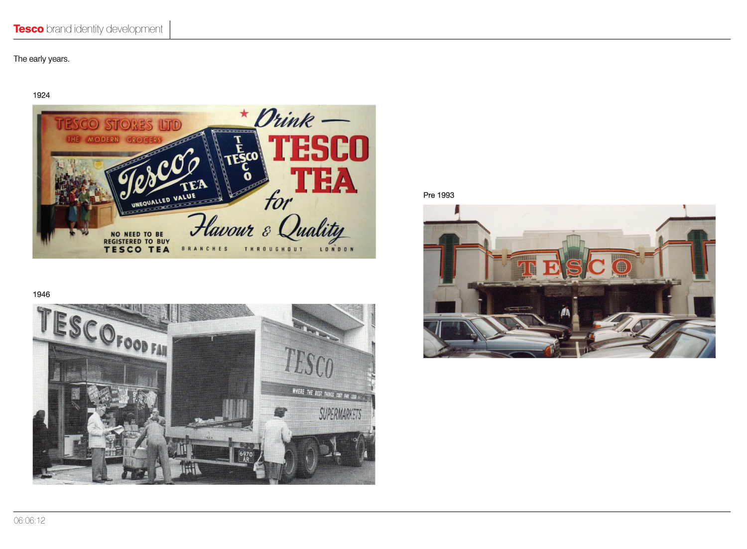
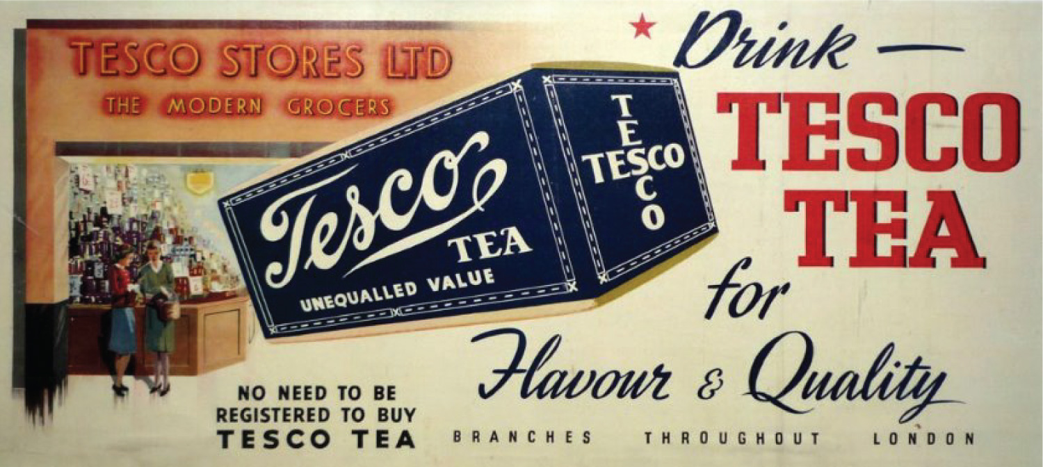
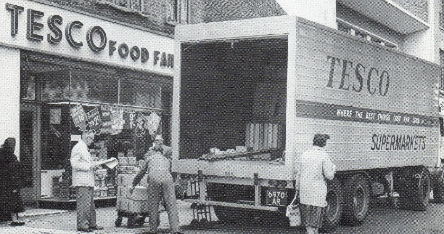
As you can see from the page above Tesco's branding early on was quite inconsistent, particularly with the advert from 1924 displaying 'Tesco' in 3 different faces and styles. On the image below from 1946, you can still see serious inconsistancies, with both serifs and sans being used in branding.
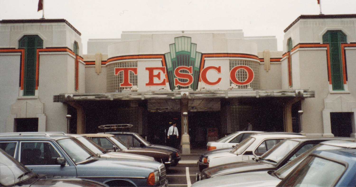
A branch of Tesco built inside the Hoover Building in Perivale, London (now a listed building)
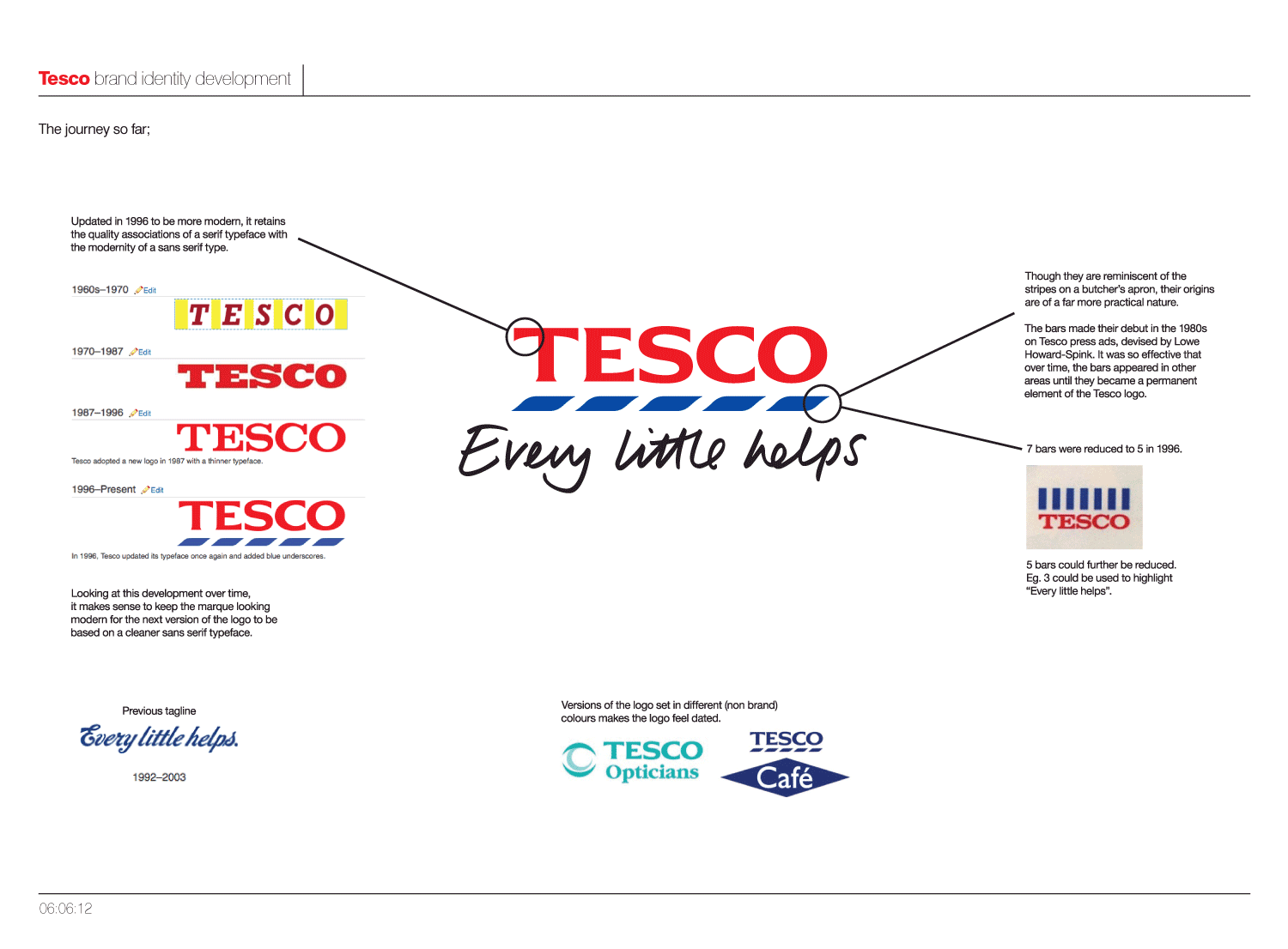
As you can see on the above image, since the Tesco has gradually refined the logo over, moving from a slab-serif, with the most recent incarnation from 1996 becoming almost a sans-serif.
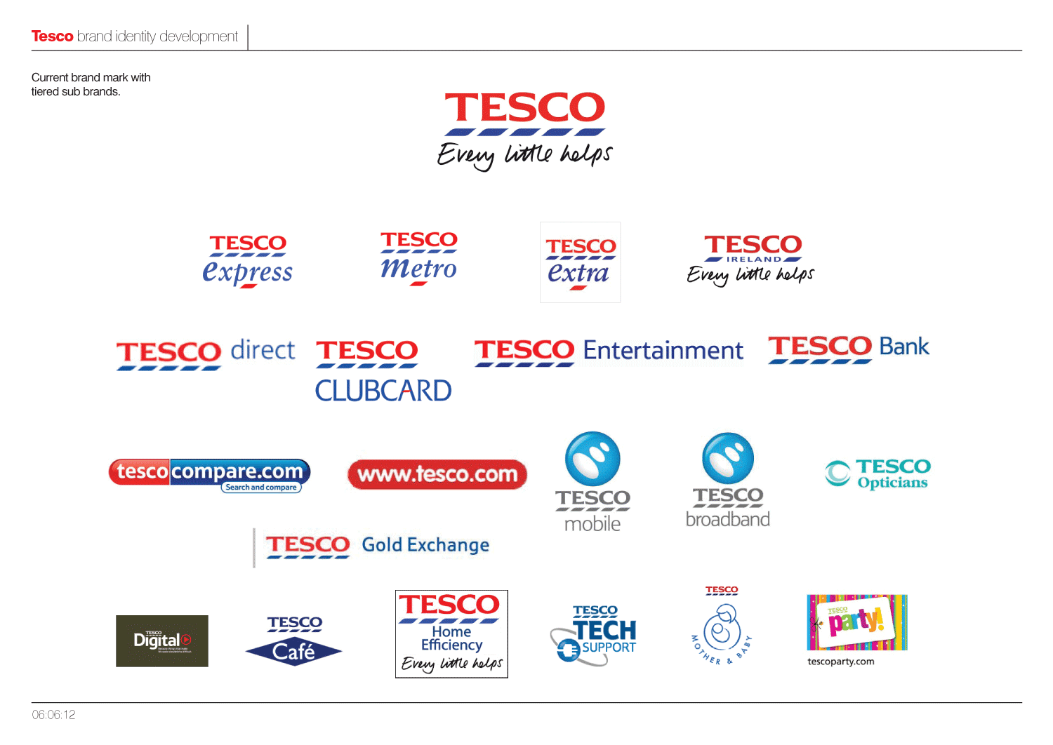
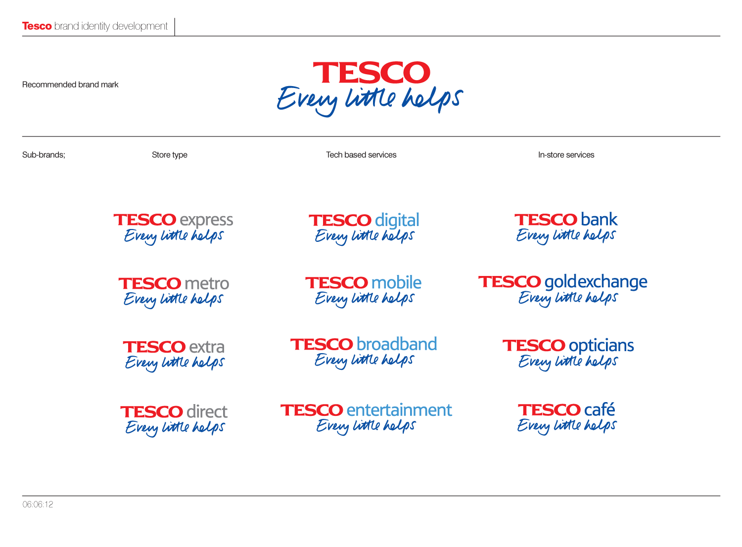
However, with Tesco's rapid expansion into many other areas and sectors, the various sub-brands lack a visual consistency and cohesion.
The blue stripes, which are reminiscent of the stripes on a butchers apron, made their debut in the 1980s on Tesco press ads, devised by Lowe Howard-Spink. It was so effective that over time, the bars appeared in other areas until they became a permanent element of the Tesco logo. But they are used differently by different parts of the business which I feel is confusing.
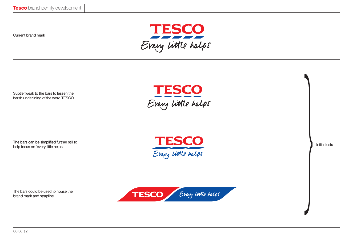
Exploring the best way to make that next refinement of the logo can be seen over the next few images.
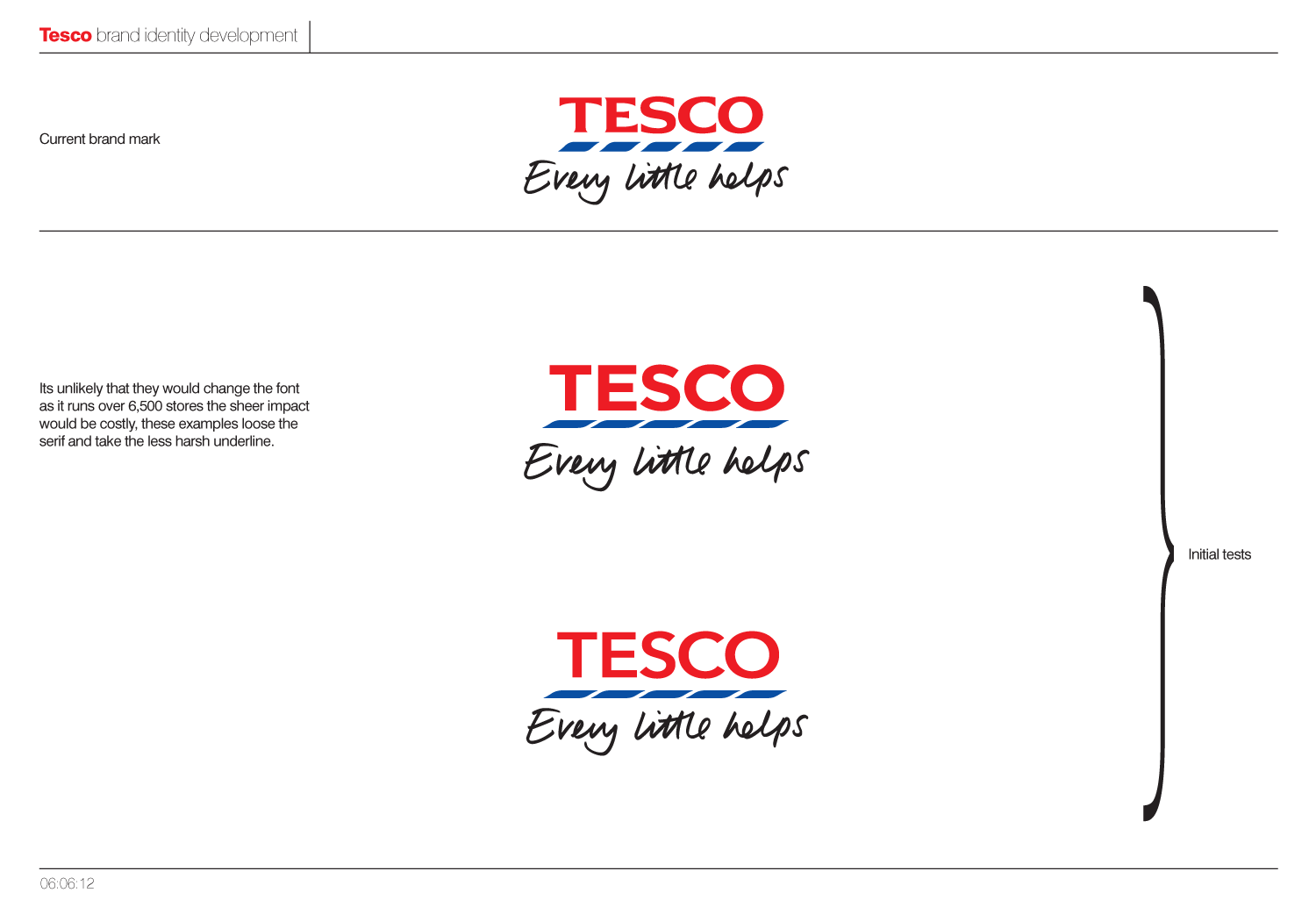
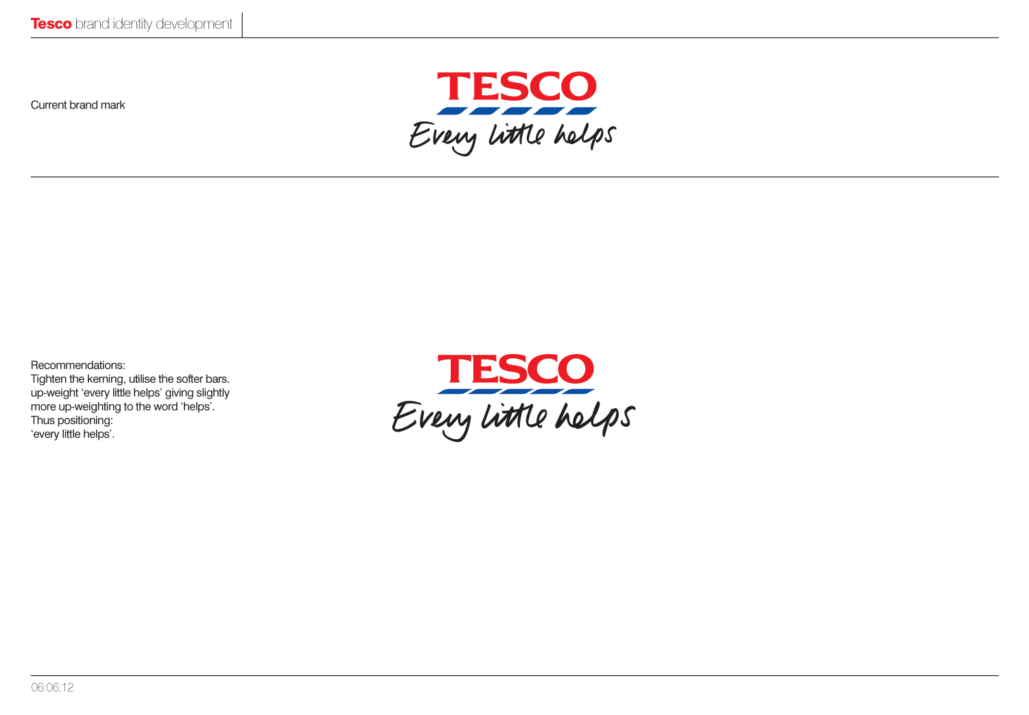
Should the number of stripes be reduced, or the size of them modified? Looking at the options below, moving to a completely sans typeface seems like a step too far. Getting the level of compression in x-height right, is also a tricky so as with not enough compression it doesn't look like Tesco, and too much and the logotype just looks squashed. Until actually having a look at it, I hadn't fully appreciated just how squashed it actually is.
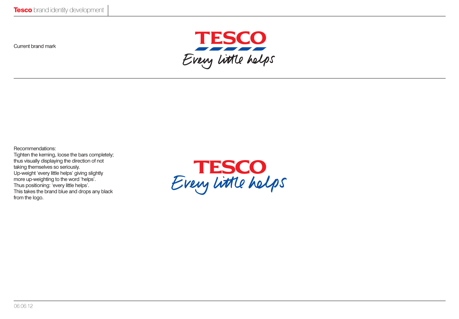
In the end, we would recommend to lose the bars completely, as they don't actually represent anything. Black as a colour is then completely lost from the logo, with "every little helps" taking on the Tesco brand blue and thus aligning it closer to the master brand. Further to this "Every little helps" has been upweighted, with extra emphasis being placed on "helps", as this was one the core aspects of the pitch strategy.
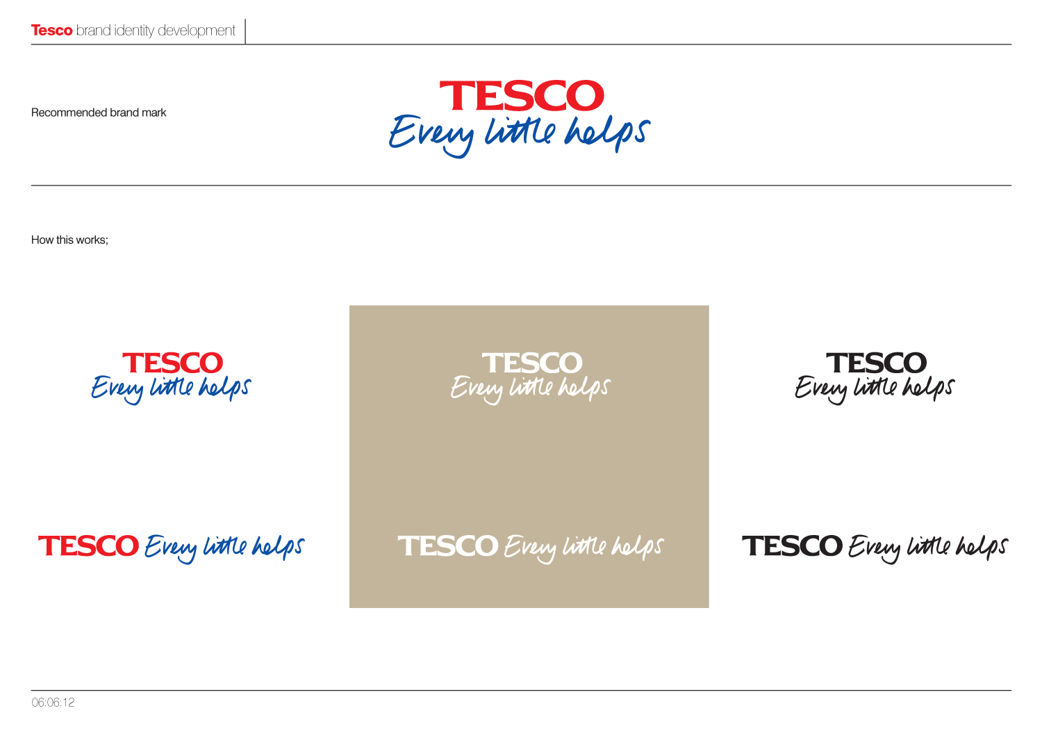
Below you can see how this would be applied on an individual basis and across the various sub-brands, with each sector taking a slightly different colour.
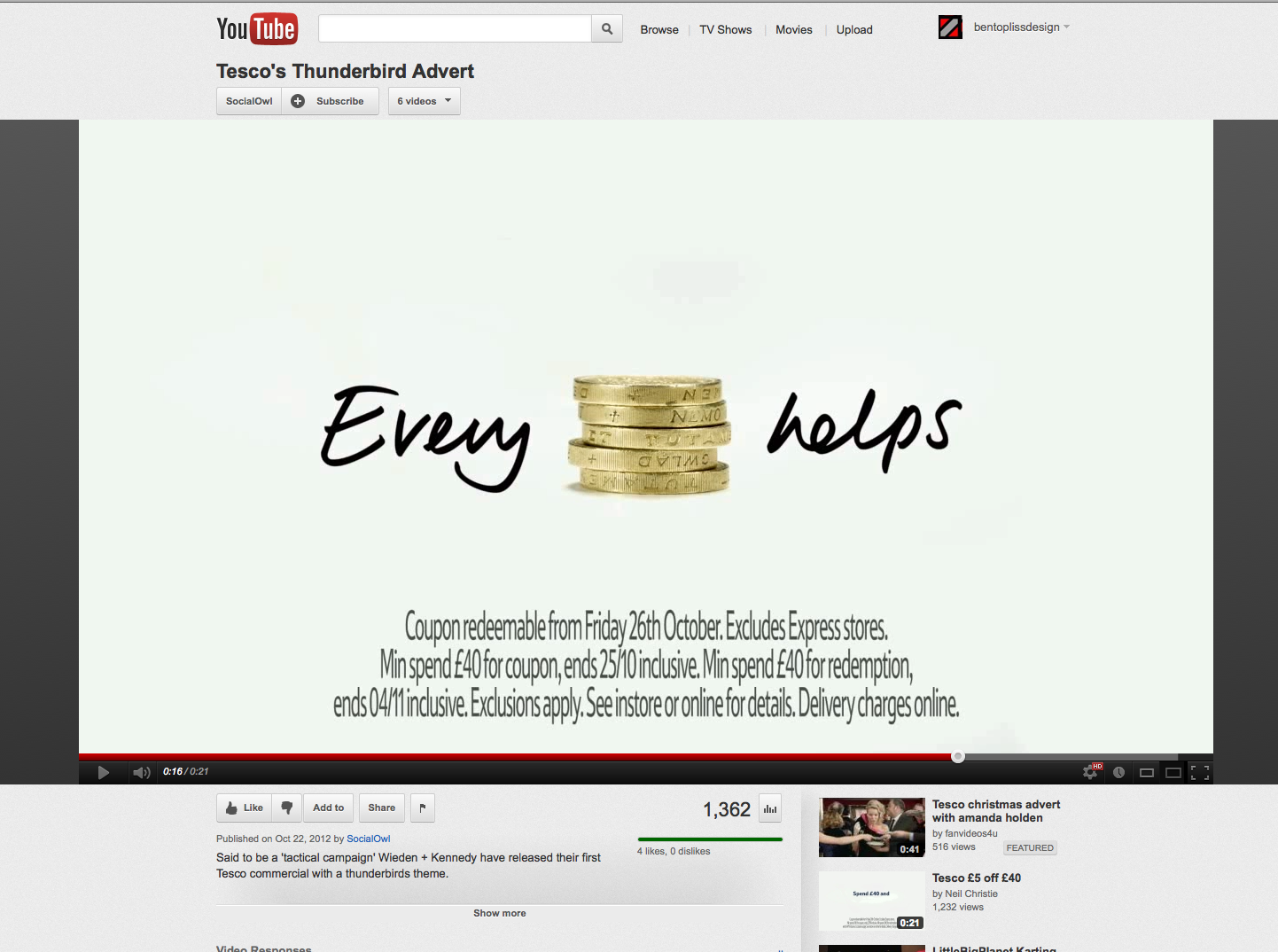
 As I said at the beginning, this was only a quick brand overview and would have been great to get to delve deeper into the details and across the huge range of sub-brands. On a another note its interesting to see W+K's take on "every little helps" in their current ads, and how it wasn't too far away from our own.
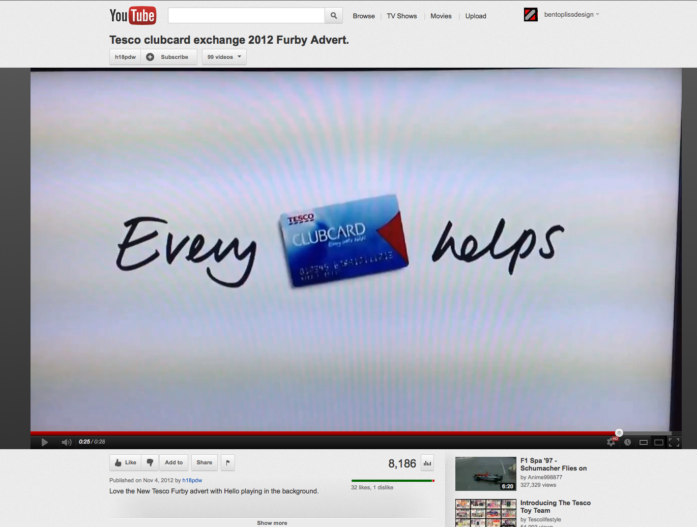
www.youtube.com/watch?v=CLPxDZtNMJ0
www.youtube.com/watch?v=3CPs_BnFbqM
en.wikipedia.org/wiki/Tesco
telegraph.co.uk/foodanddrink/9188573/Every-little-hurts-Tescos-new-budget-brand-lacks-snob-value.html
logos.wikia.com/wiki/Tesco
prweek.com/uk/news/58019/BELOW-THE-LINE-Tesco-checks-its-corporate-branding
Comments