![Reebok – NBA All Star Event [2022]](https://i0.wp.com/bentopliss.com/assets/2022/03/Project_panel_480x328px__0007_ALLSTAR.jpg?fit=480%2C328)


![Reebok x Jurassic Park [Pitch]](https://i0.wp.com/bentopliss.com/assets/2022/03/Project_panel_480x328px__0006_JP.jpg?fit=480%2C328)


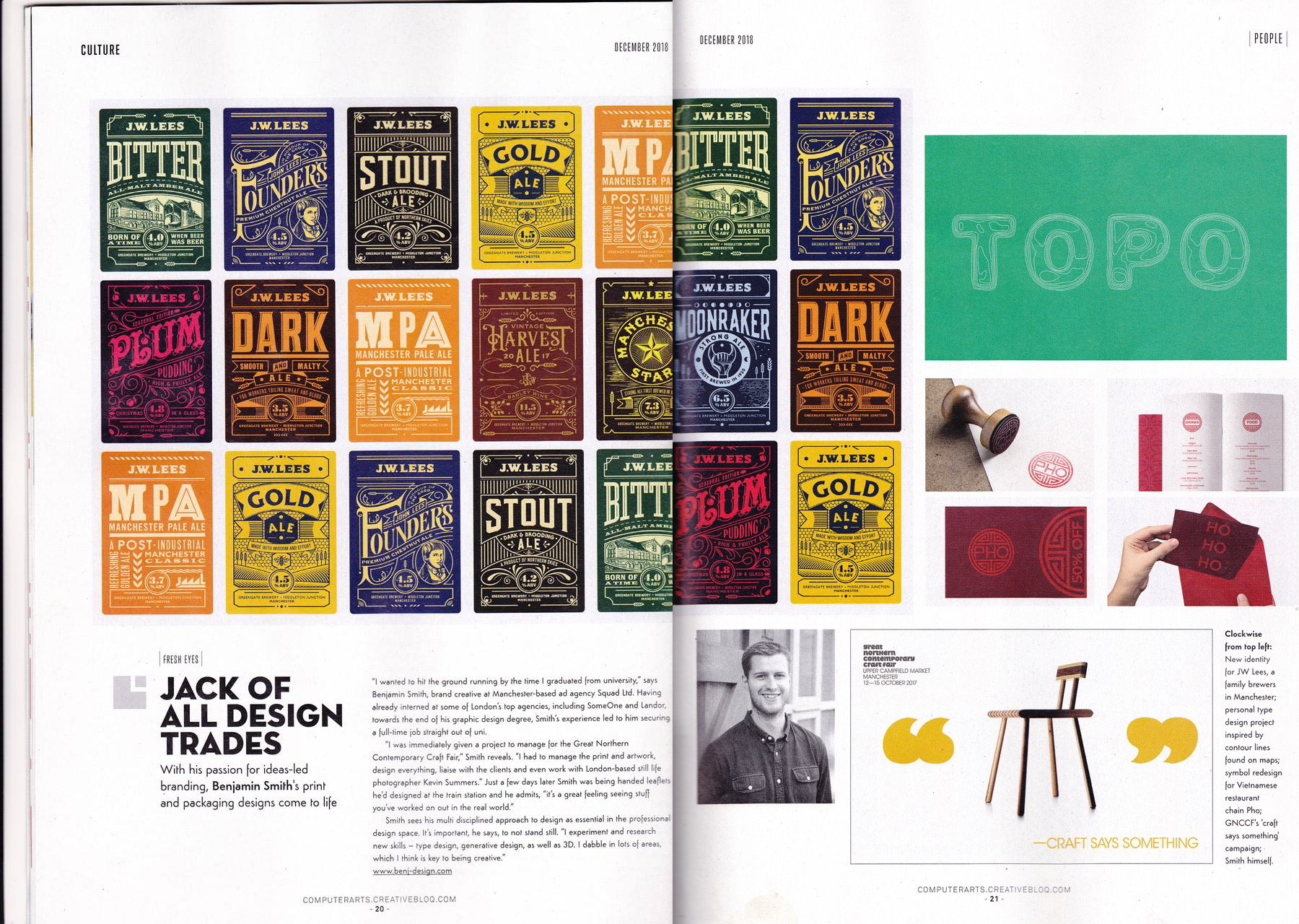
All Posts in Identity
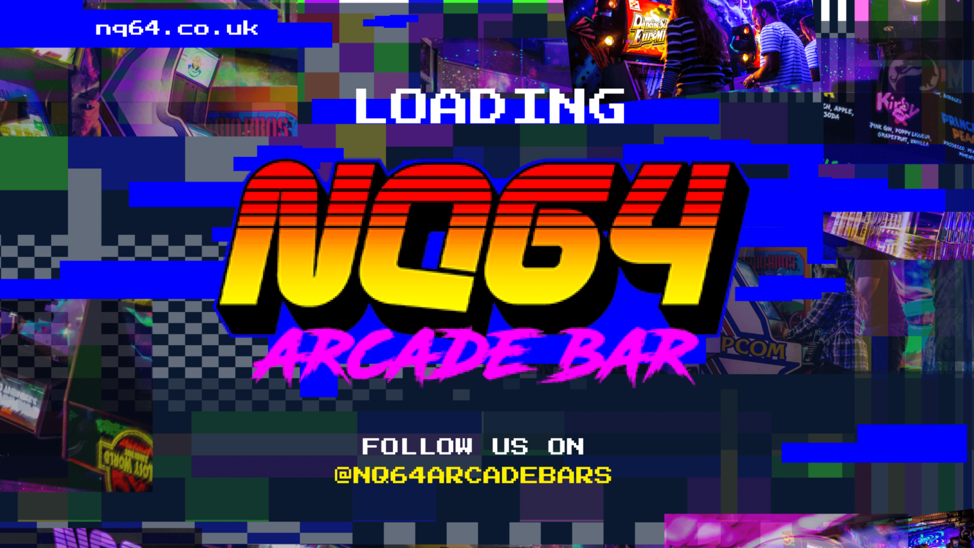
NQ64 launch campaign and retro-gaming styled website are LIVE!
I created the out-of home creative and worked with the digital team here at Serotonin to create the new website (which was nominated for several awards). We had lots of fun making the GIFs and interactive parts of the website.


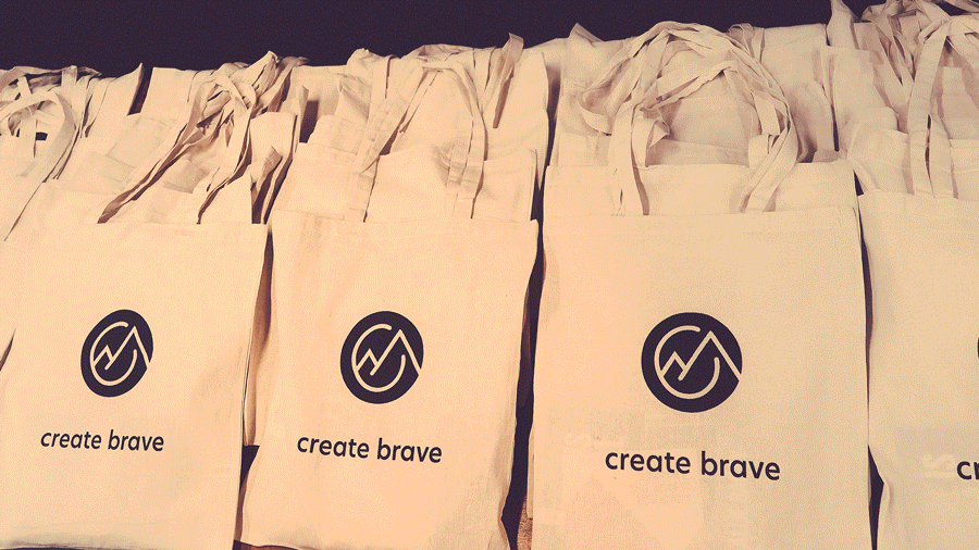
Create Brave event one in the (tote) bag! Great to have worked on the launch of the Create Brave concept and series. Fun times working on the brand identity, posters and the event photography.
Event one well was definitely a success, a great turnout and Allie Bailey @ab_runs was super engaging and inspiring. Excited for the next one. There is no wall!

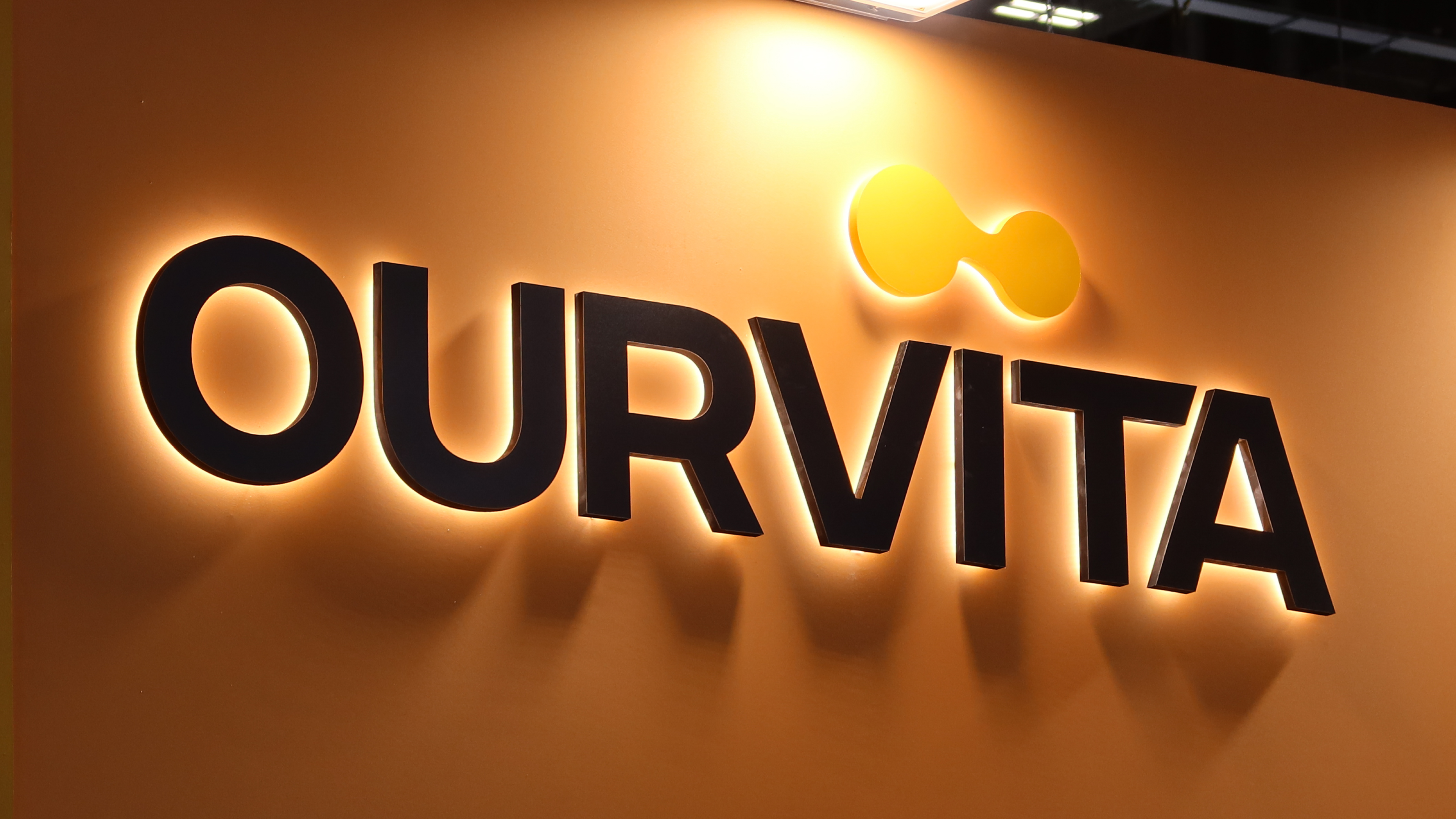
It's always great seeing something that starts as a 2D piece of graphic design come to life and turn into a real, living thing. Something you can see, touch and even taste!
Thats what happened recently on a work trip to Geneva. It started a year or so ago when six companies merged to form a new global network, the new organisation and brand we created was called Ourvita.
Fast-forward to now and Ourvita launched at their industry-leading annual expo, where the new brand literally rises up from the floor. I created a large-scale stand experience that walks attendees on the journey from 6 to 1, the Journey to Ourvita.

It was great to see over a years worth of work live and breathe, we developed everything from the initial rebrand, comms, art direction and then stand experience, all further design, print collateral, staff uniforms, social media, a really playful digital AR experience, bespoke event packaging and even the infinite cocktail bar (we call the logo the infinite link, as that is what connects the different parts of the network)... Marg-o-vita anyone?
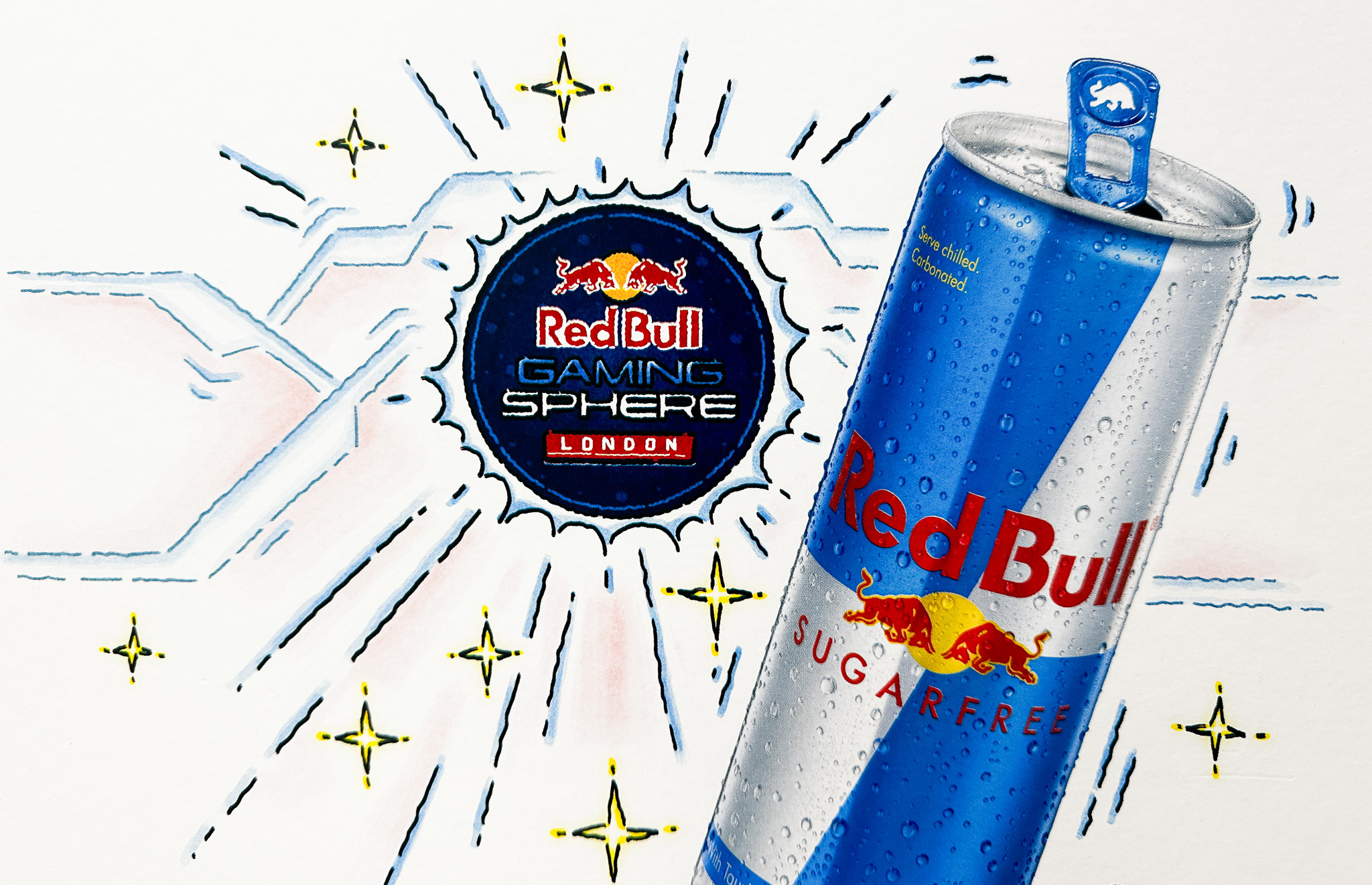
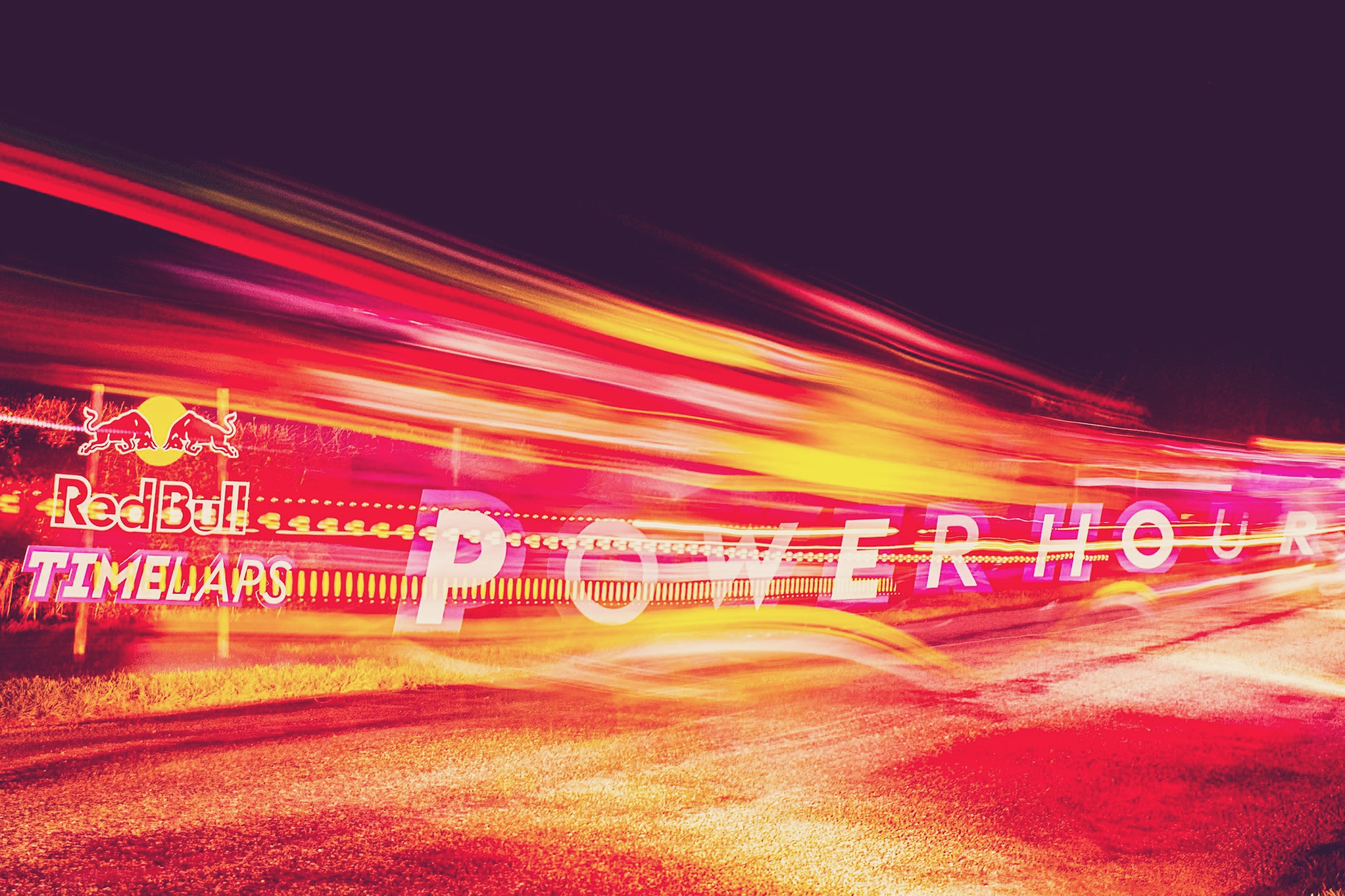
It was nice surprise last week to walk into a local neighbourhood food store and see the Red Bull Gaming Sphere logo being used to front Red Bull's latest campaign. I worked on quite a few event and activation identities when I was freelancing but I'd never seen any work grace the iconic packaging!


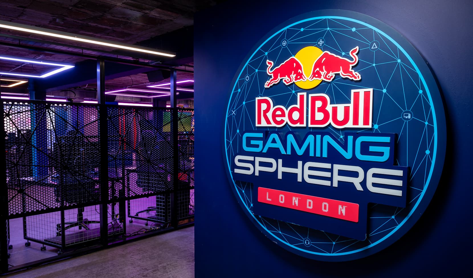
Love this incredible footage around the Red Bull Gaming Sphere space in London shared recently on instagram.

I worked on the branding and identity for the Gaming Spheres several years ago when they were first developing their gaming and e-games concept and strategy. This was following on from a number of the other Red Bull identities I created for them.
The Sphere regularly hosts tournaments, bootcamps and workshops, enabling professionals, amateurs and fans to level up their game.
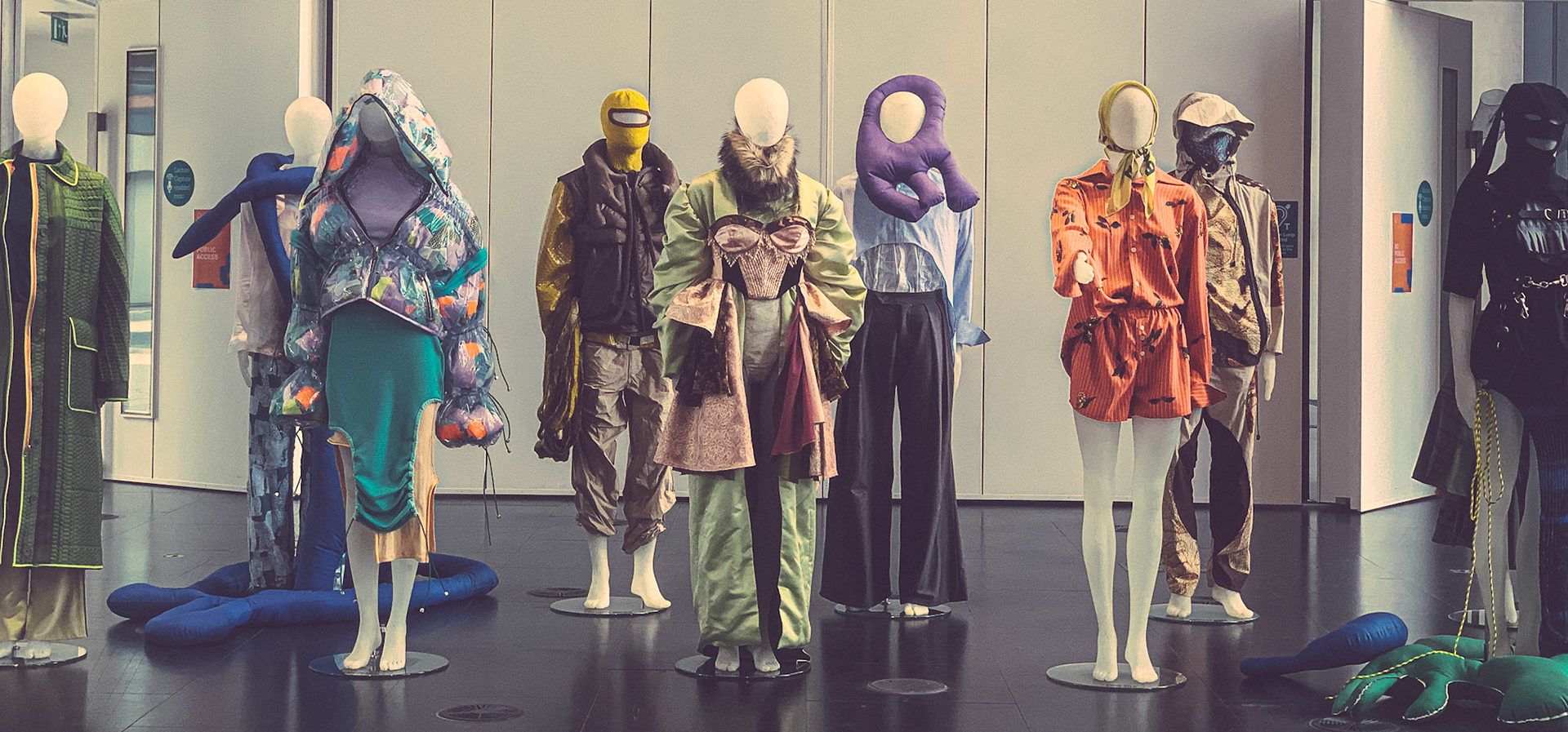
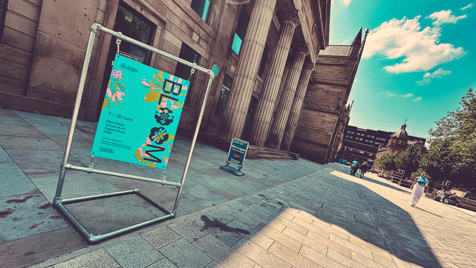
A couple of weeks I took a visit to the Manchester School of Art to check out the latest graduate showcase. Some great and thought provoking work on show from the across the courses.


The show ran until the 22nd June but you can still see the work online.
Some more photos are on my photojournal.


The Bok Door - Welcome to the future.
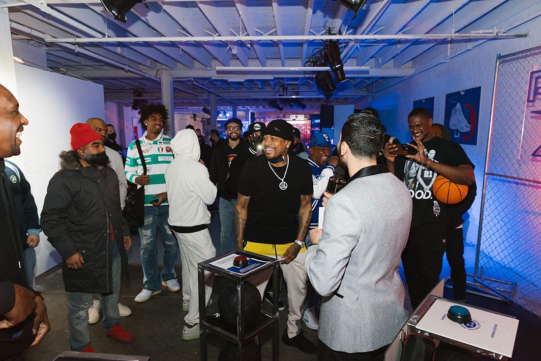
Just before Christmas I received a truly exciting brief from Reebok that really had the whole team busy right up to Christmas and then into the new year.
Our biggest budget activation to date with a whole host of VIP's and exciting ideas flying around - it was all hands on deck to turn our pitch around on time and move super quickly with just 6 weeks to turn mood boards into reality.
Leading the pitch creative team we worked up and presented routes on the last day before the Christmas break. We really wanted to celebrate Reeboks basketball heritage and really hero them coming back into that arena going forwards (now they're under new ownership).
We did this be looking forwards into the brands future by transforming a space into a retro 90's Reebok store and turning the back 'staff room' door into a gateway into 'The Future' of Reebok activation space. No stone was left unturned when finding truly creative ways to make this event stand out and really help Reebok connect with it's consumers, VIP's and stakeholders.
From 90's style jeopardy games shows, to customisation stations with bespoke Reebok fonts, to Shaquille O'Neill's very own Wreck-Reation room complete with blow up couches and retro Shaq-Fu computer games and Dee Brown's famous 'No Look Dunk' slam contest.


The event put Reebok on the map during All Star weekend 2022 with people coming from across Cleveland and the US to blag their way onto the most exclusive guest list for the weekend and get involved in the action.


We were joined by many of Reeboks key directors, account contacts and some legendary VIP's including Big Shaq himself, Allen Iverson aka The Answer, Dee Brown, Myles Garrett and a host of other big names from the NBA All Star Weekend.
The event smashed all targets, by selling out twice and getting more people through the door than promised, the clients were super happy with the outcome with praise coming from across Reeboks retail, global basketball and procurement teams.
A huge thanks to everybody involved in this iconic event!