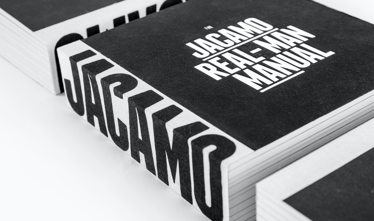
Following on from the previous weeks D&AD wins, I attended the Roses Creative Awards ceremony where the Jacamo brand book scooped three more awards.
Gold award in “Corporate / Promotional Literature".
Silver award in “Typography”.
Gold award in “Illustration”.
Shout out to Peruvian based British illustrator Bloodsausage.
I should probably get the work into a case study and put it on my site, in the mean time check it out here.

I'm proud to have been involved in the Jacamo re-brand project which last week won 2 pencils at the D&AD awards in London. The 'Real-Man Manual' took away two pencils - a graphite for 'Brand Expression for Print' & wood in 'Branding'.
Congrats to the whole LOVE Jacamo team; Gary, Rory, Laffers, Pat and Myers.
About the project and re-inventing the Jacamo brand.
We knew we needed to raise brand awareness for Jacamo but, at the same time, consider how we could shift opinions of those who had negative, and often unfair, perceptions of what Jacamo was all about. Fundamentally, it’s great-fitting and stylish clothes for men.
From sizes S to 5XL, Jacamo offers clothes for every man. Well, every real man. And real men aren’t that keen on the frills and fuss when it comes to shopping. So we created a brand that offers a shopping experience for men who want to look and feel great without any of the
hassle. Our brand proposition was born – Jacamo. Outfitters For The Real Man.
The Jacamo Real-Man Manual
We created the ‘Jacamo Real-Man Manual’ to lay down in black and white (literally) all those nitty-gritty details of the brand’s reinvention. The manual combines our new, humorous tone of voice with a series of comical illustrations to create a brand book that inspires and entertains in equal measure. Used as both an internal rallying cry and an external opinion changer, the book has served as a catalyst for a year of change at Jacamo.
View the project here, whilst I get round to adding to the work section.
A fun shoot and project to be involved with, shot as a stop-frame animation by Tommy Cockram, starring former England Cricket Captain, Freddie Flintoff with post production provided by The Mill.
The stop-frame animation worked really well across social too:
Below are some of the behind the scenes, including me taking a (it was three or four) snowball(s) for the team. I'm thankful it wasn't Freddie wasn't throwing them, an unlucky digi was on the receiving end the next day and whoa!
I also shot a series of four of interviews with Freddie between scenes, where he ponders some the big festive issues check one below, more on Jacamo's youtube channel.
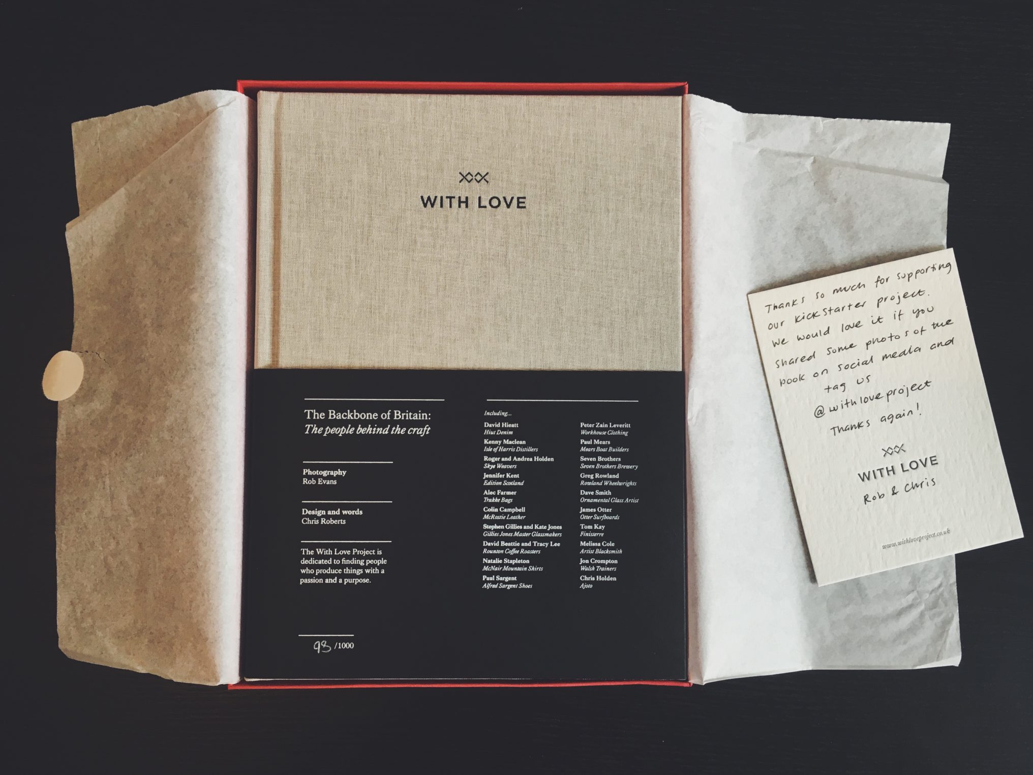
I first heard about this project about 18 months ago over a coffee with my then neighbour Chris Roberts. He had started a little side project meeting, photographing and interviewing craftsmen and makers - people who run their own business built on their passion for the product and process.
Cut to now after one failed and a second successful kickstarter campaign the With Love book has finally landed on my table and it's a thing of beauty. (Good work lads!) Full of inspiring case studies and beautiful photography from projects and businesses of passion from around the UK. It's lovingly put together and well worth getting your hands on.
Now the kickstarter is finished you can buy a copy here: withloveproject.co.uk
Finally after nearly going on several occasions I finally got to check out the Design Museum at its current home on the bank of the Thames. There was a great exhibition on cycling, from its first forms through to ultra modern time trial bikes. A highlight was seeing Chris Boardman's gold medal winning Lotus from the '92 Barcelona Olympics.
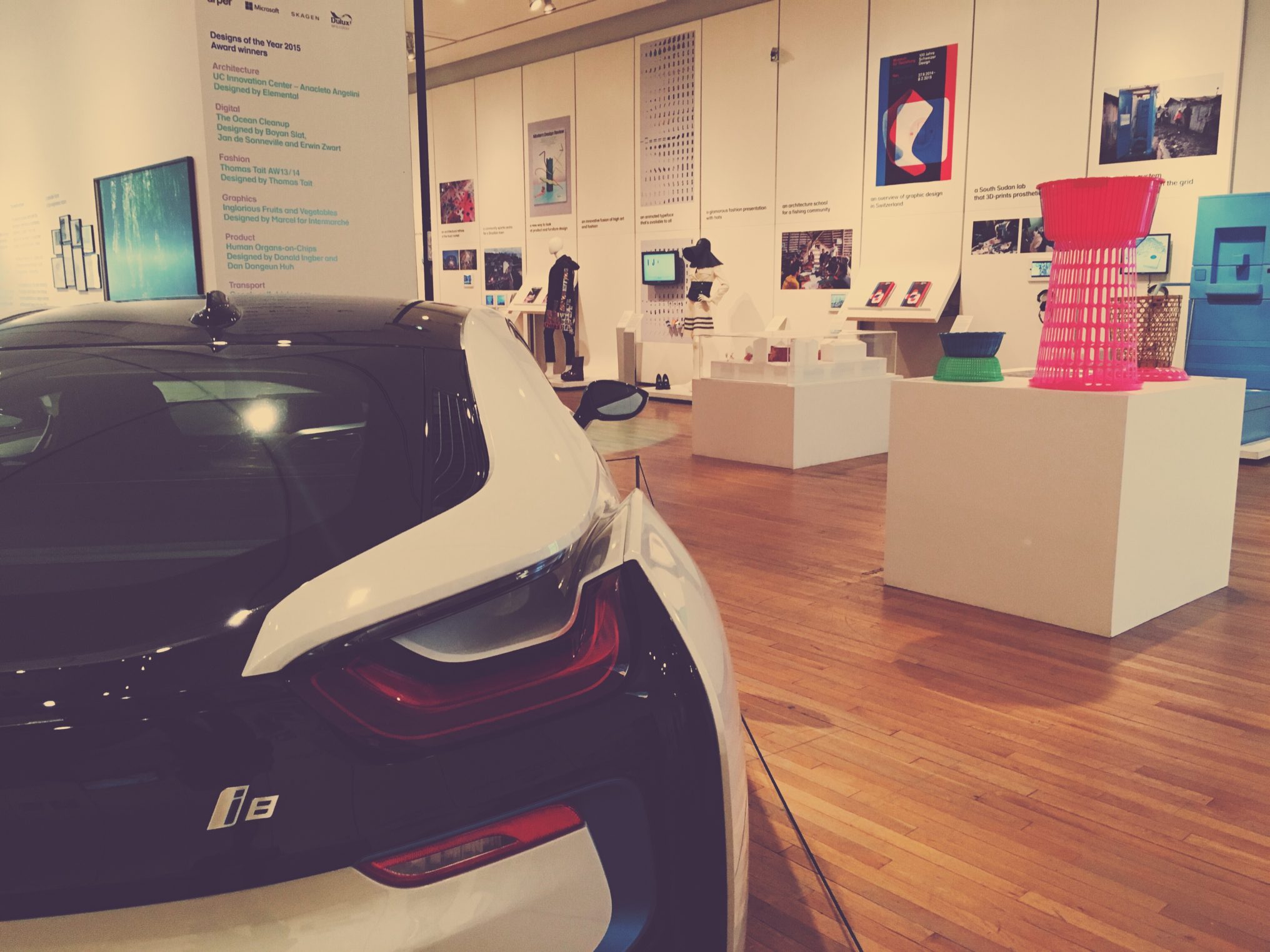
The other main exhibition was "Design of Year 2015".
Now in its eighth year, Designs of the Year celebrates design that promotes or delivers change, enables access, extends design practice or captures the spirit of the year. Someday the other museums will be showing this stuff.
Some great work on display... and I love the BMW i8.
Finally I squeezed in a quick visit to the Barbican for the "World of Charles and Ray Eames" exhibition. I got there 20 mins before it closed and the attendant advised me it takes 2 hours to see it all. I whizzed round in 15 mins... here are the highlights!
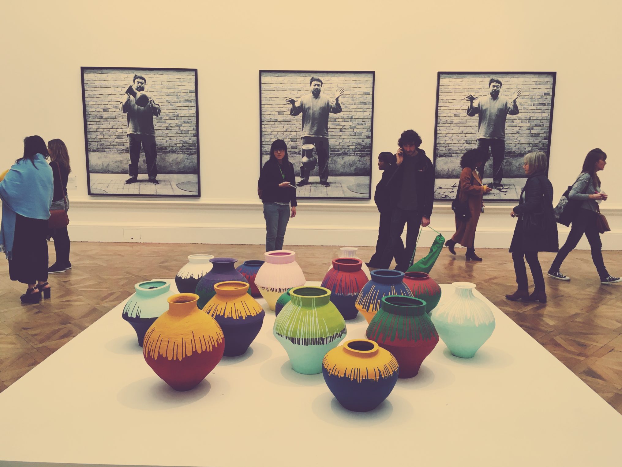
Major artist and cultural phenomenon Ai Weiwei takes over the main galleries at the Royal Academy with brave, provocative and visionary works.
Looking at people looking at art
The exhibition has finished now, but you can check out a full 360 online version here.
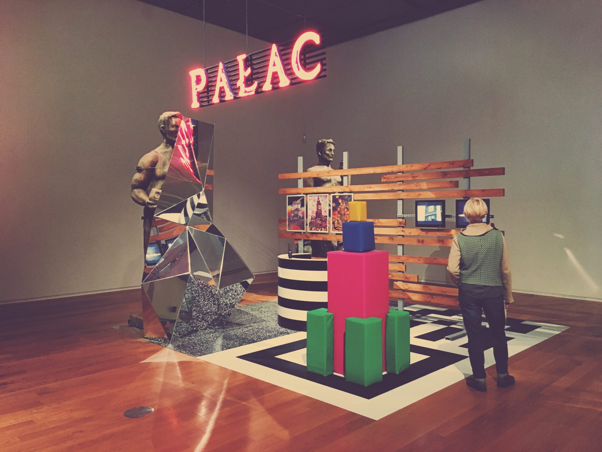
It was a beautiful autumn day and my sister was up visiting from London, so we headed for a wander around some of Manchester's finest galleries and exhibitions. These are some of the highlights.
Walking home
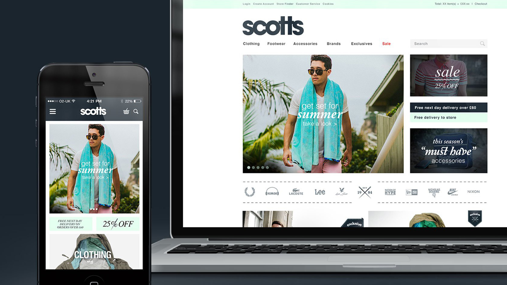
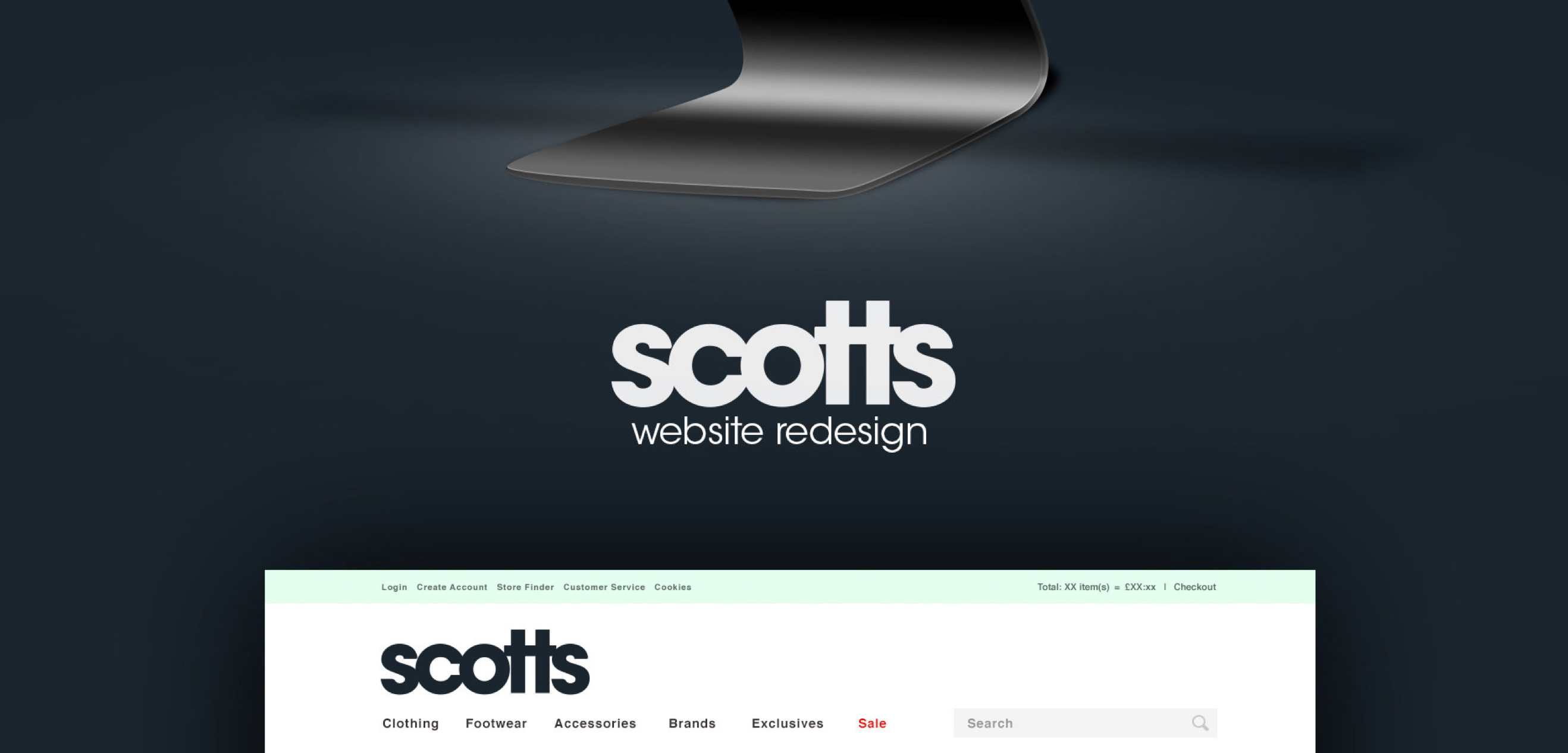
After being featured in the Adweek Talent Gallery a couple of months ago, I'm pleased to say that the project I worked on for Scotts Menswear has now been featured on Behance, as part of their Web Design Served curated gallery. Check out the full project here or follow me on Behance.
Manchester After Hours is the rainy city’s take on the national, annual Museums at Night celebrations: for one night only, museums, galleries and libraries stay open late for some creative goings on - with nearly everything free to attend.
First up was the Unit X exhibition at Federation House. Unit X took over Federation House for its annual showcase of emerging talent from Manchester School of Art. Film, art, design and photography come together in exhibitions and installations throughout the building.
After a pit stop in Trof for a cheeky pint (the free bar ran out in Federatin House just as we got to the front of the queue), we bumped into the choir and brass band which were touring the Northern Quarter playing and singing to whoever was passing by.
Next stop was Fred Aldous which was hosting an evening of FREE creative collaboration including; live painting, photobooth mugshots and a Risograph zine workshop.
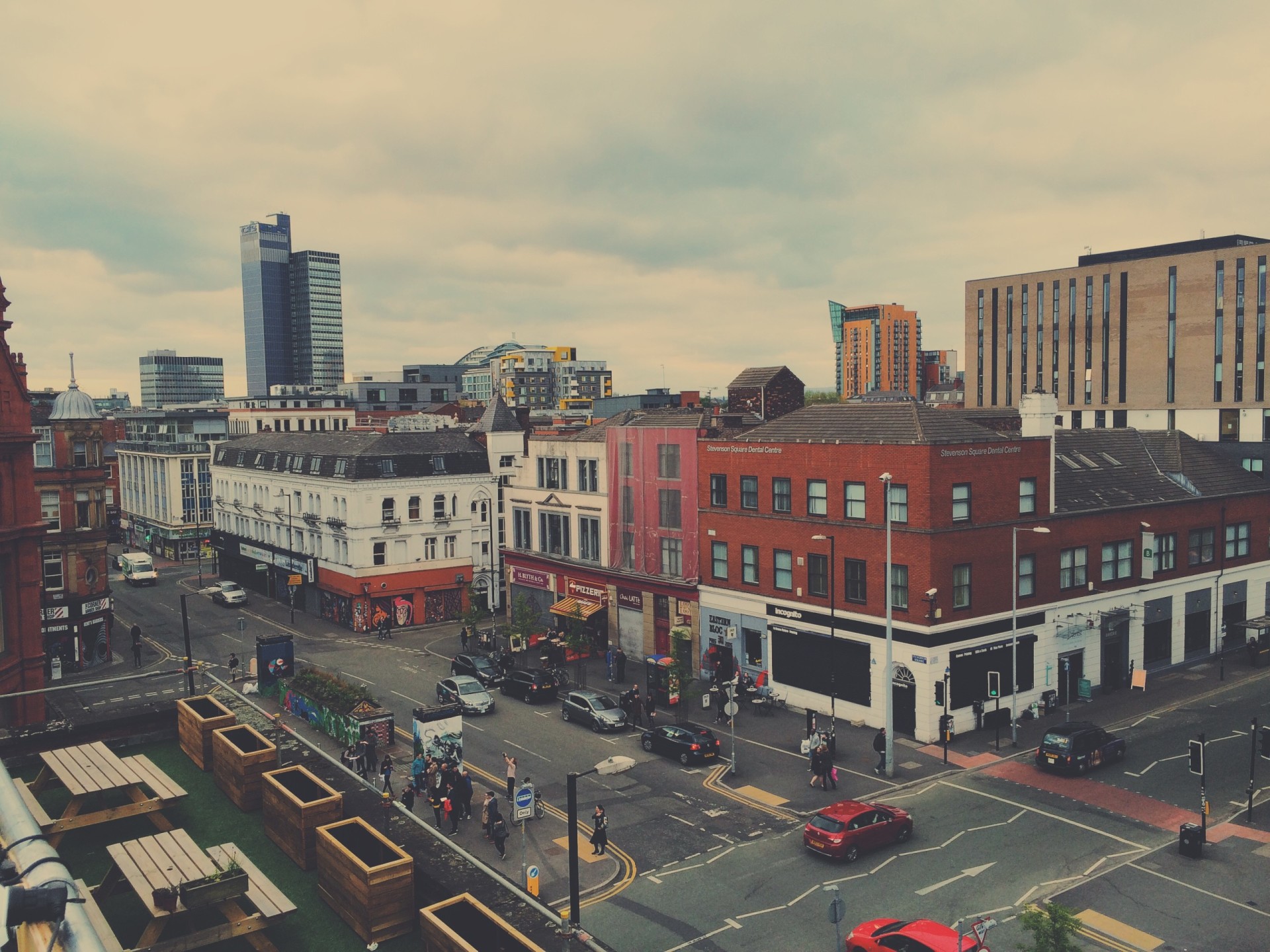
Up next was a visit to the roof terrace above Manchester creative agency, Music, where they were playing a few tunes whilst offering up good views back over Stevenson Square and the Northern Quarter.
 A crowd gathering around the brass band below.
It was getting cold now, so we headed down to Ply below for a little break and to kill some time before heading over to the NCP car park in the centre of the Northern Quarter for our final event of the evening.
A-top of the NCP multi-storey car park on Church Street, musicians, choirs, street performers and brass bands deliver a pumping finale to the Northern Quarter’s proceedings. As the pictures and videos below show, it was a great way to end the evening with everyone getting involved in the carnival atmosphere.
What is required from a creative brief
A creative brief is a unifying document that identifies the important key benefits for a project or task. It tells the story and explains why it’s important to the audience, serving as a guide for the creation of new materials. It seems simple. Yet developing an effective creative brief is far more difficult than it may at first seem.
A poor creative brief can waste time and money, and creates frustration because the resulting concepts do not nail it.
A well thought out creative brief is imperative no matter the scale of the project. From quick turnarounds, amends or longer projects, a solid creative brief is the one document all parties refer to throughout the life of the project or task.
The key aspects of a creative brief are as follows:
1) Background/summary.
This is where the brief provides all the supporting, contextual and target audience information, as well as any customer insights or knowledge gained from previous projects and research.
Always provide more information than you think is relevent. Remember the person working on the job
may not be as familer with the task or a projects history as the person who created the brief.
2) Proposition.
What are the problem(s) which needs solving. Keep it short, and to the point.
3) Requirements.
This is where any other supplementary information is confirmed, this includes (but is not inclusive):
- Brand guidelines, styleguides and technical specifications.
- Supporting copy and headlines.
- Assets - Brand supplied or campaign imagery, logos, lockups or illustrations.
- All links/CTAs and their destinations.
4) Deliverables and objectives.
What is required and what do you expect to gain from it.
Eg. A webpage, banner, email, logo, page takeover, etc.
5) A reasonable deadline.
Liase with the creative department to get an idea of timescales if unsure.
If it is a large project, set intemediate targets/deadlines along the way.
6) Approval.
Before starting confirm everyone involved with the project and all stakeholders are happy and onboard.
It is then the job of the creative(s) to consider the brief, carry out suitable research (as required) and
present back solution(s) which answer the brief once completed.
Remember: Briefs are in their nature, brief. Use bullet points, keeping each point short and concise.
Avoid: Stating or illustrating how you want the final design to appear.
Further reading:
http://advertising.about.com/od/tipoftheweek/ht/How-To-Write-A-Creative-Brief.htm
www.bbrmarketing.com/blog/how-to-write-a-great-creative-brief/
http://chempetitive.com/chemunity/importance-creative-brief
http://www.jetfuelcreative.com/marketing/benefits-of-a-creative-brief/
http://www.creativeoncall.com/2013/08/19/7-simple-steps-to-an-effective-creative-brief/
http://www.commarts.com/columns/creative-briefs-shifting
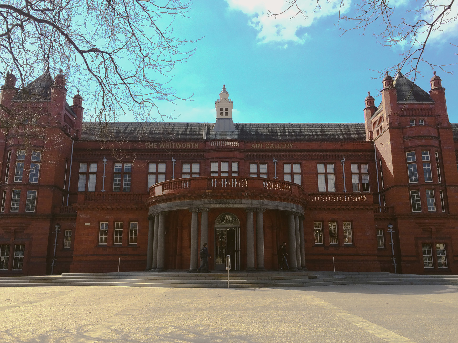
The Whitworth, Manchester's gallery in the park, has just reopened after a £15 million renovation and expansion. Having never been before I had been wanting to check it out since the re-opening, and its well worth a visit. There's good mixture of exhibitions from photography, portraits, sculpture and art, with the exhibition spaces also adding their own character to the displays.
The park location is great, especially on a sunny day like day. Whether you're inside and catching glimpses of green out side or outside where the new glass extension cantilevers into the park.
My highlights were: The 1960s: Works by Peter Blake, Bridget Riley and others reveal the riotous colour, fashion and art of the era and Cornelia Parker's solo show. Cai Guo-Qiang, Unmanned Nature looked interesting, but there was a big queue so I just poked my head round the corner for that. Also worth noting is the 'War Room', a large space lined with the left over cutting sheets from the production of memorial poppy's.
Today in the UK we witnessed a rare astronomical occurance, a solar eclipse. A solar eclipse is where the moon moves in between the earth and the sun, blocking out the sun's light for a short period of time.
Its really impressive to witness, and is one of the only times you get a sense of being apart of system of moving rocks in space, and just how small we are.
The eclipse reached at around 83% coverage in the UK, with only two places on earth getting a full 100% coverage.
The next solar eclipse in the UK won't be until 2026.
This week I was fortunate enough to receive an email from Oscar at Behance to let me know that my work for Scotts had been selected by their curatorial team to feature on the front of their Adweek Talent Behance gallery.
Be sure to visit and check out the other great work on there if you've never done so, and if you want to follow me on Behance, check out my profile.

Looking at those numbers so far, I think I need to up my game a bit - or at least get a larger Behance following!
A few days ago I received an email from the good people at Creative Bloq about a follow-up piece to their wildy popular Designers and their tattoos article. This time the idea being 'Designers as you've never seen them before'.
We've featured a lot of designer interviews over the years on Creative Bloq, but a lot of the time we end up with very similar photographs. Here's a designer sitting at his Mac with Illustrator open and a bunch of vinyl toys on his desk! Here's a designer in her studio, with lots of inspiring artwork on display! Here's a designer leaning against a wall!
I sent over a few tales and the story they wanted to feature was from when I featured as part of the final of the BBC's Junior Apprentice TV show. If you want to read more about and also find out about what 9 other top creatives get upto in their spare time, head over to Creative Bloq.
Contact.
ben[@]bentopliss.com
+44 (0) 7825 814797
Graphic Design & Creative Direction.
© 2023.
All work displayed remains the property of either Ben Topliss,
the agencies and/or the clients
it was created for.


![Reebok – NBA All Star Event [2022]](https://i0.wp.com/bentopliss.com/assets/2022/03/Project_panel_480x328px__0007_ALLSTAR.jpg?fit=480%2C328)


![Reebok x Jurassic Park [Pitch]](https://i0.wp.com/bentopliss.com/assets/2022/03/Project_panel_480x328px__0006_JP.jpg?fit=480%2C328)


