Selected projects:

All Posts in Design

November 4, 2014 - No Comments!

Behance Portfolio Reviews, Manchester

Behance Portfolio Review week, is global event happening in hundreds of towns and cities across the world organised on behalf of the online portfolio service now owned by Adobe. Last night was the Manchester event, and Jonny Evans at Degree53, who was hosting the night was good enough to ask me to help out and take one of the feedback sessions.

10464296_952742558087727_3279167557662444286_n

The night started off with a talk from Brendan Dawes, which took us through his work and general search for serendipity (and chaos). Brendan’s work has been featured in numerous journals including idN, Creative Review, MacUser, Computer Arts, Create, Wired, Eye, The Guardian, The Times, Communications Arts and was interviewed by Computer Arts in December 2008 for their "Design Icon" series.

Behance Portfolio Review, Manchester. November 2014. Behance Portfolio Review, Manchester. November 2014.

The whole group then split into groups 8 or 9 groups for the portfolio reviews. I lead one group, and it was an enjoyable experience. I was impressed with some of the work on display and it was great to meet so many people passionate about design, illustration and photography.

10409007_952742688087714_6309991408872047091_n

I would like to say a big thanks to Jonny at Degree53 for taking the time to organise the event. Hope you don’t mind but I’ve also pinched some of your photos from the night.

For more photos check out the Degree53 facebook page.
Follow Manchester Behance Reviews on Twitter: @BeReviewsManc


Table Hosts:
Mark Stringer, Managing Director at Ahoy Digital (@ahoymark)
David Newton, Creative Director at Ahoy Digital (@LetsNotPretend_)
Simon Vaughan, Exec Creative Director at Amaze (@amazeltd)
Paul Normington, Art Director at Amaze (@Norm_ski)
Jade Sahota, Head of Design at Degree 53 (@jadie0503)
Tash Willcocks, Programme Manager at Hyper Island (@tashwillcocks)
Michael Watson, Creative Director at Project Simply (@projectsimply)

Speaker - Brendan Dawes (@brendandawes)

Host – Jonny Evans (@jonnylikes2rant)

July 18, 2013 - No Comments!

How to become a junior designer

You're starting at the bottom - but working as a designer, not just making tea. (Image: Sweaty Eskimo - www.sweatyeskimo.co.uk)

Design portal and sister publication to Computer Arts magazine, Creative Bloq recently asked me to give some career advice for those studying design or looking for their first jobs in the creative industries.

The article also includes tips from Peter Knapp, executive creative director, Europe and Middle East at Landor Associates, award-winning designer and art director Craig Ward.

It covers everything from eduction, starting salaries, skills required, agency vs in-house and career progression.

Head over to the Creative Bloq site to read the full article, or read my story and advice below on what its like being the junior.

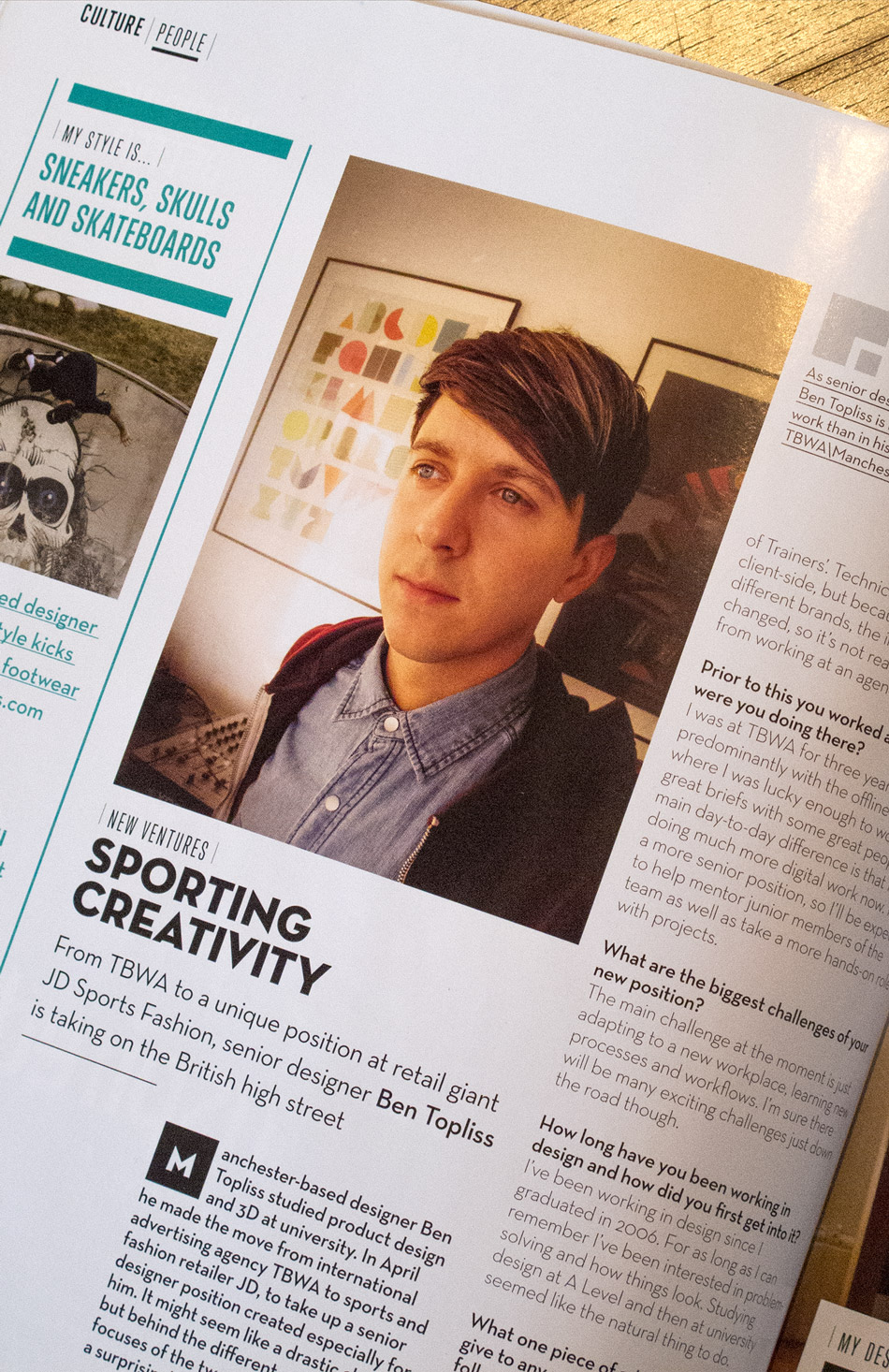
09. What it's actually like to do the job

 Ben Topliss

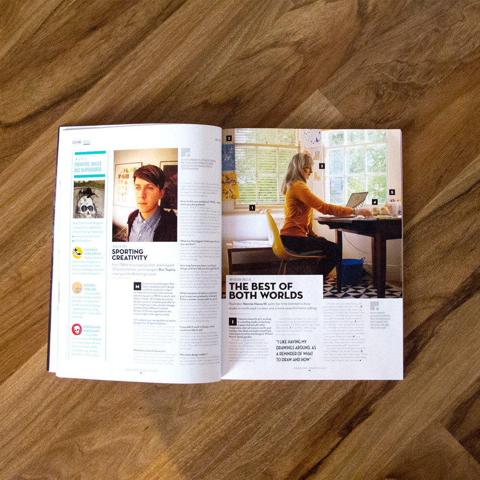
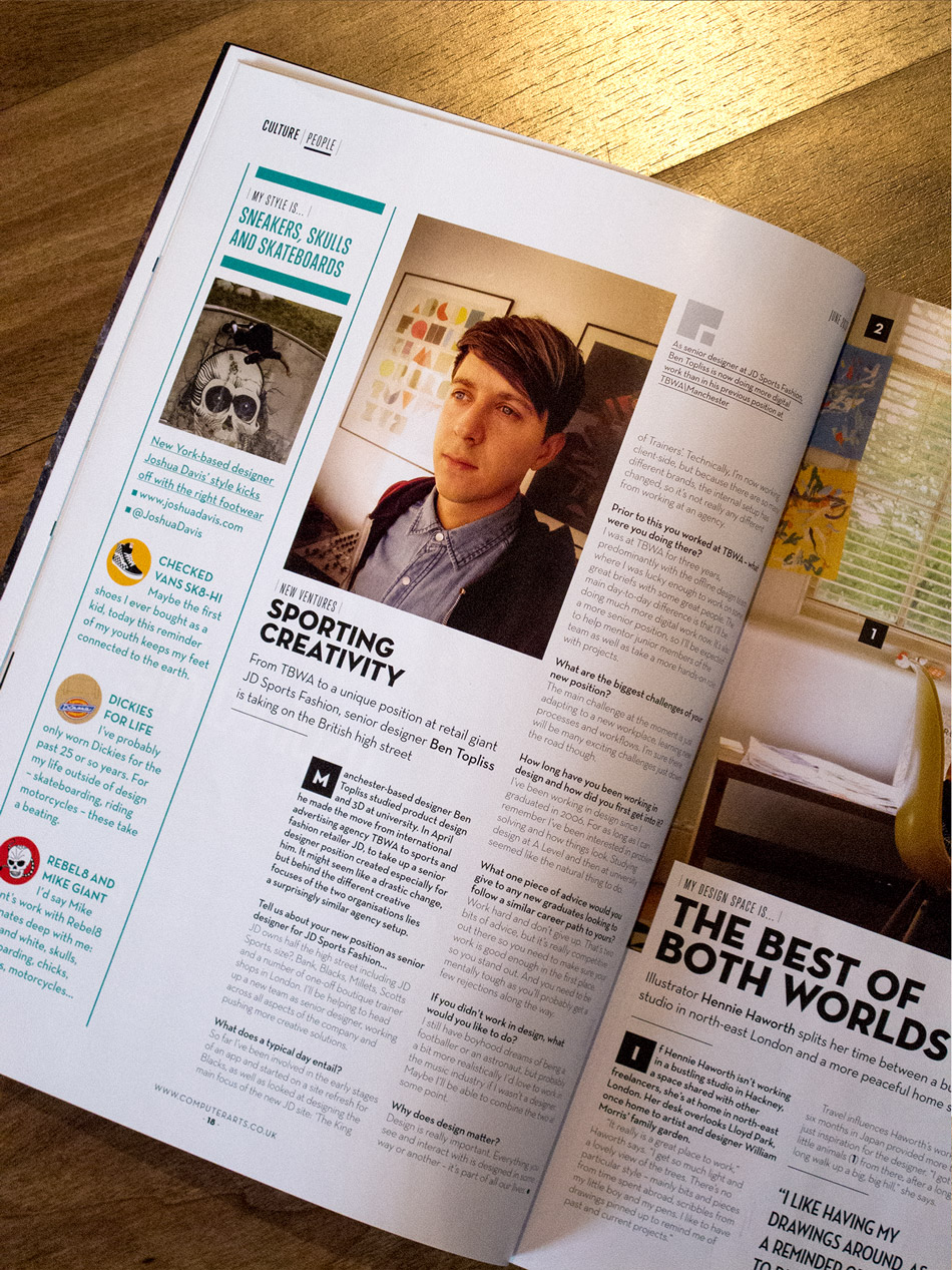
Now a senior designer, Ben Topliss explains what it was like being a junior designer

Earlier this year, multi-disciplinary designer Ben Topliss started a new senior designer position at sports and fashion-wear retailer JD PLC that was created especially for him. Since graduating seven years ago, he's been busy honing his skills at the likes of international advertising agency TBWA and developing his freelance career. He explains how he got to here from his first junior designer position, and what it's really like being a junior designer...

Creative Bloq: Your first job out of uni was junior designer at an architectural practice called Prism. What did you study at uni, and how well did your course set you up for this role?

Ben Topliss: I studied product design at university, with a minor in interactive design. I didn't realise until I'd signed up to study for the interactive modules that graphic and digital design were things I was really passionate about and wanted to do after graduating.

The main thing I took from studying design at university was the process of design and problem-solving. I didn't do any placements or internships in agencies or studios, but I did as many jobs as I could get my hands on for local businesses, designing anything they'd let me including identities, branded stationery, websites, booklets, flyers and menus. Taking this also route taught me about the other side of design - dealing with clients, and managing my time and finances - which can be just as important as the actual work.

CB: What was the job market like after you graduated? How tricky was it to get your first job as a junior designer?

BT: It was a struggle to get a job after graduating. It's so competitive out there and it's hard to differentiate yourself, especially when competing against others with graphic design degrees. I wrote a lot of letters but didn't really get anywhere. I had a few interviews and finally got something in the September after graduating. It was great to finally get a job.

CB: Why did you decide to work in-house as a junior designer, rather than in a design studio or agency?

BT: Prism was a small design studio and I got to work on projects for clients including Sainsbury's, Cambridge University and Marks & Spencer. There were only four designers - two senior and two junior - so I got to work on some large projects straight away, as everyone had to get stuck in.

Ben is currently working at TBWA

CB: Talk us through a typical day - what were your responsibilities?

BT: As it was only a really small agency I'd have to do plenty of admin-type jobs like order the stationery, be the IT guy and make tea for everyone. But I'd also get to head out to client meetings and take ownership of projects, which was good as you might not necessarily get that level of trust working somewhere larger.

CB: What was the best part of the job?

BT: Actually doing work and getting paid for something I wanted to do was great. It wasn't groundbreaking stuff by any stretch of the imagination, but I was working in the industry I wanted to be in and gaining experience all the time. To me then, that was amazing.

CB: How long did you work in this position before taking the next step in your career, and what did it take to move up the ladder?

BT: I spent a year at Prism, and another year in my next job - both in small teams so I did get to take control of a lot of projects, but I maybe missed the guidance I would have got from larger organisations.

Stepping up to the next level in a much larger agency was fun: suddenly I was working with a large group of really talented creatives. I certainly had a feeling that I needed to up my game. That's how you improve though. You need to get out of your comfort zone, push yourself to be better and learn from those around you.

CB: How long did it take you to get to a senior designer position?

BT: I graduated about seven years ago, with the last three of those working at TBWA. There I had the opportunity to learn from lots of talented people and gain some good experience working on some great projects, big and small, for clients like Manchester United, EA Games and BP.

CB: What do you love most about your job now?

BT: Getting to work with talented and inspiring people. I've got a busy couple of months coming up, with the launch of at least two iOS apps and a couple of site redesigns on the horizon.

CB: What advice would you give a junior designer for becoming a senior designer?

BT: Work hard, ask questions and soak up as much as you can from more the experienced people you are working with, whatever their job role. Do the jobs no-one else wants to do - make yourself indispensable.

Also, it pays to be nice. The industry is smaller than you think - you never know when you'll come back into contact with someone you used to work with, met at an industry event or even slated on Twitter.

June 18, 2013 - No Comments!

Computer Arts Magazine

I was fortunate to enough to be interviewed for this months edition of Computer Arts magazine regarding my new  job. I have subscribed to the magazine for a number of years I feel pretty honored to grace a full page of the newly redesigned and industry renowned magazine.

Go check it out, available at all good stockists...

May 24, 2013 - No Comments!

FS Emeric

Fontsmith have designed a new face FS Emeric, and a copy of the type specimen booklet (printed beautifully in four spot colours with two foils on GF Smith paper), landed on my desk today. Designed by Believe In, it does a great job of showing off the typeface in various situations from online and in iPhone apps, to print spreads and wayfinding. Its a really versatile typeface made up of eleven weights - Thin, Extra Light, Light, Book, Regular, Core, Medium, Semi Bold, Bold, Extra Bold and Heavy - each with a corresponding italic.

“Emeric is a kinetic type. An optimistic typeface which marries precision with expression, geometry with movement and functionality with humanity — a classic working sans serif with a distinct and individual character, open to whatever shape the future may take.”

FS Emeric is the result of over two years work by Fontsmith's type design director, Phil Garnham, who set out to create a humanist alternative to classic modernist fonts. "The timeless alphabets of the fifties have a deliberate neutrality born out of an unfaltering mechanical solidity in each line and curve," he says. "FS Emeric has been designed to share this sense of structure and universality but it also introduces a new approach, intuitively informed by a sense of today, one of progress and optimism."

Phil also asked eleven of his heroes to create a poster, each using a different weight of the typeface. Contributors include Build, Studio Dumbar, Pentagram, Non-Format, Manual and Bibliothèque, all screen-printed on Colorplan by Dan Mather in a limited run of 50. You can see the whole set here. Lucky customers buying two or more weights of FS Emeric will receive one randomly selected poster (while stocks last).

May 7, 2013 - No Comments!

One Thing I Know: The Book

Over the weekend I received my copy of 'One Thing I Know' published by Creative England, and featuring original articles and illustration pieces from some of the UK’s top creatives. Compiling hard-earned insights from creative entrepreneurs from across the UK, the series of articles interspersed with beautiful illustrations is aimed at passing their experience down to the next generation. This is first-hand advice from those who have experienced it - and overcome it - themselves.

The printed version of One Thing I Know is available now for free, all you have to do is pay the cost of the postage. Alternatively head over to onethingiknow.co.uk to check out some of the articles and illustrations online.


March 12, 2013 - No Comments!

Typography Served

Back in February, I was lucky enough to have some work featured on the front page of the curated type gallery on Behance, Typography Served.

Since then I've had a load of new followers, appreciations and views which has been amazing. Its funny how big a difference a tiny amount of exposure has done for my stats. I used to barely get a single view to my profile and 6 weeks on I'm still getting at least 40 every day. It is also interesting to see how the traffic flows throughout a week, with the obvious low points over the weekends, and then building up gradually throughout the week.

Check out the work.

You can follow me on behance, and thanks if you already do.

January 5, 2013 - No Comments!

2013 Calender

Most years I get given a calender for the upcoming year by my family for Christmas. With this year the first time for as long as I can remember when that hasn't happened I decided to make my own using photographs from the previous 12 months. Fortunately last year was pretty good, with loads of great shots/memories to choose from - I now just have to plan some equally cool stuff so that I don't get too depressed in 2013 looking back on last years trips.


[Download Calender]

December 21, 2012 - 1 comment.

The Young Apprentice Final

Now in its third series, Sir Alan Sugars hunt for a Young Apprentice takes a group of “aspiring moguls which have been selected for their academic flair and burning passion for business” and tests them against each other in a series of tasks.

For their final task, the remaining competitors found themselves in Manchester needing to create a completely new sports brand from scratch. As it was the final all the original contestants came back to help and assist those still left in the competition, and we were asked to help the teams develop and design the core assets for their new brands.

I got the task of looking after one the teams, and this is my experience.

Filming happened over a sunny day at the beginning of August and my team, lead by feisty Maria had opted to go for a cycling brand as they felt that cycling wasn’t deemed very “cool” especially within the 18-30 market. At the beginning of the day before we started shooting, we were very clearly briefed that in no way were we allowed to offer them any advice or guidance and that we were just there to facilitate their ideas. Personally, I would say I don’t think cycling has ever been cooler especially within that age group, there are some great cycle clothing brands out there like Rapha and smaller outfits such as Milltag, style icon Bradley Wiggins had just become the first British man to win the Tour De France the week before, and later that day he was set to win Olympic gold (for the fourth time) in the men’s time trial.

Baring their main strategy maybe not being bang on as far as I was concerned, there is room in the market for a new brand and the way they went about the task when they were with me was quite impressive. They had some decent ideas and concepts and had a good grasp of what they wanted from the session.

It was quite a long day, I arrived at work early having set up the area we recorded in the day before. The contestants were due to arrive at about 10:30 and film outside the building before coming in, being briefed by me and having a couple of hours to brainstorm and design a brand marque and tagline.

Each team got the use of a logo book to help with the brainstorming ideas, a pantone swatch book and a selection of pads, pens and other stationary items.

After initially briefing the contestants to camera, the first half of the filming was pretty quiet for me whilst they brainstormed ideas amongst each other and made some phone calls like they do via speakerphone, which was pretty funny to watch live. Once they had decided on their idea, it was then my job to visualize their sketches help them select colours and typefaces. As none of them had any real knowledge of colours or type, they spent a long time getting hung up the tiny details and arguing over very similar shades of green in the pantone book we had provided! This wasted time later on made it tricky for me when we got word from the printer of minimum stroke width in the design.

They had called their company “CYC”, as in cyc-ling, and wanted the logo to form a bicycle wheel with the second ‘C’ being flipped. I designed quite a delicate wheel with fine spokes emerging from the ‘Y’ which formed the axle in the centre of the wheel, but as I said above, the last minute print spec called for 50% of the spokes to be removed and thickened up considerably which made the final design look a little unrefined and chunkier than I would have liked. However given the time available (about 30 minutes), with a team of indecisive youngsters sitting on my shoulder and a camera crew filming the whole process I’m not sure I could have done much more.

Once the deadline was reached, work stopped and the final design was then fired off to a printer, who was with the other half of the team, and they were going to print the designs onto all the collateral required for their final presentation. The next step was to design a flyer and brand manifesto, before Nick was briefed on animating the logo, which would be used on a digital six sheet and in the final presentation, whilst then Alex artworked all the final files.

It was a pretty full on morning, a great incite into the making of the program and as a fan of the program it was just great to take part. The whole filming process was pretty fun, and by the end of it I was used to having a camera in my face. Fortunately it wasn’t focused on me too often, despite that I have been cringing at thought of watching myself back with every new episode of the series!

It has been pretty tough to keep it a secret since the beginning of August, especially meeting the legend that is Nick Hewer!

If you missed the final, it’s available to watch again on iplayer (for a limited period):
http://www.bbc.co.uk/programmes/b016kgww


November 13, 2012 - No Comments!

TBWA Building type

During the summer, in downtime we redecorated the agency. Initially the design department and swiftly followed by all the other departments in the agency once they saw what we had achieved.

There where massive clear outs and tidying sessions and St Paul's has been transformed into an even more inspiring workplace. The transformation was finally completed a week ago with the installation of some wall vinyls placed around the building. I designed a couple of pieces, an organic and flowing welcome as you enter the front door and typographic treatment of a famous pangram in the studio.

I'm going to create a proper portfolio page for it all, but I'm still working on a colour version of the pangram statement, but in the meantime here are a couple of snaps.


Here are some more shots of the entire agency.

November 8, 2012 - 1 comment.

Re-branding Tesco

Along with most of the people at TBWA\Manchester, my summer was consumed pitching for Tesco. We were up against the great and the good of advertising, beating off competition including JWT, VCCP, McCann Erickson, SapientNitro and WCRS, before finally losing out to W+K..

Now that Wieden & Kennedy's work is starting to see the light of day, I thought I'd share the little case study I put together on the evolution of the Tesco marque, and its possible future evolution. Please bear in mind this was a single afternoons work, and it is nowhere near as comprehensive as the brilliant microsoft rebrand done by Andrew Kim. This is meant as more of an evolution in the style of recent high profile rebrands like Starbucks.

Please click on the images below to enlarge.

As you can see from the page above Tesco's branding early on was quite inconsistent, particularly with the advert from 1924 displaying 'Tesco' in 3 different faces and styles. On the image below from 1946, you can still see serious inconsistancies, with both serifs and sans being used in branding.


A branch of Tesco built inside the Hoover Building in Perivale, London (now a listed building)

As you can see on the above image, since the Tesco has gradually refined the logo over, moving from a slab-serif, with the most recent incarnation from 1996 becoming almost a sans-serif.

However, with Tesco's rapid expansion into many other areas and sectors, the various sub-brands lack a visual consistency and cohesion.

The blue stripes, which are reminiscent of the stripes on a butchers apron, made their debut in the 1980s on Tesco press ads, devised by Lowe Howard-Spink. It was so effective that over time, the bars appeared in other areas until they became a permanent element of the Tesco logo. But they are used differently by different parts of the business which I feel is confusing.

Exploring the best way to make that next refinement of the logo can be seen over the next few images.

Should the number of stripes be reduced, or the size of them modified? Looking at the options below, moving to a completely sans typeface seems like a step too far. Getting the level of compression in x-height right, is also a tricky so as with not enough compression it doesn't look like Tesco, and too much and the logotype just looks squashed. Until actually having a look at it, I hadn't fully appreciated just how squashed it actually is.


In the end, we would recommend to lose the bars completely, as they don't actually represent anything. Black as a colour is then completely lost from the logo, with "every little helps" taking on the Tesco brand blue and thus aligning it closer to the master brand. Further to this "Every little helps" has been upweighted, with extra emphasis being placed on "helps", as this was one the core aspects of the pitch strategy.

Below you can see how this would be applied on an individual basis and across the various sub-brands, with each sector taking a slightly different colour.

 As I said at the beginning, this was only a quick brand overview and would have been great to get to delve deeper into the details and across the huge range of sub-brands. On a another note its interesting to see W+K's take on "every little helps" in their current ads, and how it wasn't too far away from our own.

www.youtube.com/watch?v=CLPxDZtNMJ0

www.youtube.com/watch?v=3CPs_BnFbqM

en.wikipedia.org/wiki/Tesco
telegraph.co.uk/foodanddrink/9188573/Every-little-hurts-Tescos-new-budget-brand-lacks-snob-value.html
logos.wikia.com/wiki/Tesco
prweek.com/uk/news/58019/BELOW-THE-LINE-Tesco-checks-its-corporate-branding

August 22, 2012 - No Comments!

Generative drawing fun

I came across revoid.be/codebrush/ a generative drawing experiement earlier today, and got a little bit hooked over lunch.

Its pretty simple, there are 4 different brushes and several colour options. Drawing is quite intuitive, the faster you move your cursor the larger the brush stroke. It does take a little working out, but after a while you can drawing with an idea of the outcome, although at first glance it looks entirely random.

And at the end, you can watch your drawing redraw itself.

Looking into it a bit more know whilst writing this, and seeing as its done in html5/css3  and javascript I see it works on mobile devices and supports multi touch as well, although I've not tried it on my iphone.

Gwen Vanhee has done a great job and its well worth a little play.  Here is what I came up with: