![Reebok – NBA All Star Event [2022]](https://i0.wp.com/bentopliss.com/assets/2022/03/Project_panel_480x328px__0007_ALLSTAR.jpg?fit=480%2C328)


![Reebok x Jurassic Park [Pitch]](https://i0.wp.com/bentopliss.com/assets/2022/03/Project_panel_480x328px__0006_JP.jpg?fit=480%2C328)


Gap, being arguably one of the most iconic brands across the US & Europe, presented a fantastic opportunity to work on refreshing the brands retail identity, in what is an increasingly competitive market with the emergence of many new/contemporary vertical retailers fighting for their share of the previously Gap dominated arena.
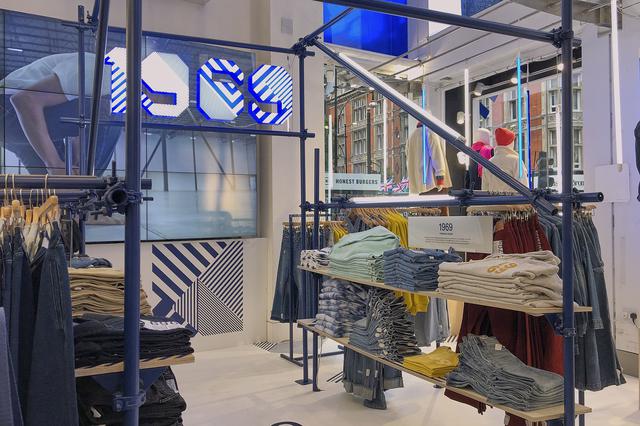
The first task was to develop a Global retail toolkit for their 50th anniversary 1969 collection which meant going through a rigorous sign off process including presenting to Gap's CEO & CMO in their head office.
Three months after final delivery of the toolkit, the UK & Asia have rolled out the IMA creative across key stores (Oxford Street pictured) as well as a London pop-up celebrating fifty years of Gap denim.
Taking inspiration from the woven intricacies of the weave of denim, the pattern featured in the lead creative was developed alongside a new branding identity for the 1969 collection in a bid to appeal to a younger (Gen Z), fashion focused audience whilst still being recognisable to the core Gap consumer. We also worked on the positioning of the in-store experience and developed fixtures to showcase the range.
The pop-up store in Soho London, was targeted at attracting a new higher end consumer with the objective of educating this consumer on the brands rich heritage, building credibility & offering an experience which included an in-store customisation area, all of which was linked to the wider social campaign #GapDenimFutures- both key areas of our toolkit and strategy.
A huge thank you to everyone at Intermarketing who worked on this campaign alongside the team in Manchester, across no less than four offices around the world including Amsterdam, Leeds and NYC.
-
See below images of the Oxford Street store and read the featured article on the London pop-up here, and be sure to keep your eyes peeled for updates on the other projects worked on globally.


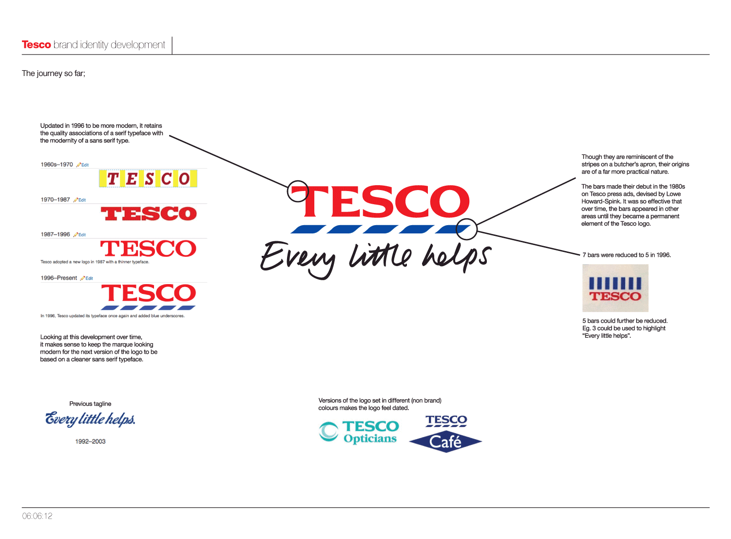
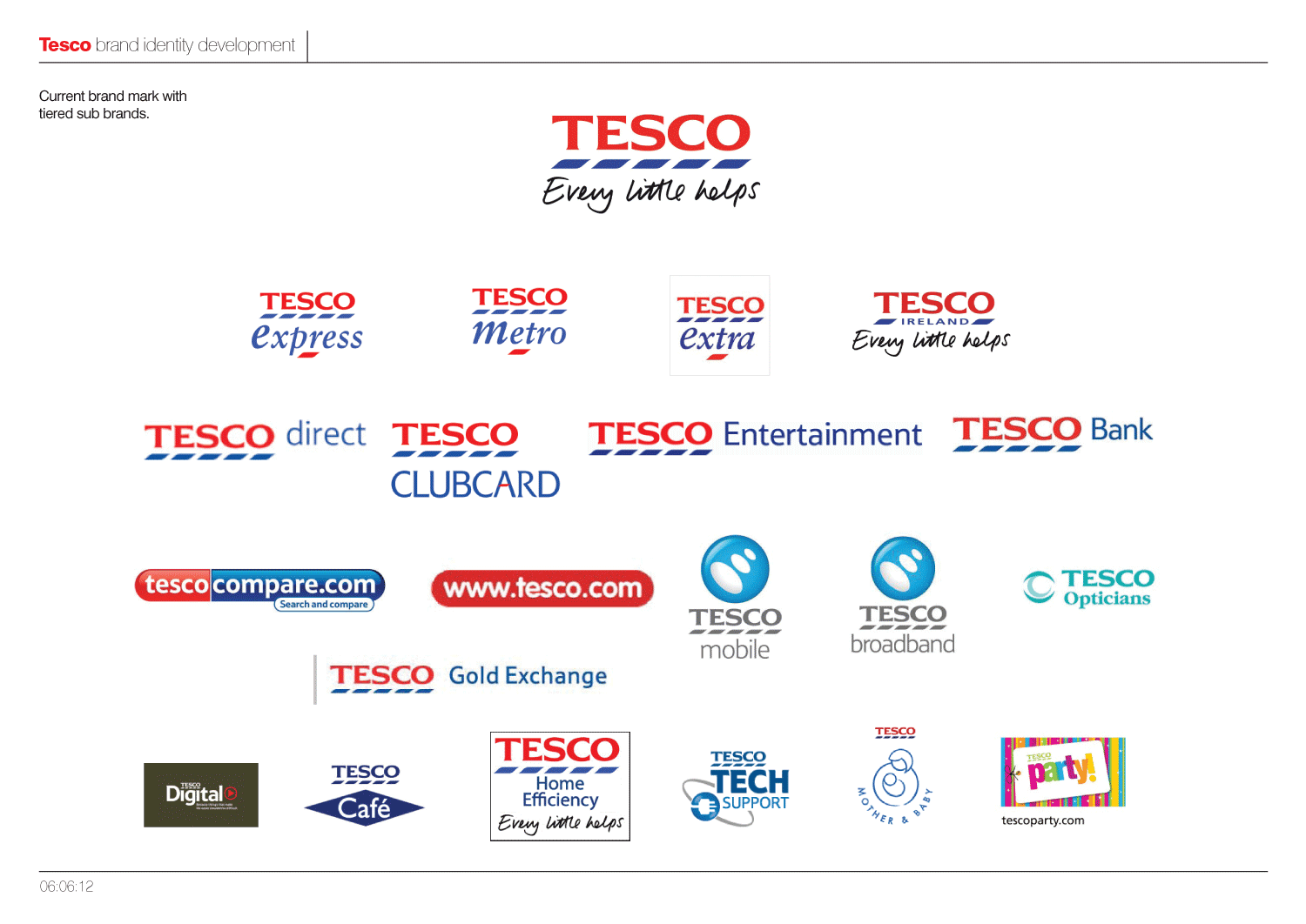
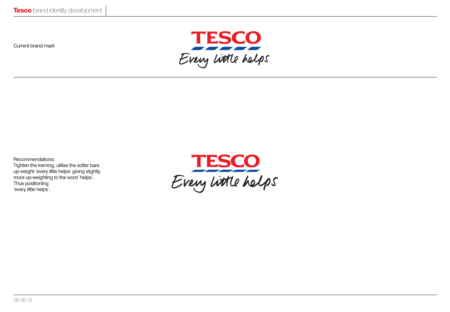
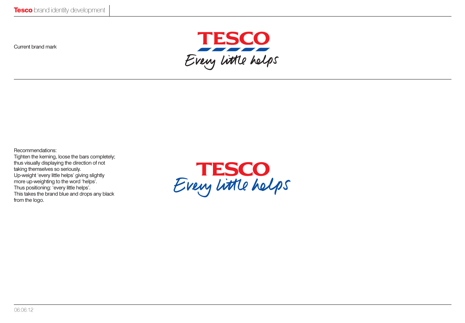
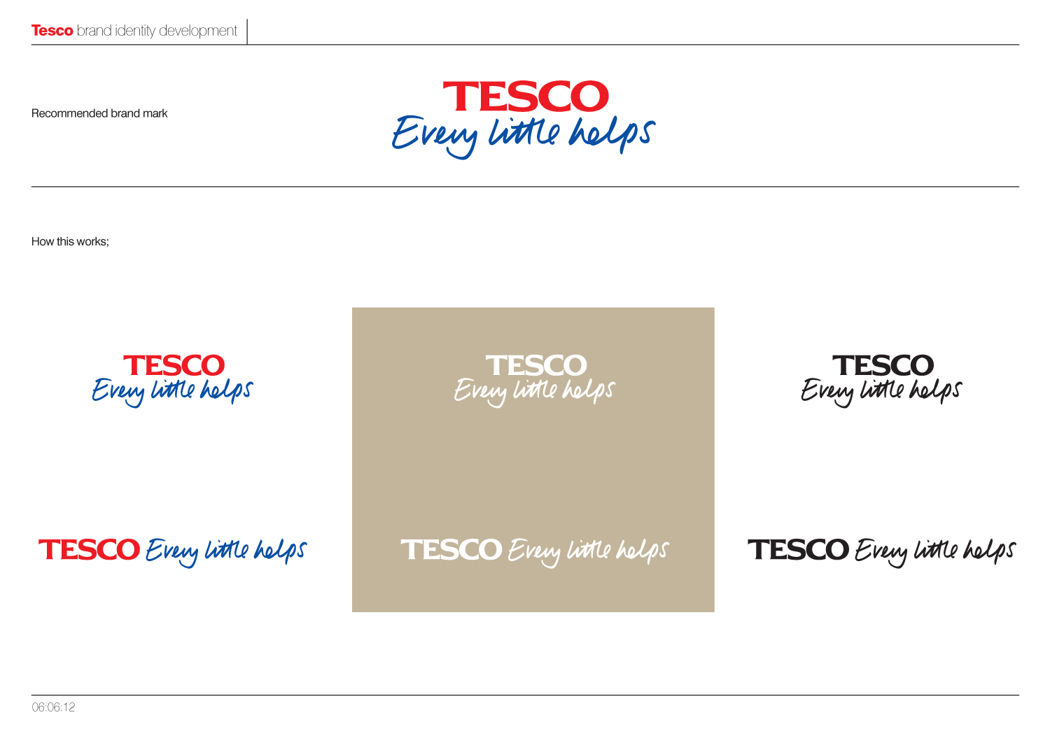
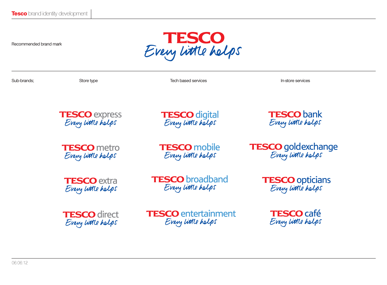 As I said at the beginning, this was only a quick brand overview and would have been great to get to delve deeper into the details and across the huge range of sub-brands. On a another note its interesting to see W+K's take on "every little helps" in their current ads, and how it wasn't too far away from our own.