Patterns and forms can be found just about anywhere. Take a look around the room and I bet you can find a number of examples of natural and man-made patterns. They often get ignored. Not at ctrl-clothes.com where these modern, abstract forms are front and centre. The triangles, squares, lines and shapes are certainly fresh and original, and remind me a little bit of a mix between my geometry class and class trip to the modern art museum. Give the Tunnel? shirt a good long look and you might get lost therein: certainly works brilliantly as an eye-catcher. But, shirts aren’t the only things greeting you at ctrl-clothes: you are presented with quite the innovative, interactive store front (based on a Manchester street – see below). Here’s the interview with Ben, the man behind ctrl:
Where are you from and where do you live now? What’s the weather like there?I live in the Northern Quarter, Manchester. It’s currently nice and sunny, although it usually rains!
What do you do, other than t-shirts?
I’m web/graphic designer, but I do a bit of DJing in my spare time.
What’s the story behind ctrl-clothes?
ctrl-clothes.com was originally setup in 2005 when I graduated from university. It started off as a little project which I could use to increase my own portfolio, as well showcase the work of myself and a few friends/up and coming designers and illustrators. The idea was only ever to have a few designs on sale at a time, with a limited number of each item to be produced and sold before being removed and updated with a new design. This way the store would constantly be evolving, with each item being a limited edition. This would mean that you would be extremely unlikely to bump into someone else wearing the same tee. I hate it when this happens, going to university in a small(er) city (than Manchester), where there were only 2 or 3 cool shops to buy clothes from, it was always fairly likely that you will see at least one person in the same top as you. With ctrl-clothes.com I wanted to change this, at the very least I wanted to make items I want to wear.
Your store front is a real street in Manchester (Houldsworth Street – Google Street View) What is the concept behind your “store front”? Did you create it yourself?
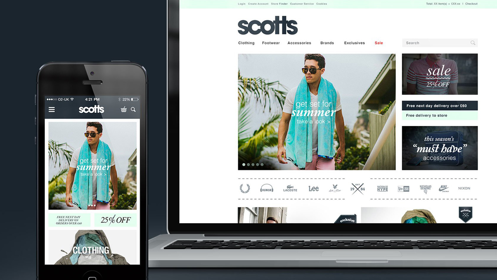
Yes I created the storefront myself. There are thousands/millions of t-shirt sites across the web now, which all tend to look very similar. I wanted mine to stand out from all the others.
With the storefront, I wanted something which showed off the products in simple, clear and interesting way, which also showed off the t-shirts and the designs roots in Manchester. The site is meant to be a bit of fun, I want people to play with site, and through the user interaction to potentially introduce a product they may not usually look at.
How would you describe your shirts in 5 words or less?
Abstract, modern, fresh, personal and ctrl’d.
What is your shop’s target group and how do you market your shop to them?
The target shopper for my shop are those people who are fed up of buying t-shrts from the high street, where the majority of people in every town and city shop, buying the same tees from the same stores. Ctrl-clothes.com is for those people who want something a bit different, something which is almost bespoke just for a select number of lucky customers.
I currently don’t do too much to promote the shop, and what I do do is mostly through social networking sites such as twitter (twitter.com/ctrlclothes or you can follow me at twitter.com/bentopliss) and Facebook. Although I am currently considering some new forms of promotion.
How did you come across Spreadshirt?
I came across the site about a year and a half ago I think, I can’t quite remember. I remember being impressed by the simplicity of setting up your own store, and the benefits which go along with having a spreadshirt store.
What do you like about Spreadshirt and what could we do better?
I love the whole efficiency of the Spreadshirt service, the whole experience is great from initial product setup through to the handling of shipping and billing. I used to get all the t-shirts printed up myself, manage invoicing and organise the shipping. This was a real pain, and just took up too much time. Spreadshirt makes it easy. I just send you my artwork, and create the products and then you handle everything else. It has freed up a lot of my time, which I can use to update the website, design new t-shirts and work on other freelance projects.
Do you have any advice for shop partners starting up at Spreadshirt?
Just spend that extra bit of time to customise your store, there are some many t-shirts sites about now, that you need to do something a bit extra to make yours stand out.
Where do you get your ideas for designing? What happens before a shirt lands on your site?
I get ideas from everywhere, it can really depend on my mood. I love music and the whole culture (fashion/design/visuals) which goes with it. Being a child of the eighties, I’m a bit of fan of eighties popular culture, and that definitely has an influence, as well as things like modern architecture.
Before a shirt lands on the site and ends up on the ctrl-clothes.com wall, it has to go through a rigorous design process starting on my trusty notepad before going digital via Illustrator CS4. The process can end when I can answer “ yes” to the question: “Would I wear it?”.
What do you think about Spreadshirt’s printing techniques - how do you use them for different designs?
I have only used Flex printing so far, and I am pleased with all the results I’ve had, especially the printing onto the hoods of hoodies. I really want to experiment a bit with some of the other finishes, like the flock, but especially the glow in the dark. My style I don’t think would suit some of the glittery finishes, but glow in the dark definitely appeals to me.
What’s your favorite shirt of all time?
I have so many favourites that’s it is hard to keep up, but I’m currently loving this Major Lazer t-shirt.
Have you ever seen a stranger wearing one of your shirts? What did you do?
Unfortunately, I haven’t seen a stranger wearing one of my t-shirts, if I saw someone in the street though, I would probably end up jumping on them or something. That would be pretty cool!
What’s your opinion about t-shirt culture in the U.K.?
I think t-shirt culture is pretty good in the UK, there seem to be quite a few small outfits producing really cool limited run items. Quite a lot of the main stream stuff is a bit naff, but yeah, there are definitely lots of cool tees about if you know where to look.
What are some of your favourite places to visit on the Internet?
Apart from obvioulsy www.ctrl-clothes.com (shameless plug!), I have a bit of a social networking addiction! You can follow me or the store on twitter (@bentopliss or @ctrlclothes). I like to look through and upload my work to user-generated design portfolio sites like behance.net, some of the work on there is really amazing.
I like to keep up to speed with the latest in both the design world and the real world, so sites like www.thecoolhunter.co.uk, www.designboom.com, www.smashingmagazine.com and or course news.bbc.co.uk are all good, as well as all the interesting links posted up by people I follow on twitter. There are just too many to list!
Are you working on any other new designs?
I’ve just finished designing the gallery part of the website (so please take a look, I’d love to know your thoughts), so I will start work on some new designs very soon, as it’s been a while now.
Thanks for the interview Ben!


![Reebok – NBA All Star Event [2022]](https://i0.wp.com/bentopliss.com/assets/2022/03/Project_panel_480x328px__0007_ALLSTAR.jpg?fit=480%2C328)


![Reebok x Jurassic Park [Pitch]](https://i0.wp.com/bentopliss.com/assets/2022/03/Project_panel_480x328px__0006_JP.jpg?fit=480%2C328)


