All Posts in Work

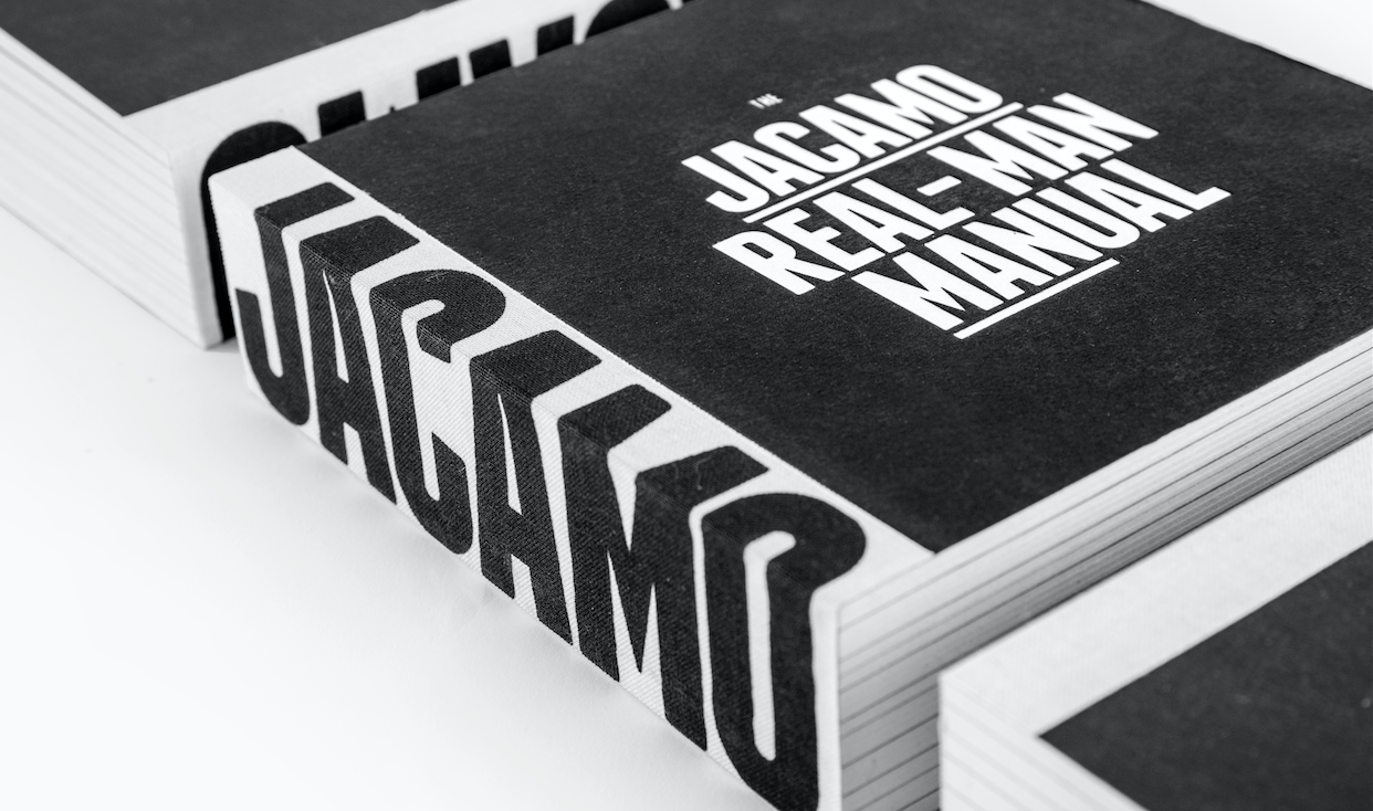
I'm proud to have been involved in the Jacamo re-brand project which last week won 2 pencils at the D&AD awards in London. The 'Real-Man Manual' took away two pencils - a graphite for 'Brand Expression for Print' & wood in 'Branding'.
Congrats to the whole LOVE Jacamo team; Gary, Rory, Laffers, Pat and Myers.
About the project and re-inventing the Jacamo brand.
We knew we needed to raise brand awareness for Jacamo but, at the same time, consider how we could shift opinions of those who had negative, and often unfair, perceptions of what Jacamo was all about. Fundamentally, it’s great-fitting and stylish clothes for men.
From sizes S to 5XL, Jacamo offers clothes for every man. Well, every real man. And real men aren’t that keen on the frills and fuss when it comes to shopping. So we created a brand that offers a shopping experience for men who want to look and feel great without any of the
hassle. Our brand proposition was born – Jacamo. Outfitters For The Real Man.
The Jacamo Real-Man Manual
We created the ‘Jacamo Real-Man Manual’ to lay down in black and white (literally) all those nitty-gritty details of the brand’s reinvention. The manual combines our new, humorous tone of voice with a series of comical illustrations to create a brand book that inspires and entertains in equal measure. Used as both an internal rallying cry and an external opinion changer, the book has served as a catalyst for a year of change at Jacamo.
View the project here, whilst I get round to adding to the work section.
A fun shoot and project to be involved with, shot as a stop-frame animation by Tommy Cockram, starring former England Cricket Captain, Freddie Flintoff with post production provided by The Mill.
The stop-frame animation worked really well across social too:
Below are some of the behind the scenes, including me taking a (it was three or four) snowball(s) for the team. I'm thankful it wasn't Freddie wasn't throwing them, an unlucky digi was on the receiving end the next day and whoa!
I also shot a series of four of interviews with Freddie between scenes, where he ponders some the big festive issues check one below, more on Jacamo's youtube channel.
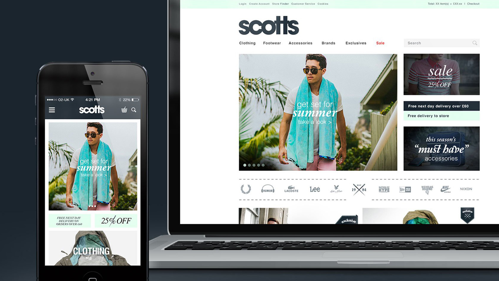
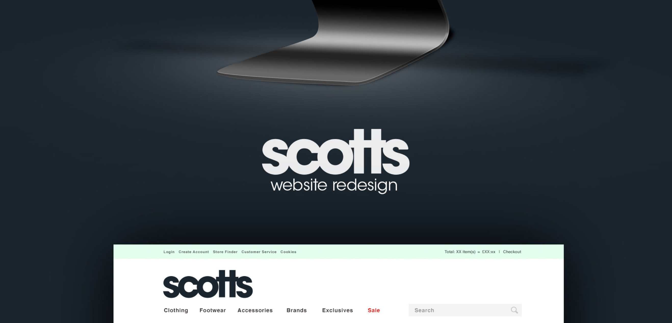
After being featured in the Adweek Talent Gallery a couple of months ago, I'm pleased to say that the project I worked on for Scotts Menswear has now been featured on Behance, as part of their Web Design Served curated gallery. Check out the full project here or follow me on Behance.
This week I was fortunate enough to receive an email from Oscar at Behance to let me know that my work for Scotts had been selected by their curatorial team to feature on the front of their Adweek Talent Behance gallery.
Be sure to visit and check out the other great work on there if you've never done so, and if you want to follow me on Behance, check out my profile.

Looking at those numbers so far, I think I need to up my game a bit - or at least get a larger Behance following!
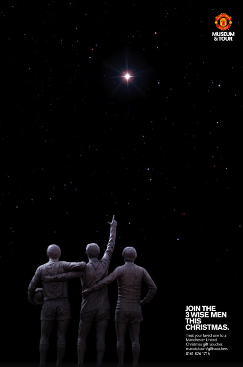
It was good to see the ad I designed (concept by Adam & Becci) win a silver in the '6, 4 or Smaller Sheet' category at the Roses Creative Awards last night. This was amongst several awards scooped by TBWA\Manchester which included: two golds, three silver and three bronze. Well done everyone involved.
Client: Manchester United
Agency: TBWA\Manchester
Art Director: Adam Richardson
Copywriter: Becci Tyrell
Designer: Ben Topliss
During the summer, in downtime we redecorated the agency. Initially the design department and swiftly followed by all the other departments in the agency once they saw what we had achieved.
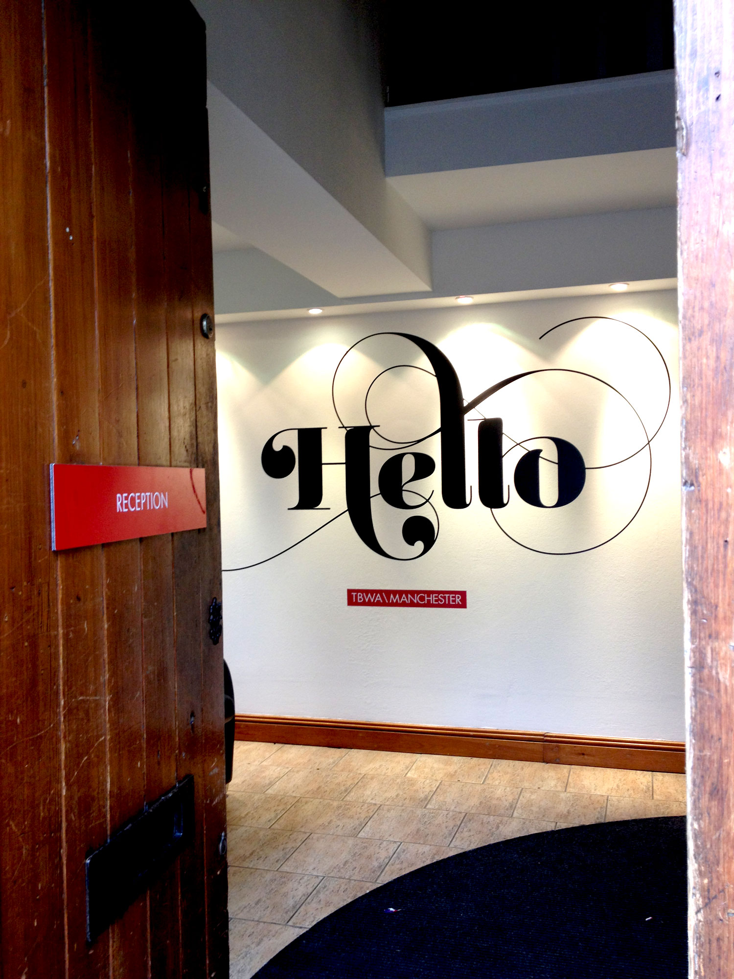
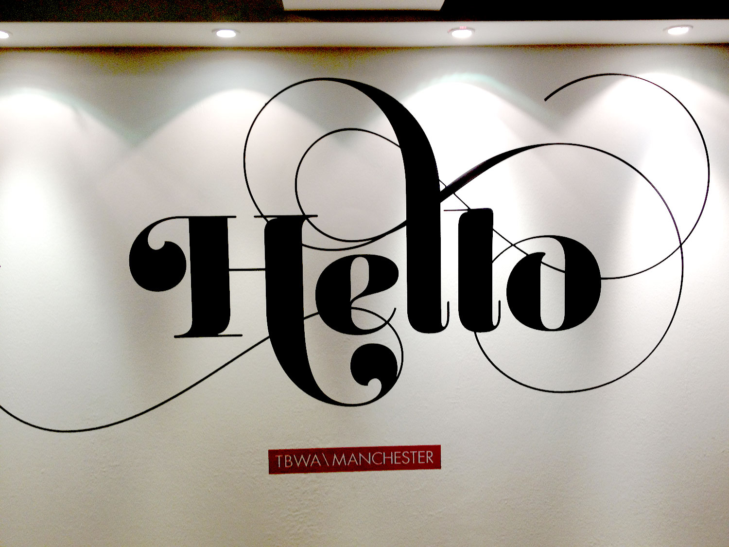
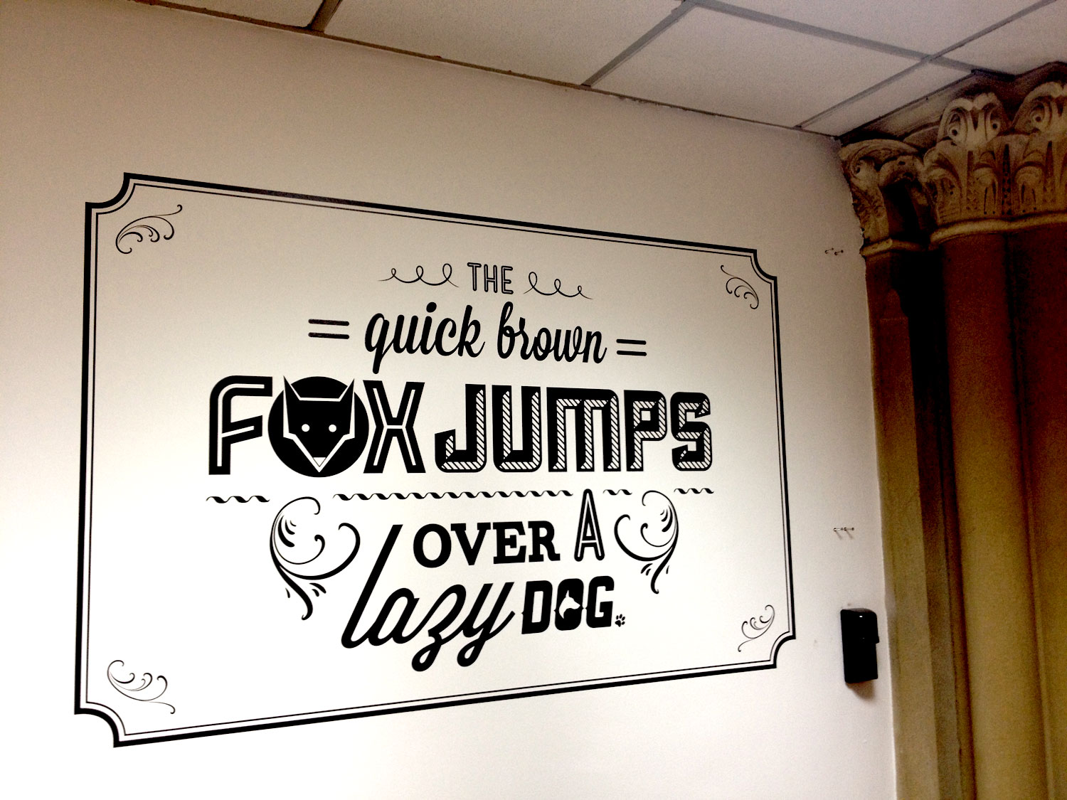
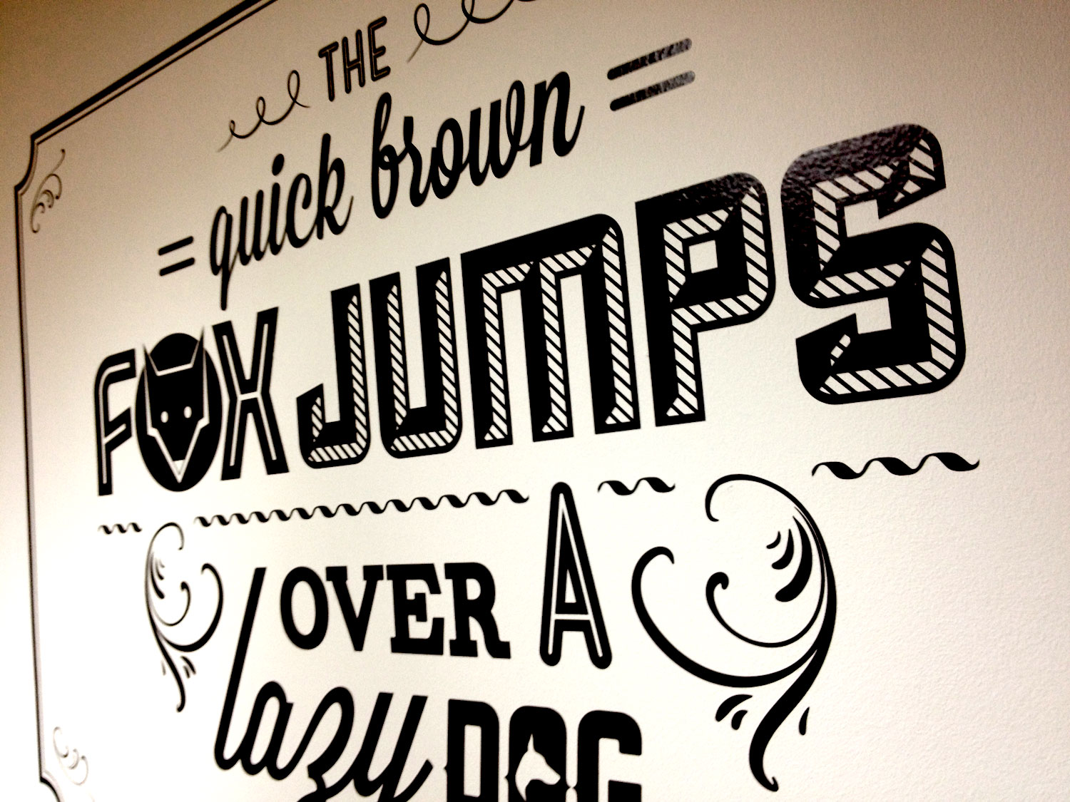
There where massive clear outs and tidying sessions and St Paul's has been transformed into an even more inspiring workplace. The transformation was finally completed a week ago with the installation of some wall vinyls placed around the building. I designed a couple of pieces, an organic and flowing welcome as you enter the front door and typographic treatment of a famous pangram in the studio.
I'm going to create a proper portfolio page for it all, but I'm still working on a colour version of the pangram statement, but in the meantime here are a couple of snaps.
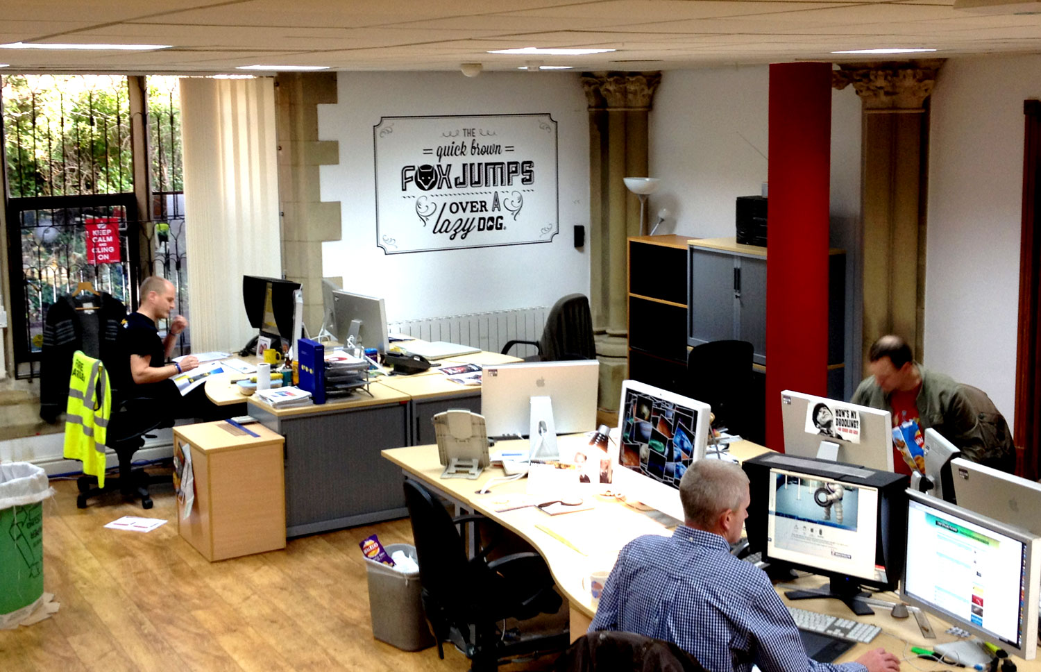
Here are some more shots of the entire agency.


Along with most of the people at TBWA\Manchester, my summer was consumed pitching for Tesco. We were up against the great and the good of advertising, beating off competition including JWT, VCCP, McCann Erickson, SapientNitro and WCRS, before finally losing out to W+K..
Now that Wieden & Kennedy's work is starting to see the light of day, I thought I'd share the little case study I put together on the evolution of the Tesco marque, and its possible future evolution. Please bear in mind this was a single afternoons work, and it is nowhere near as comprehensive as the brilliant microsoft rebrand done by Andrew Kim. This is meant as more of an evolution in the style of recent high profile rebrands like Starbucks.
Please click on the images below to enlarge.
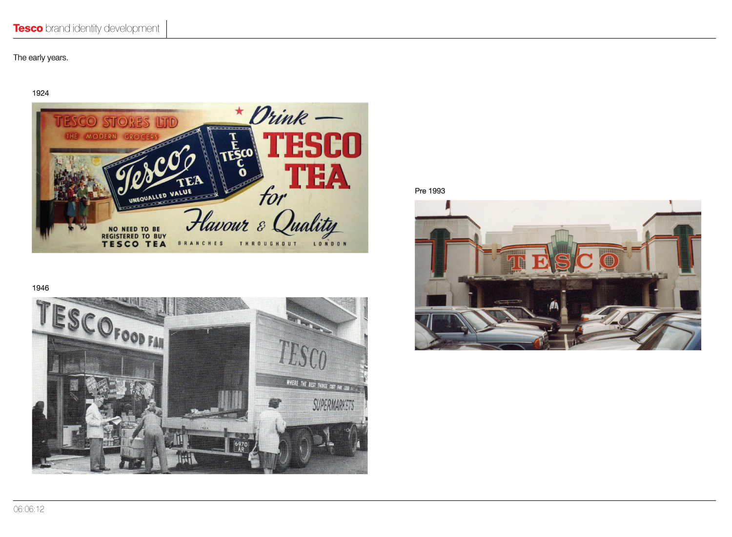
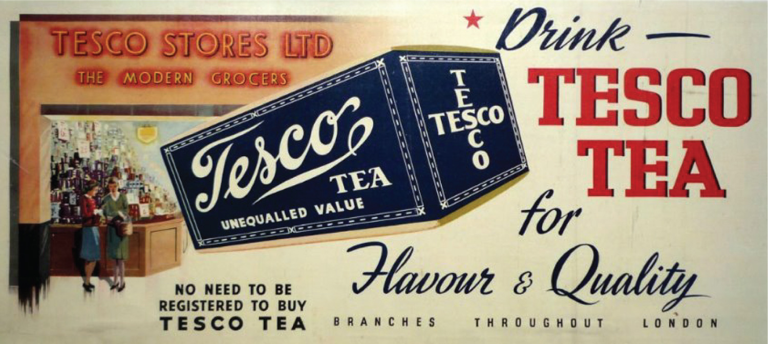
As you can see from the page above Tesco's branding early on was quite inconsistent, particularly with the advert from 1924 displaying 'Tesco' in 3 different faces and styles. On the image below from 1946, you can still see serious inconsistancies, with both serifs and sans being used in branding.
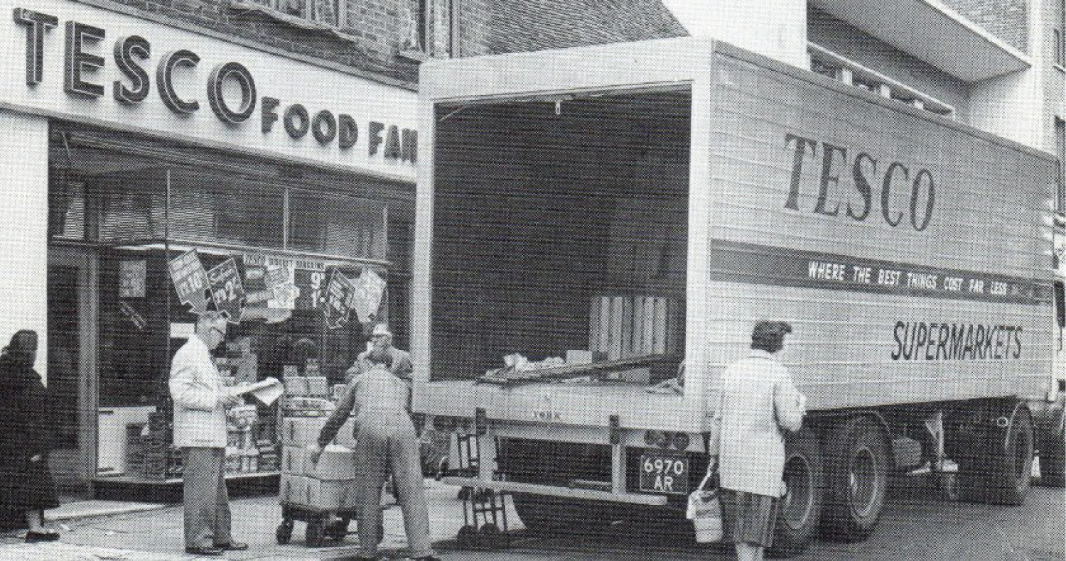
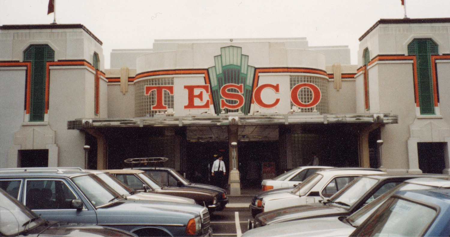
A branch of Tesco built inside the Hoover Building in Perivale, London (now a listed building)
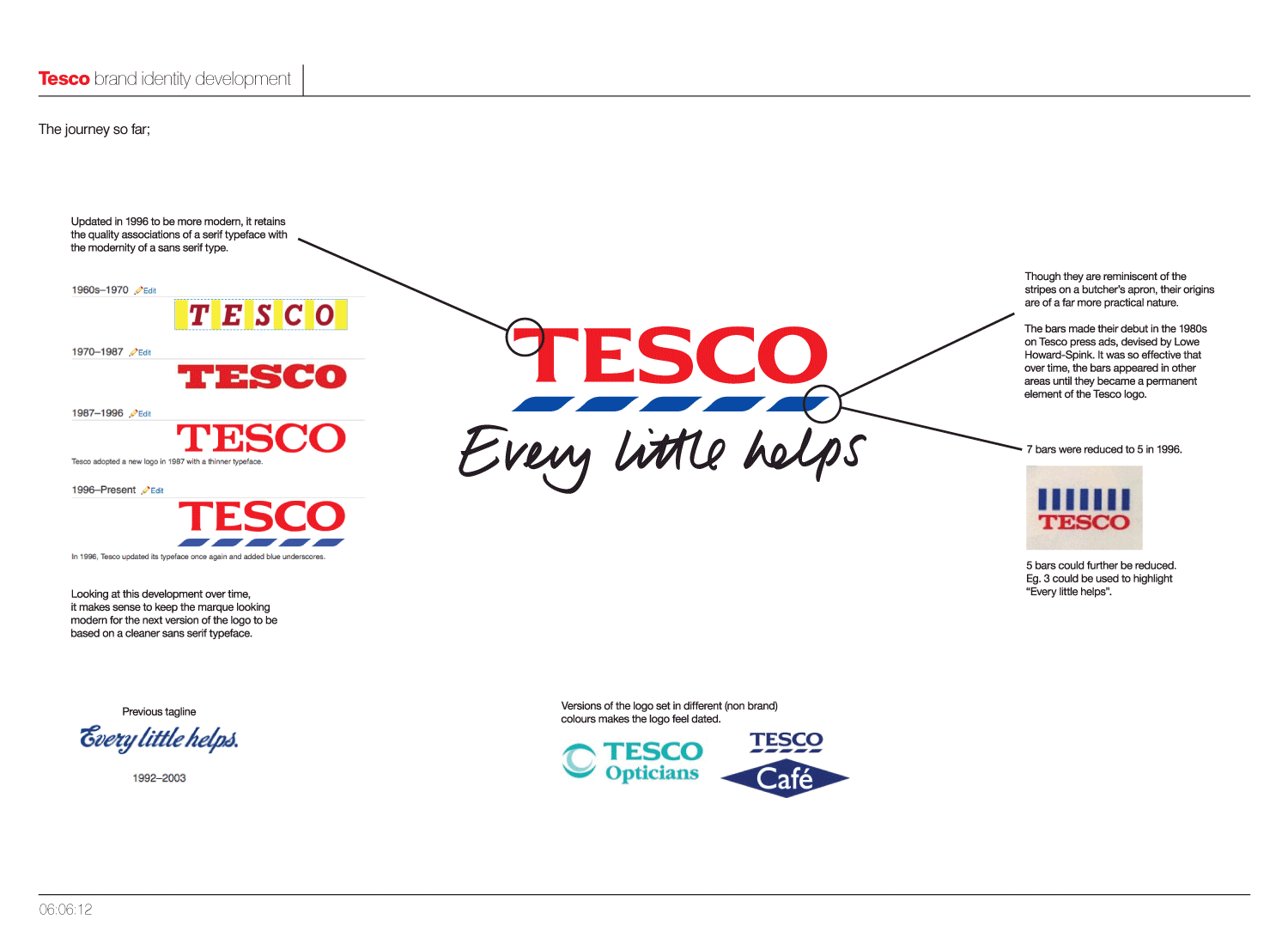
As you can see on the above image, since the Tesco has gradually refined the logo over, moving from a slab-serif, with the most recent incarnation from 1996 becoming almost a sans-serif.
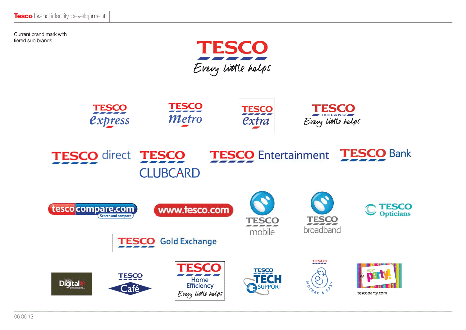
However, with Tesco's rapid expansion into many other areas and sectors, the various sub-brands lack a visual consistency and cohesion.
The blue stripes, which are reminiscent of the stripes on a butchers apron, made their debut in the 1980s on Tesco press ads, devised by Lowe Howard-Spink. It was so effective that over time, the bars appeared in other areas until they became a permanent element of the Tesco logo. But they are used differently by different parts of the business which I feel is confusing.
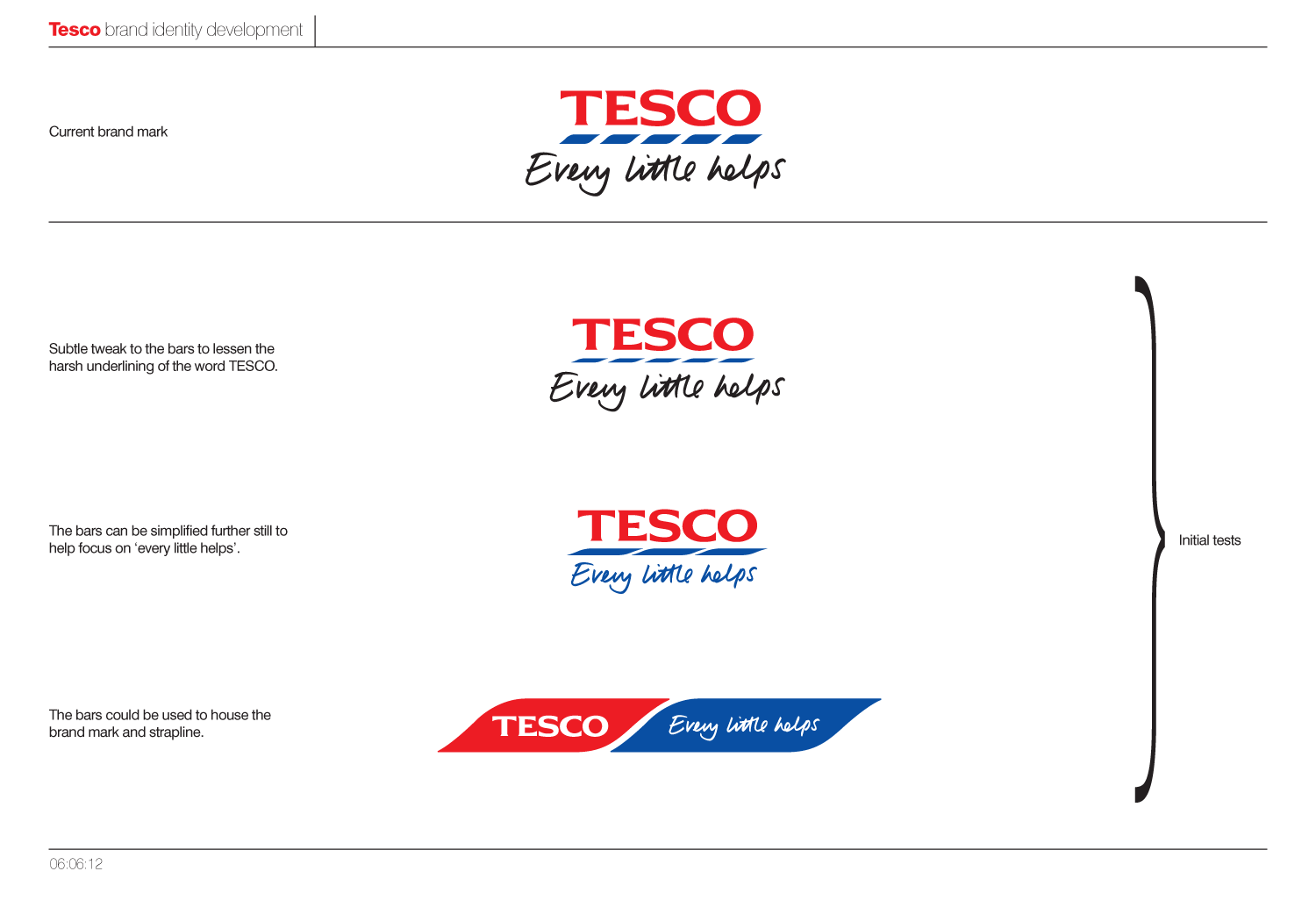
Exploring the best way to make that next refinement of the logo can be seen over the next few images.
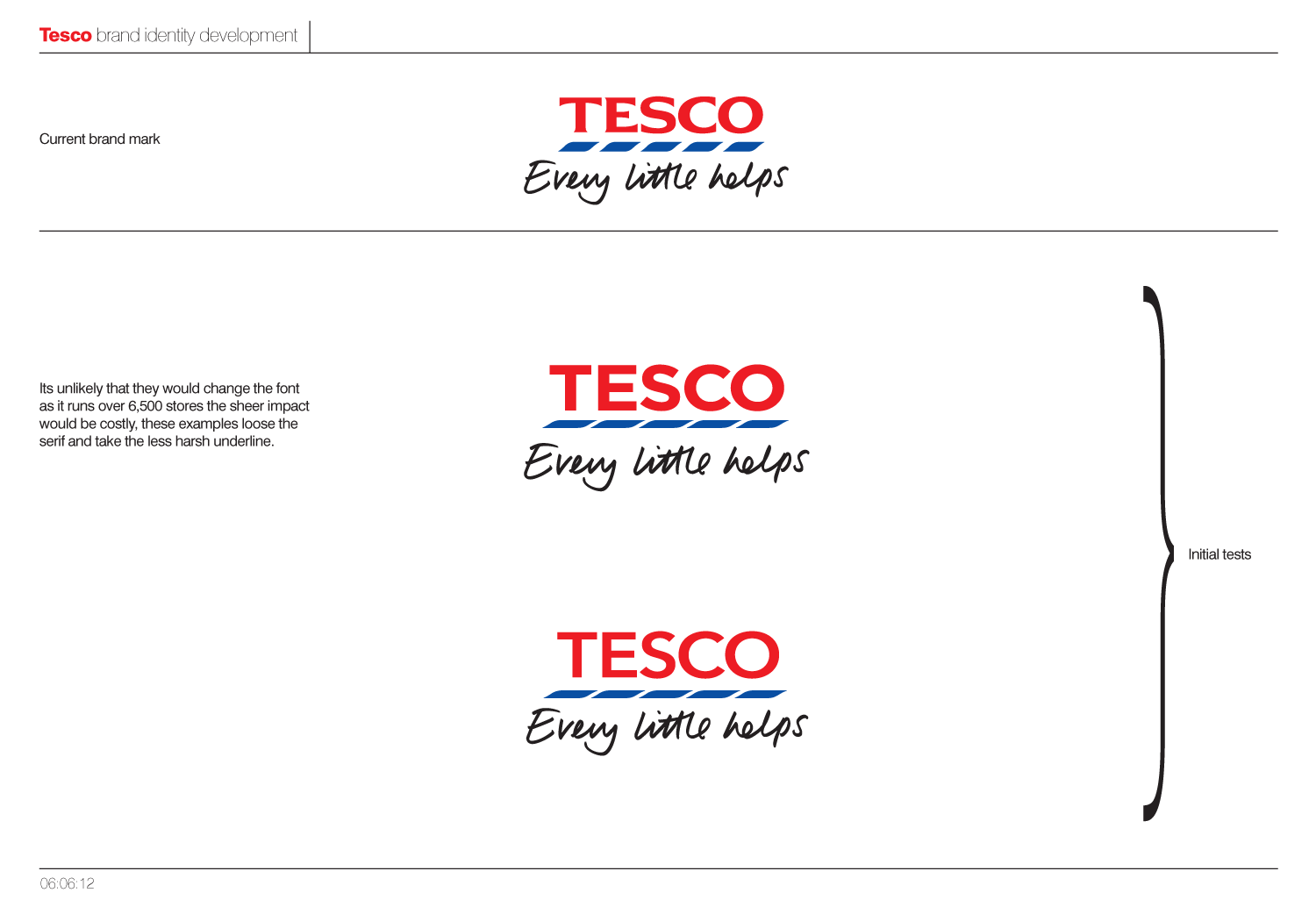
Should the number of stripes be reduced, or the size of them modified? Looking at the options below, moving to a completely sans typeface seems like a step too far. Getting the level of compression in x-height right, is also a tricky so as with not enough compression it doesn't look like Tesco, and too much and the logotype just looks squashed. Until actually having a look at it, I hadn't fully appreciated just how squashed it actually is.
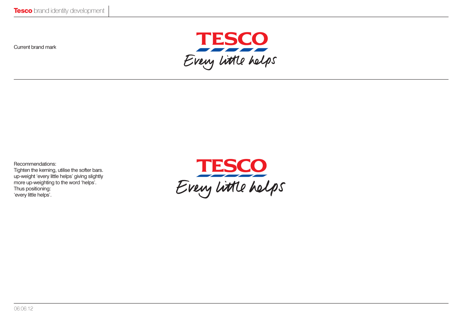
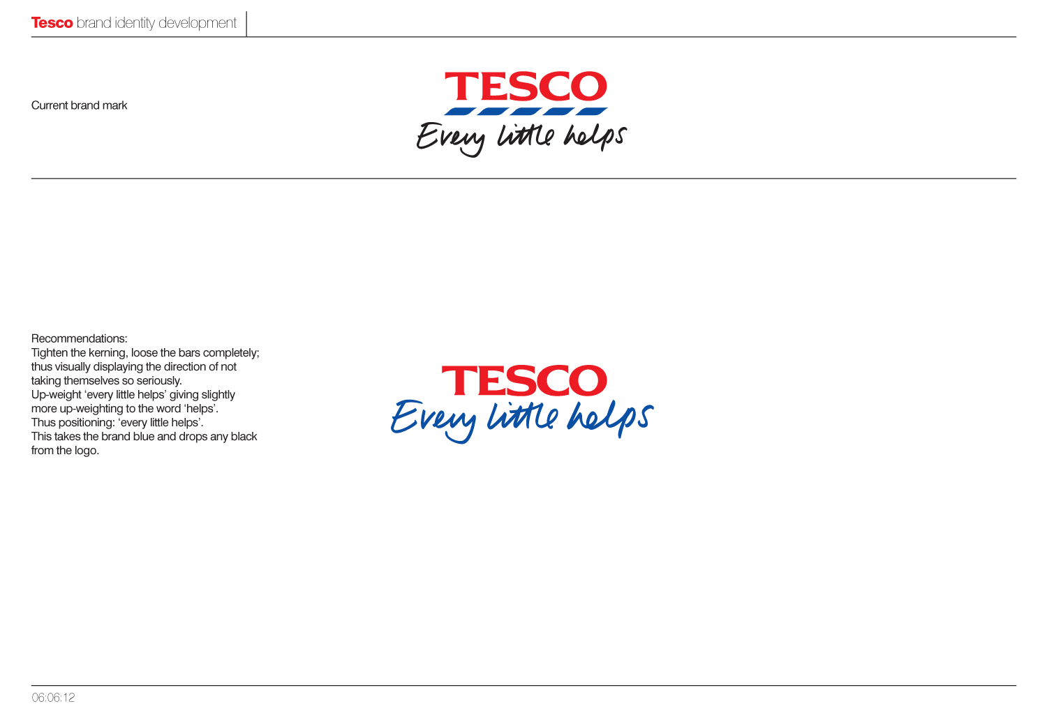
In the end, we would recommend to lose the bars completely, as they don't actually represent anything. Black as a colour is then completely lost from the logo, with "every little helps" taking on the Tesco brand blue and thus aligning it closer to the master brand. Further to this "Every little helps" has been upweighted, with extra emphasis being placed on "helps", as this was one the core aspects of the pitch strategy.
Below you can see how this would be applied on an individual basis and across the various sub-brands, with each sector taking a slightly different colour.
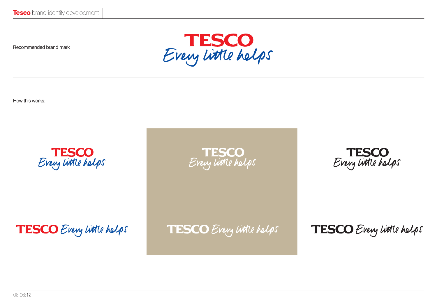
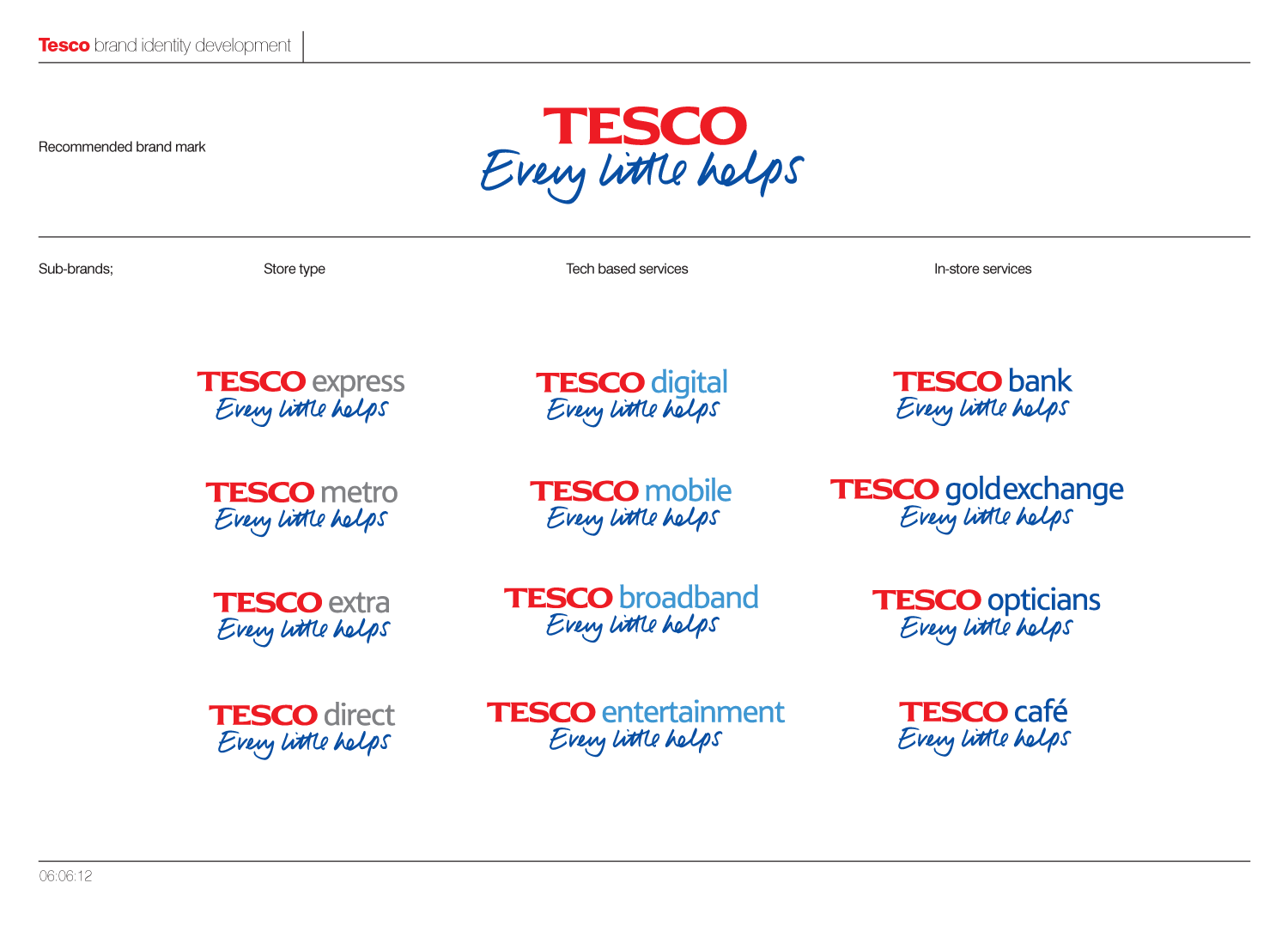 As I said at the beginning, this was only a quick brand overview and would have been great to get to delve deeper into the details and across the huge range of sub-brands. On a another note its interesting to see W+K's take on "every little helps" in their current ads, and how it wasn't too far away from our own.
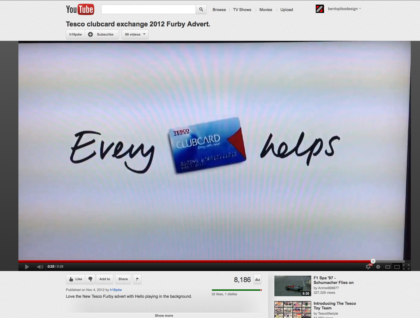
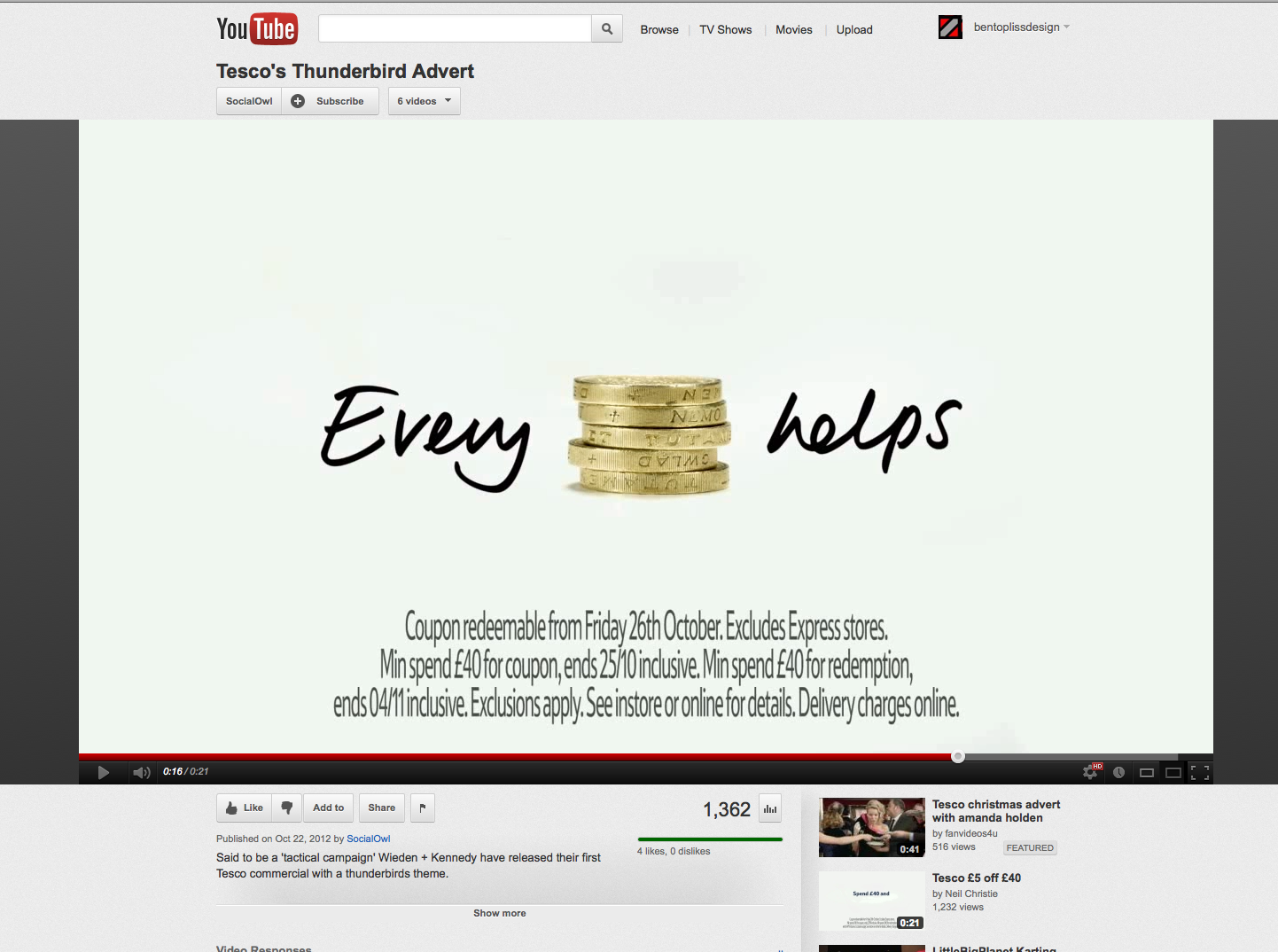
www.youtube.com/watch?v=CLPxDZtNMJ0
www.youtube.com/watch?v=3CPs_BnFbqM
en.wikipedia.org/wiki/Tesco
telegraph.co.uk/foodanddrink/9188573/Every-little-hurts-Tescos-new-budget-brand-lacks-snob-value.html
logos.wikia.com/wiki/Tesco
prweek.com/uk/news/58019/BELOW-THE-LINE-Tesco-checks-its-corporate-branding
Contact.
ben[@]bentopliss.com
+44 (0) 7825 814797
Graphic Design & Creative Direction.
© 2023.
All work displayed remains the property of either Ben Topliss,
the agencies and/or the clients
it was created for.


![Reebok – NBA All Star Event [2022]](https://i0.wp.com/bentopliss.com/assets/2022/03/Project_panel_480x328px__0007_ALLSTAR.jpg?fit=480%2C328)


![Reebok x Jurassic Park [Pitch]](https://i0.wp.com/bentopliss.com/assets/2022/03/Project_panel_480x328px__0006_JP.jpg?fit=480%2C328)


