


![Reebok – NBA All Star Event [2022]](https://i0.wp.com/bentopliss.com/assets/2022/03/Project_panel_480x328px__0007_ALLSTAR.jpg?fit=480%2C328)


![Reebok x Jurassic Park [Pitch]](https://i0.wp.com/bentopliss.com/assets/2022/03/Project_panel_480x328px__0006_JP.jpg?fit=480%2C328)


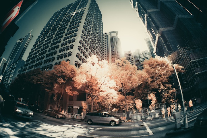


Hong Kong-based designer Yiu Yu Hoi turns his fast-paced city into a slow moving dream with the use of infrared photography. He first learned about this technique from photography forums which got him "totally fascinated" with how shockingly different he could make his city scenes appear.
Look through his photos and you'll notice that Hoi seeks out trees in Hong Kong, making them look vibrant in their pink-ish tone. "The glowing trees can be obtained in-camera, but they are bluish straight out of camera," he tells us. "A more natural reddish tone could be available by simply swapping Blue and Red channels in Photoshop. That is a very popular, yet powerful way to develop colored infrared photos."
Infrared photography has the ability to show us what the eye cannot see, it's the art of capturing invisible light. These days, digital photographers can use filters and image-editing software like Photoshop to achieve this otherworldly effect.


Yiu Yu Hoi's photos can also be found in the third issue of his quarterly publication 16HOURS Magazine, Urban. 16HOURS is the result of two designers, each on opposite sides of the world, collaborating on a magazine aimed to get you inspired from each and every angle of life. A quarterly publication where each issue is based around a specific theme, to date there has been: Wanderlust, Home and now Urban. To capture these themes and feelings in print they collect art to showcase from photographers, designers, illustrators and writers from around the world.
It's called 16HOURS because that's the time difference between Calgary, Canada and Sydney, Australia, the two cities where you'll find the designers who curate and put the magazine together.
via mymodernmet.com


 You can also get these as


