![Reebok – NBA All Star Event [2022]](https://i0.wp.com/bentopliss.com/assets/2022/03/Project_panel_480x328px__0007_ALLSTAR.jpg?fit=480%2C328)


![Reebok x Jurassic Park [Pitch]](https://i0.wp.com/bentopliss.com/assets/2022/03/Project_panel_480x328px__0006_JP.jpg?fit=480%2C328)


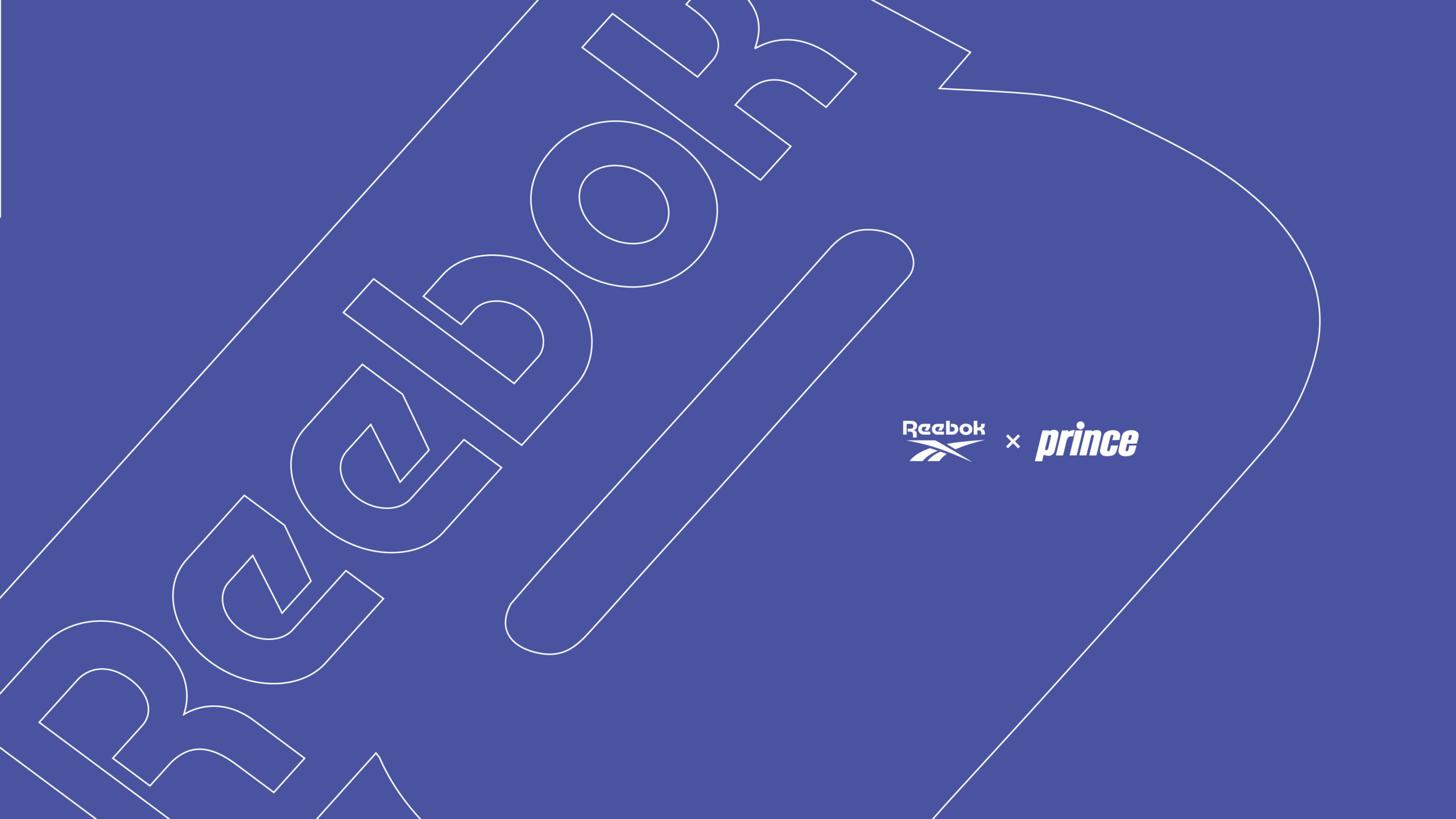
Court inspired summer streetwear, Reebok x Prince
- Case study coming soon!
Shot at Pharrell and Dave Grutman's sick hotel in Miami, the Goodtimes Hotel.
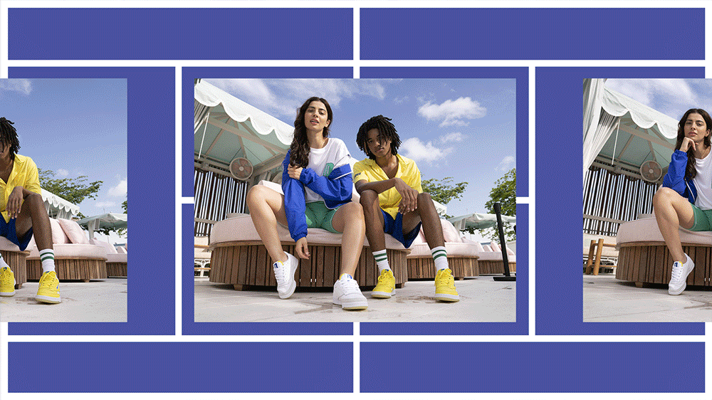
Court inspired summer streetwear, Reebok x Prince
- Case study coming soon!
Shot at Pharrell and Dave Grutman's sick hotel in Miami, the Goodtimes Hotel.
Immerse yourself in the beauty of the solar system and the extra terrestrial store take-over created for the END. x Reebok "Jupiter" drop. It's the closest thing you'll get to the Milky Way!
The takeover featured an in store lunar campsite, intergalactic planetary launch zones as well as window takeovers of London, Newcastle and Glasgow stores.


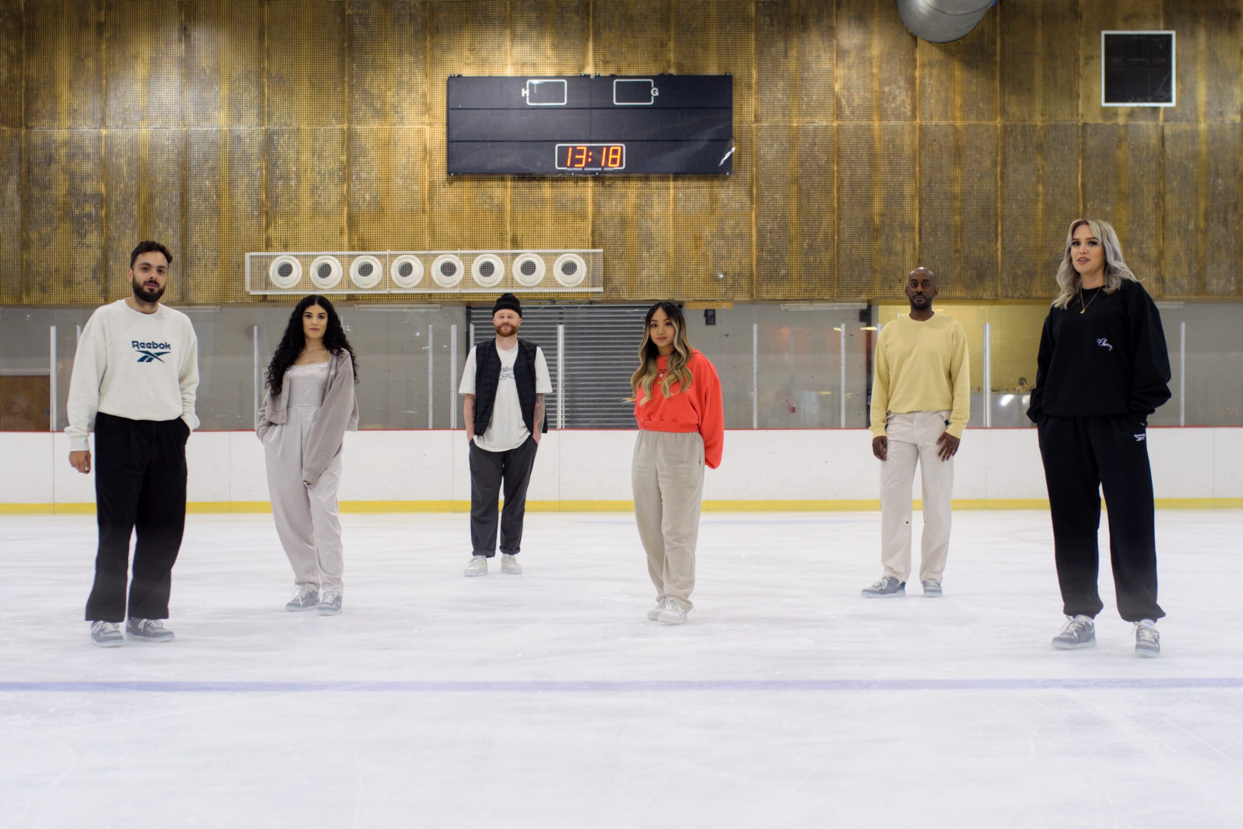
Celebrating everything community with the OFFSPRING collaboration with Reebok with campaign concept art direction, activation creative and retail tools that brings OFFSPRINGS limited edition of the Workout Plus ‘Ice’ to the consumer.

For those who are old enough to remember, the Reebok Work Out “Ice” was a big U.K. trend in the late 90s. Whether it was on the Ripple sole, in a multitude of colours and shades or finding it’s way on other Reebok models, the “Ice” sole was a must have. You’d have people teaming them up with Iceberg jackets and crazy Mosh jeans, it truly was a phenomena that swept up and down the country.


The campaign was shot by OFFSPRINGS very own community member @nineteen.85
"We wanted to encapsulate and evoke nostalgic emotions of fun times with friends. Whether it was in the park, at the skate rink or just hanging out in the community, Reebok’s rich historic heritage has always been present, and representative of UK culture through the years."
The idea was for this shoe to give you the feeling of those good old memories and whilst you wear it, to make new ones.
In addition to all this I created special elements for the release. With every purchase OFFSPRING included a custom ice cubes tray stamped with the brands logos to keep you cool on those summer days and you will also receive a dual branded community tote bag.
Back at the end of 2019 and the start of 2021 I got to lead the creative for the launching premium capsule collection from Reebok, Reebok Reserve. This is an exclusive collection of faithful reproductions from the archive and modern twists on Classic silhouettes.
Aimed at the sneaker aficionado who truly appreciates the stories and minute details in a shoe. Whether its digging out the original 1983 sole mould from the Italian factory or adding fleece and washing instructions to create a truly cosy winter Workout!


Currently working on the latest Reserve Campaign, and I can't wait to share what has Reebok has Reserved for 2022.
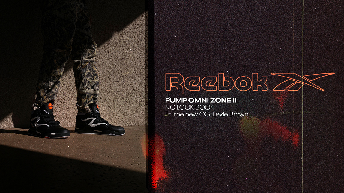
THE YEAR IS 1991.
THE DUNK CONTEST TITLE IS STILL ANYONE’S GAME.
DEE BROWN STEPS ONTO THE COURT.
HE SIZES UP THE RIM, BALL IN HAND, WITH ATTENTION FROM FANS ALL OVER THE WORLD.
HE SETS THE BALL ON THE FLOOR. WITH TWO HANDS HE PRIMES THE PUMPS ON HIS PUMP OMNI ZONE II SNEAKERS, REVOLUTIONARILY LOCKING IN A CUSTOM FIT FOR TAKEOFF.
EACH TIME HE APPROACHES THE NET, HE—AND THE UNPRECEDENTED PUMP TECHNOLOGY— BECOME EVEN MORE OF A PHENOMENON.
ON THE SEVENTH TRY, HE LAUNCHES INTO THE AIR, EYES COVERED BY HIS FOREARM.
BROWN CASUALLY JAMS THE BALL THROUGH THE BASKET, NAILING THE ICONIC NO-LOOK DUNK.
AND THE REST IS HISTORY.

CHARLOTTE, NC - FEBRUARY 9: Dee Brown #7 of the Boston Celtics goes up for slam dunk during the Slam Dunk Contest in the 1991 NBA All-Star Week on February 9, 1991 at Charlotte Coliseum in Charlotte, North Carolina. NOTE TO (Photo by Nathaniel S. Butler/NBAE via Getty Images)
🏀 🏀 🏀
Last month Reebok reached out to us to help celebrate the launch of Pump Omni Zone II, 30 years on from this iconic moment. They asked us to create a digital look book using WNBA player Lexie Brown (Dee Brown’s daughter) that could support PR and tell the younger digital consumer the history around Dee Brown’s iconic no-look dunk (without actually being allowed to tell the story due to legal reasons SHOCK).
The challenges of lockdown have led to creatives experimenting with virtual photography, with #facetimeshoots becoming a huge trend among celebs and brands. To create our “No Look Book”, we thought we’d give this new trend a go ourselves.
We opted for a more candid approach making sure the models never look down the camera lens. Through collaborating with a Leeds based photographer who has mastered the art of the #homeshoot, we were able to shoot Lexie living in Florida and model Gabe residing in Phoenix using their iPhones - all from the comfort of our own home!
This allowed us to be extremely flexible working around Lexie’s strict training schedule whilst also battling with shipping delays, apparel going missing, weather conditions and last-minute shoot location changes.
Check out the The No Look Book
The client was absolutely buzzing with the quality that we were able to produce using an iPhone and our flexibility throughout the campaign, sharing the feedback below:
“This is absolutely perfect, we love the execution here and thank you everyone for your work on this.”
The Pump Omni Zone II release sold out in hours.


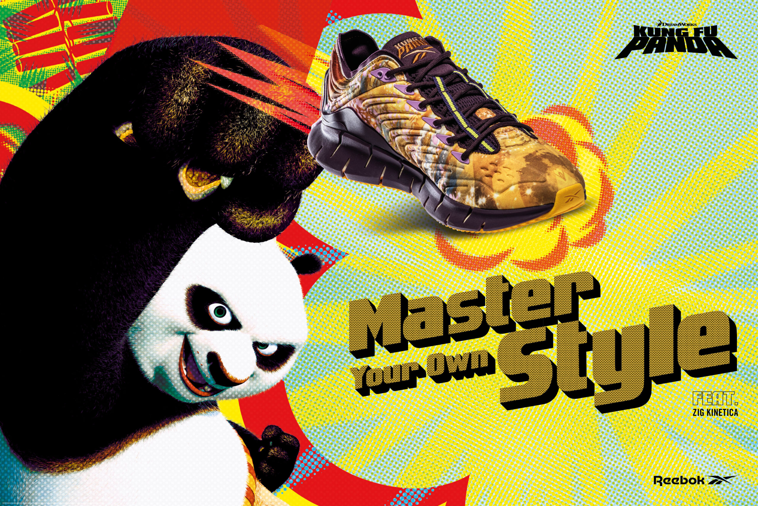
Leveraging the graphic language of old Kung-Fu movie posters, graphic novels and the humour of the film franchise, creating the key visuals for the Reebok and KFP collab was a fun project work on.
Starting with a teaser social story campaign based around Chinese New Year before leading into the graphic poster inspired key campaign.


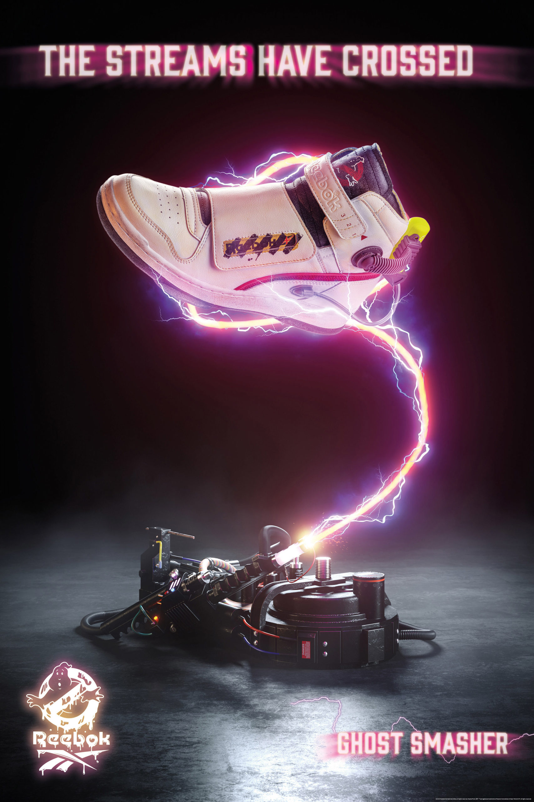
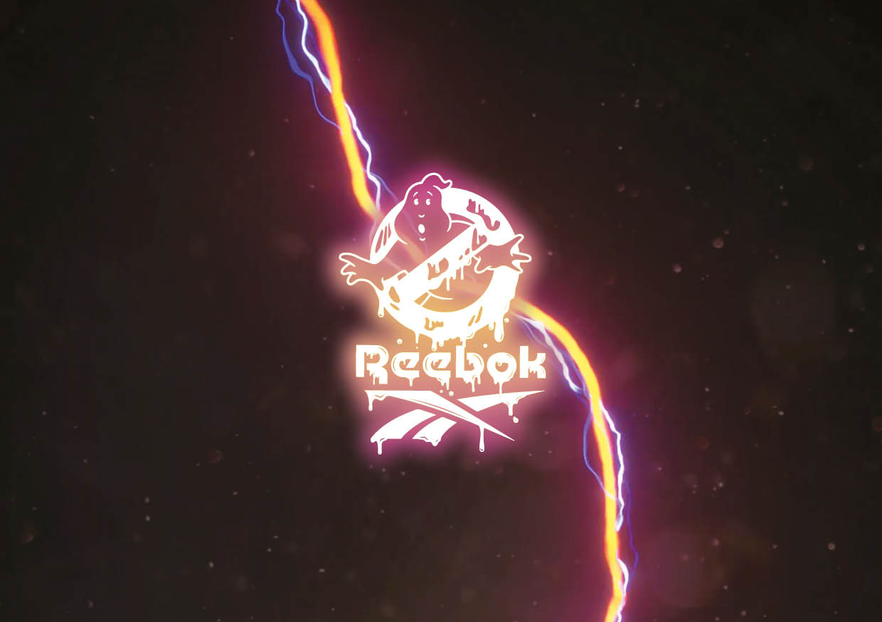
The streams have crossed! Proud to see this work drop - a great project to be a part of.

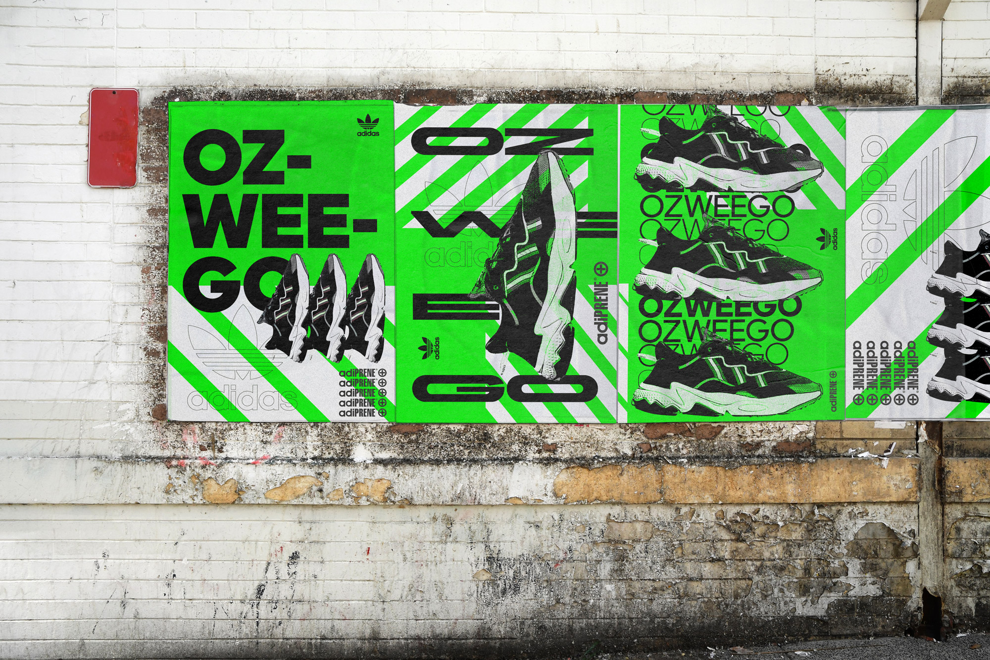
A series of rave inspired posters for the rave inspired Ozweego shoe.

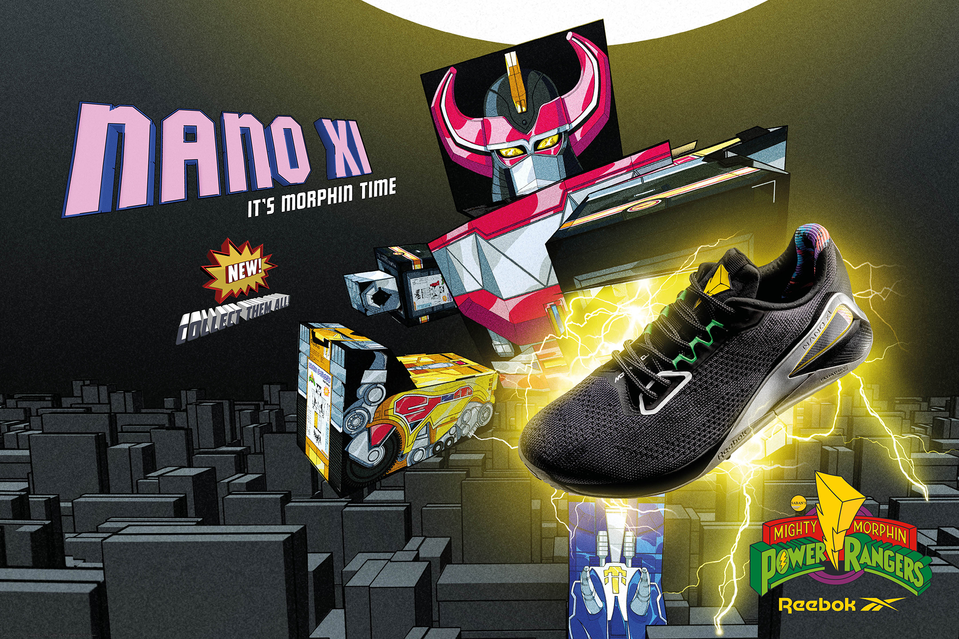
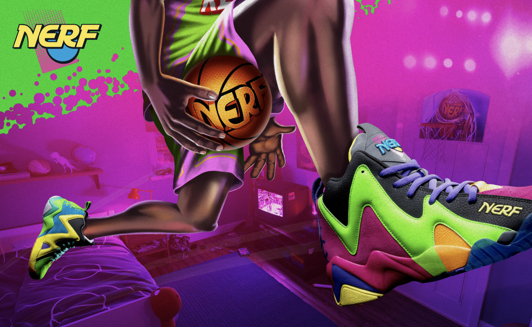
The latest project Reebok project I've been fortunate enough to be involved in, with the good people at Tangent has now started to be released on the global Reebok Classic channels.


Over six months hard work went into the creation of these three global campaigns for Reebok, working with the good guys at Tangent and work I'm really proud of.


Full case studies can be found on the below links: