Selected projects:

All Posts in Typography

January 20, 2018 - No Comments!

Red Bull Timelaps

Last year I was lucky enough to work on a number of projects with drinks brand Red Bull. The first one to go live was the branding and visual identity for Red Bulls first foray into road cycling, Red Bull Timelaps. The event saw teams of 4 battle it over a 25 hour endurance race on 28th October 2017 at Great Windsor Park as the clocks went back (that's where the extra hour came in).

Whilst I put together a full case study here are a few shots from the event for which I was lucky enough to attend. It was a great day and night all round and everyone seemed to enjoy it. The weather even held out which, for an outdoor event in October is amazing!


Participants compete during Red Bull Timelaps in Windsor Great Park, London UK, on October 28, 2017


November 15, 2017 - No Comments!

JW Lees Brewery – Rebrand

A full case study to come once everything has fully launched, but in the mean time it was a real pleasure to work on the rebrand and redesign of the JW Lees Brewery portfolio of beers whilst freelancing at Manchester agency Squad.

Working alongside Squad Creative Director David Barraclough, with Manchunian master typographer Daren Newman we created a suite of beers that each tell their own story in a different way and brings them right up-to-date, whilst still retaining an element JW Lees heritage.

It was a great project to be involved with and I look forward to sharing more of the project once its fully out in the wild.

August 1, 2017 - No Comments!

I’m freelance and available for hire!

So after; two enjoyable years at LOVE, two years before that leading the JD Sports digital creative team, three fantastic years at advertising agency TBWA and four years before that working in various small studios, I am now available to hire directly for all your graphic design, art direction, brand and digital design needs.

If you would like to get in touch to discuss a potential project all my contact details can be found here, I would love to hear from you!

May 11, 2017 - No Comments!

The Roses Creative Awards 2017

Following on from the previous weeks D&AD wins, I attended the Roses Creative Awards ceremony where the Jacamo brand book scooped three more awards.

Gold award in “Corporate / Promotional Literature".
Silver award in “Typography”.
Gold award in “Illustration”.

Shout out to Peruvian based British illustrator Bloodsausage.

I should probably get the work into a case study and put it on my site, in the mean time check it out here.

May 11, 2017 - No Comments!

D&AD – Pencils


I'm proud to have been involved in the Jacamo re-brand project which last week won 2 pencils at the D&AD awards in London. The 'Real-Man Manual' took away two pencils - a graphite for 'Brand Expression for Print' & wood in 'Branding'.

Congrats to the whole LOVE Jacamo team; Gary, Rory, Laffers, Pat and Myers.

About the project and re-inventing the Jacamo brand.

We knew we needed to raise brand awareness for Jacamo but, at the same time, consider how we could shift opinions of those who had negative, and often unfair, perceptions of what Jacamo was all about. Fundamentally, it’s great-fitting and stylish clothes for men.

From sizes S to 5XL, Jacamo offers clothes for every man. Well, every real man. And real men aren’t that keen on the frills and fuss when it comes to shopping. So we created a brand that offers a shopping experience for men who want to look and feel great without any of the
hassle. Our brand proposition was born – Jacamo. Outfitters For The Real Man.

The Jacamo Real-Man Manual

We created the ‘Jacamo Real-Man Manual’ to lay down in black and white (literally) all those nitty-gritty details of the brand’s reinvention. The manual combines our new, humorous tone of voice with a series of comical illustrations to create a brand book that inspires and entertains in equal measure. Used as both an internal rallying cry and an external opinion changer, the book has served as a catalyst for a year of change at Jacamo.

View the project here, whilst I get round to adding to the work section.

May 24, 2013 - No Comments!

FS Emeric

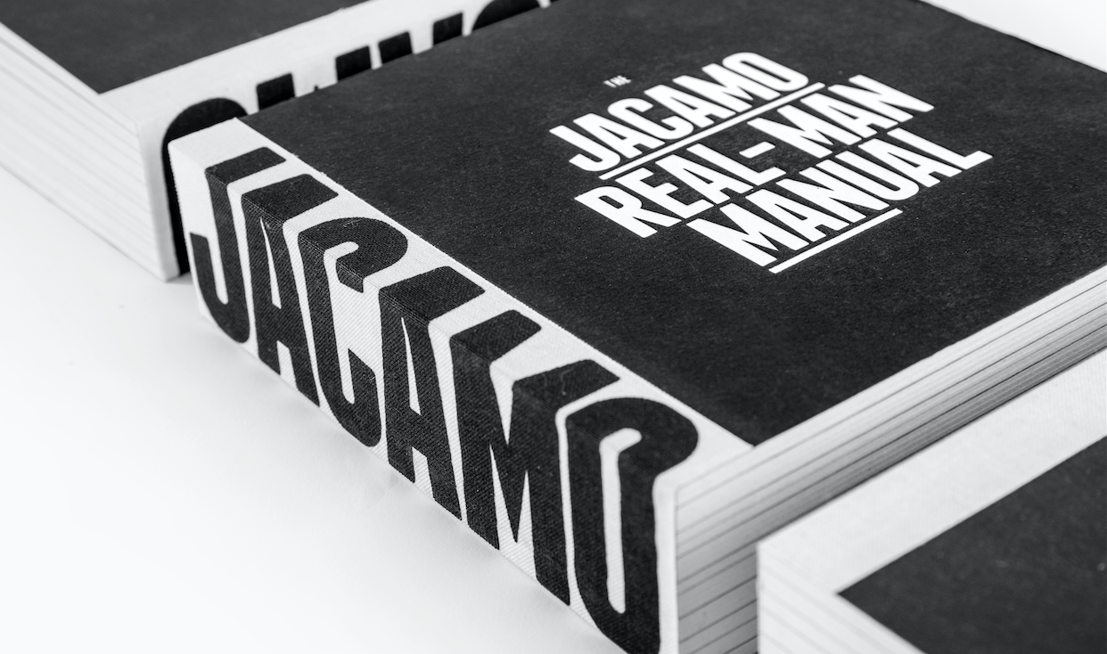
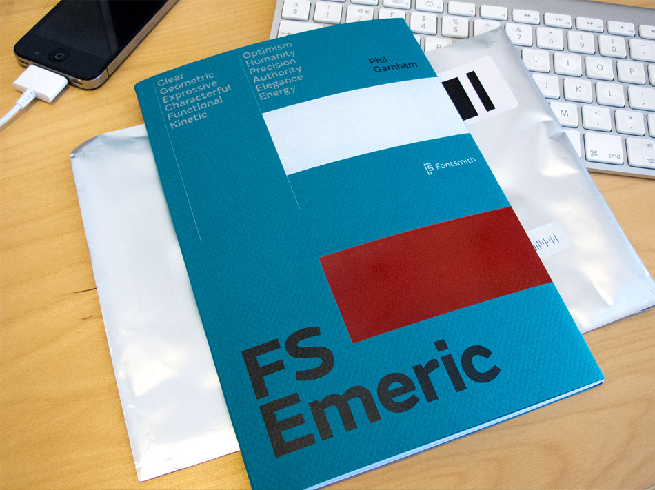
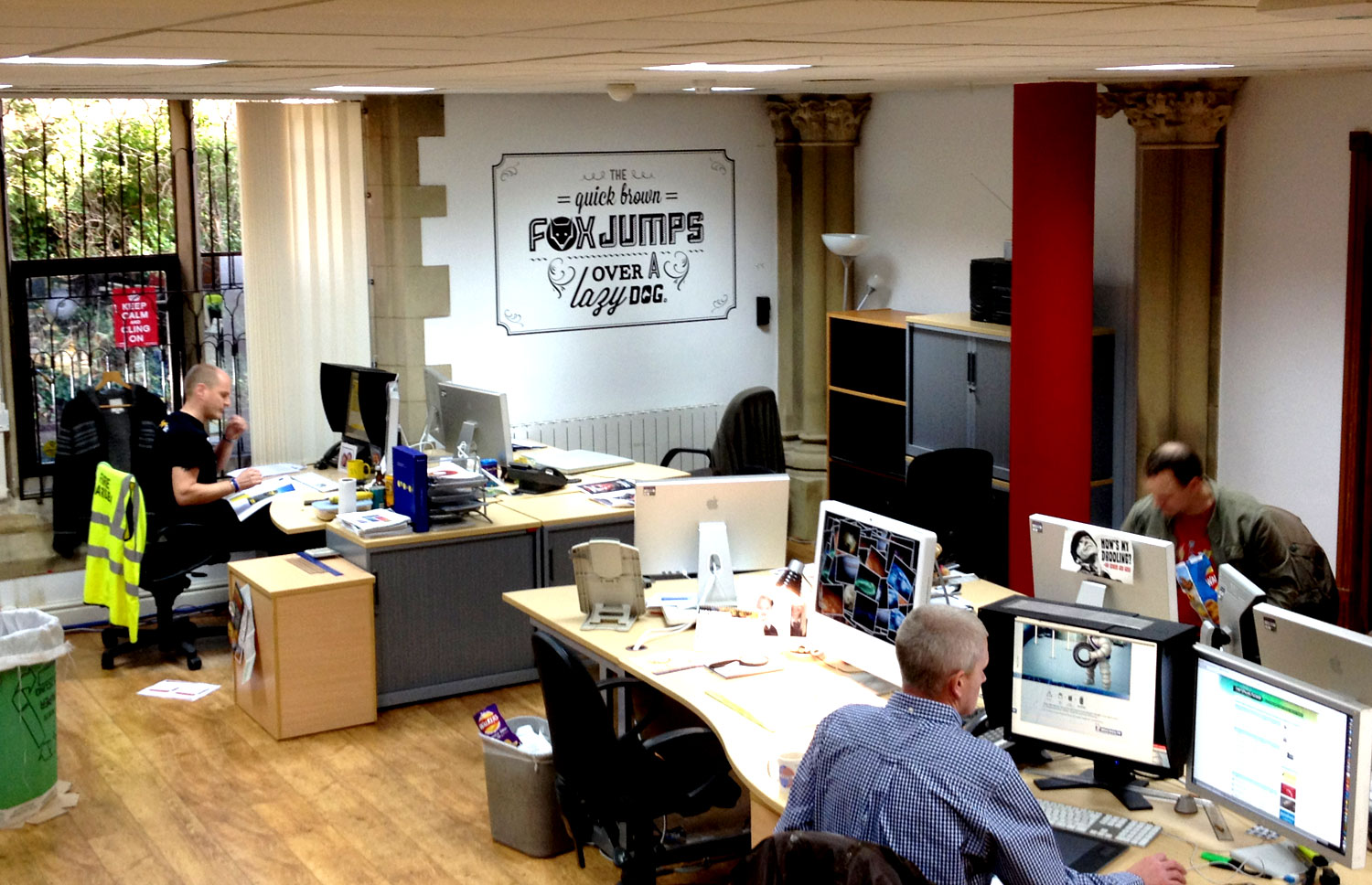
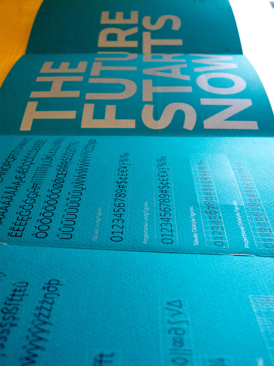
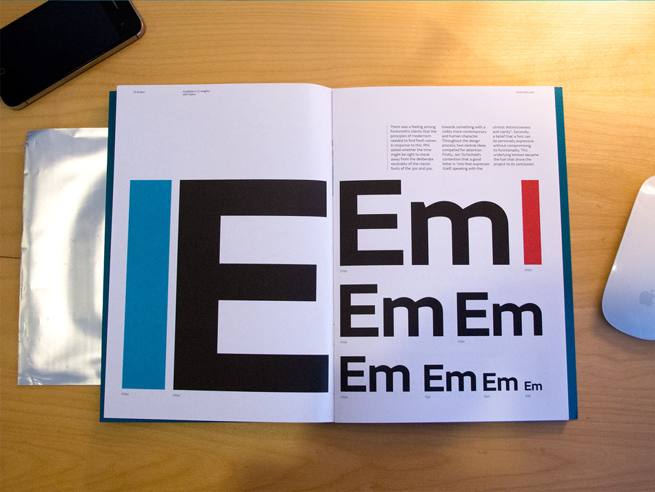
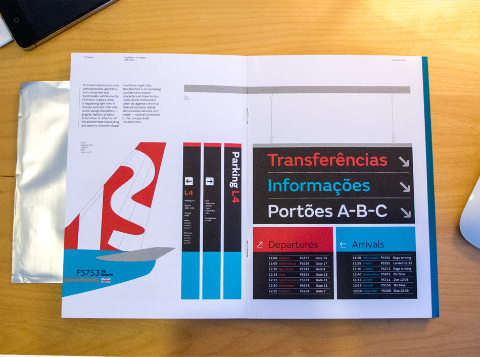
Fontsmith have designed a new face FS Emeric, and a copy of the type specimen booklet (printed beautifully in four spot colours with two foils on GF Smith paper), landed on my desk today. Designed by Believe In, it does a great job of showing off the typeface in various situations from online and in iPhone apps, to print spreads and wayfinding. Its a really versatile typeface made up of eleven weights - Thin, Extra Light, Light, Book, Regular, Core, Medium, Semi Bold, Bold, Extra Bold and Heavy - each with a corresponding italic.

“Emeric is a kinetic type. An optimistic typeface which marries precision with expression, geometry with movement and functionality with humanity — a classic working sans serif with a distinct and individual character, open to whatever shape the future may take.”

FS Emeric is the result of over two years work by Fontsmith's type design director, Phil Garnham, who set out to create a humanist alternative to classic modernist fonts. "The timeless alphabets of the fifties have a deliberate neutrality born out of an unfaltering mechanical solidity in each line and curve," he says. "FS Emeric has been designed to share this sense of structure and universality but it also introduces a new approach, intuitively informed by a sense of today, one of progress and optimism."

Phil also asked eleven of his heroes to create a poster, each using a different weight of the typeface. Contributors include Build, Studio Dumbar, Pentagram, Non-Format, Manual and Bibliothèque, all screen-printed on Colorplan by Dan Mather in a limited run of 50. You can see the whole set here. Lucky customers buying two or more weights of FS Emeric will receive one randomly selected poster (while stocks last).

March 12, 2013 - No Comments!

Typography Served

Back in February, I was lucky enough to have some work featured on the front page of the curated type gallery on Behance, Typography Served.

Since then I've had a load of new followers, appreciations and views which has been amazing. Its funny how big a difference a tiny amount of exposure has done for my stats. I used to barely get a single view to my profile and 6 weeks on I'm still getting at least 40 every day. It is also interesting to see how the traffic flows throughout a week, with the obvious low points over the weekends, and then building up gradually throughout the week.

Check out the work.

You can follow me on behance, and thanks if you already do.

November 13, 2012 - No Comments!

TBWA Building type

During the summer, in downtime we redecorated the agency. Initially the design department and swiftly followed by all the other departments in the agency once they saw what we had achieved.

There where massive clear outs and tidying sessions and St Paul's has been transformed into an even more inspiring workplace. The transformation was finally completed a week ago with the installation of some wall vinyls placed around the building. I designed a couple of pieces, an organic and flowing welcome as you enter the front door and typographic treatment of a famous pangram in the studio.

I'm going to create a proper portfolio page for it all, but I'm still working on a colour version of the pangram statement, but in the meantime here are a couple of snaps.


Here are some more shots of the entire agency.

May 26, 2011 - No Comments!

Exceed Maximum – BMW


Here's a nicely executed concept for BMW M3 Coupe at Hamburg Airport utilising a 50x2m light wall in the middle of the arrival hall to portray a car that exceed limits by exceeding its limits.


Advertising agency Serviceplan created a headline out of half letters, the super shiny floor then reflected the other half. As a result, BMW doubled the media space for free.


After discussing this a little bit, we concluded that they've missed a trick with the standard car shot at the end and that something more inventive continuing the reflections theme could have been done. The orientation of the type is changed from the first word to the second, so you are alredy reading it with your head turned which would then suit a car shot from either the front or the rear.


Advertising Agency: Serviceplan, Munich, Germany
Chief Creative Officer: Alexander Schill
Creative Directors: Alexander Schill, Maik Kaehler, Christoph Nann
Copywriter: Andreas Schriewer
Art Directors: Manuel Wolff, Savina Mokreva, Roman Becker
Others: Robin Ruschke, Michael Falkensteiner

via adsoftheworld
via designyearbook.com

July 14, 2010 - No Comments!

Typography in Water

  • YouWorkForThem have choosen five of their most popular fonts and stuck them underwater, and I'm loving the outcome.

    Agostina
    Agostina is a unique typeface in many ways. The obvious being that is is a Sans-Serif typeface that contains both beginning caps and ending lowercase swash letters. This instantly gives endless typographic possibilities to the user. Agostina takes advantage of the OpenType font format that opens further exploration with a full latin and limited alternate characters as well. With almost 300 characters, Agostina is a workhorse and a must own typeface.

  • Black Slabbath
    The heaviest typeface in the world, Black Slabbath. There's only one thing about this new typeface that isn’t colossally black: the razor-thin white space. It slices through and between geometric characters, creating a juxtaposition of contrasts and rhythms.

  • Gavin
    Gavin began as a hand-drawn exploration of George Bruce's Seven-Line Pica, and then evolved into the Jekyll and Hyde of all handset creations. This handset collection contains a huge amount of letter designs, with each letter originally drawn by hand. Great for setting strong and sometimes quirky headers for magazines, books and websites, Gavin is one of our most intense and diverse handset collections to date. Available in two styles, the regular style contains 407 letters and the alternate style another 430 letters.

  • Strike
    STRIKE Is a hand-set typeface that looks as fresh as if you just put your can back into your bag. These letters are so detailed that we could not make it a typeface, we tried and it virtually blew up the font application. This set contains alternates so your letters don't get so stale looking. Try flipping letters around and mirroring them for added flavor.

  • P22 Constructivist Set
    Font mavens of the world unite! These six Constructivist typefaces recreate the bold graphic design of early Soviet Era Russian Artists such as Rodchenko and Popova. Seize control of the means of desktop production with this revolutionary font collective! Now includes 52 Constructivist Extras.

  • You can also get these as iPhone4 and iPad wallpapers.

  • YouWorkForThem

    Copyright © 2010 YouWorkForThem, Inc.
    Lead Designer: Jackkrit Anantakul

    Creative Director: Michael Paul Young

  •  

    May 22, 2010 - No Comments!

    So, I’ve got a new job!

    As of next Tuesday (1st June), I'll be starting my new job as designer at TBWA\Manchester.  I'm really excited about the opportunity and can't wait to get to work.

    After a year and a half, its time to say goodbye to this...


    (This an advert from the dizzy heights of 1999!  Amazing,)

    and hello to...

    Media_httpwwwmediabis_jlwkf

    April 12, 2010 - No Comments!

    Veer Type Transfers

    I received this rather lovely sample pack from image & type library Veer this morning, which contains a set of six dry transfer sheets (you know, like the Letraset stuff, from the olden times). 

    The pack showcases some new typefaces they've added to their library, including a couple of exclusives from Alejandro Paul, as well as some of their older ones, including Rian Hughes' lovely Mellotron.

    To get your hands on this awesome give-away visit www.veer.com and register (or sign in) and follow the instructions.  Happy rubbing.