All Posts in Digital
So after; two enjoyable years at LOVE, two years before that leading the JD Sports digital creative team, three fantastic years at advertising agency TBWA and four years before that working in various small studios, I am now available to hire directly for all your graphic design, art direction, brand and digital design needs.
If you would like to get in touch to discuss a potential project all my contact details can be found here, I would love to hear from you!
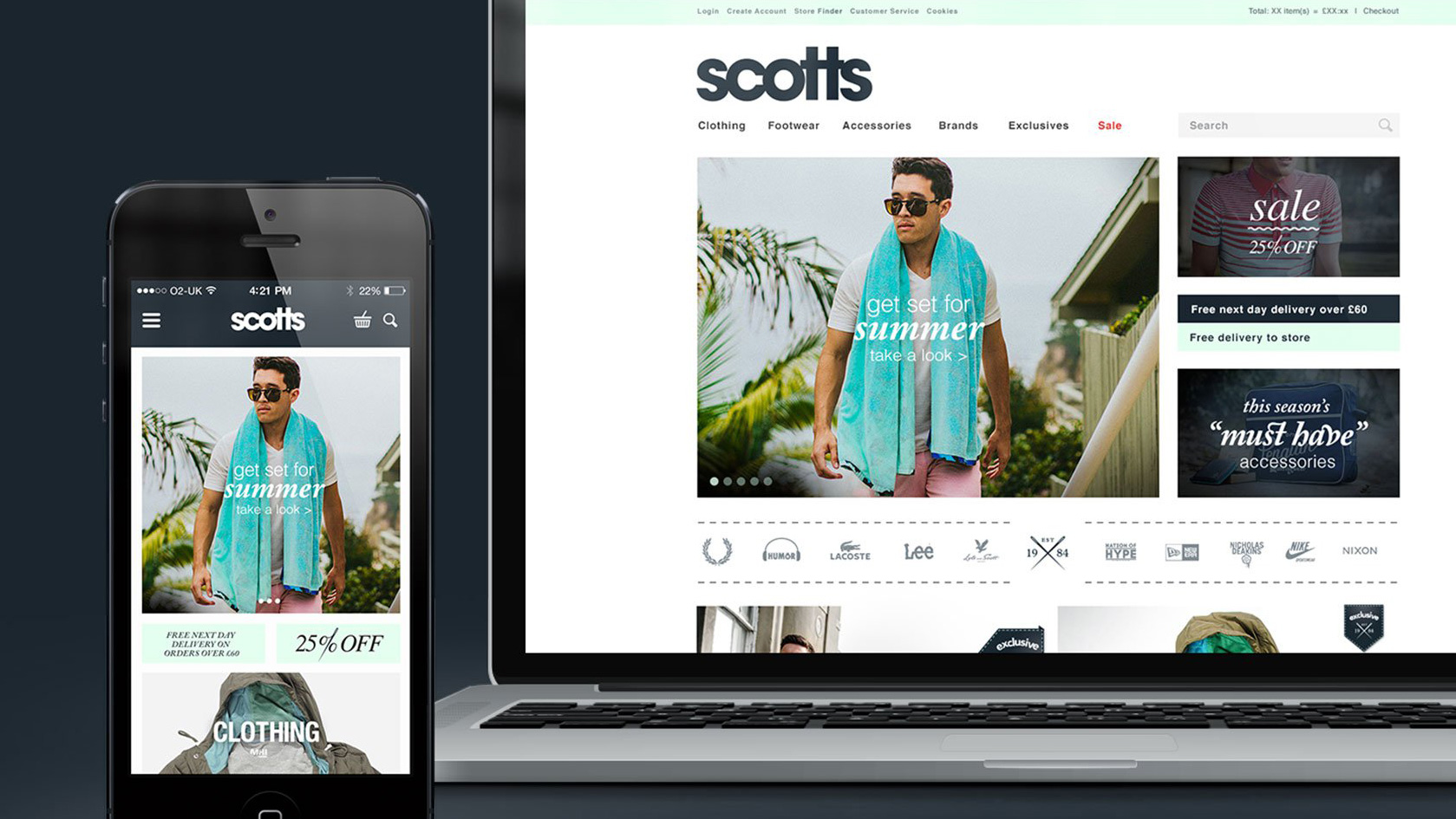
After being featured in the Adweek Talent Gallery a couple of months ago, I'm pleased to say that the project I worked on for Scotts Menswear has now been featured on Behance, as part of their Web Design Served curated gallery. Check out the full project here or follow me on Behance.
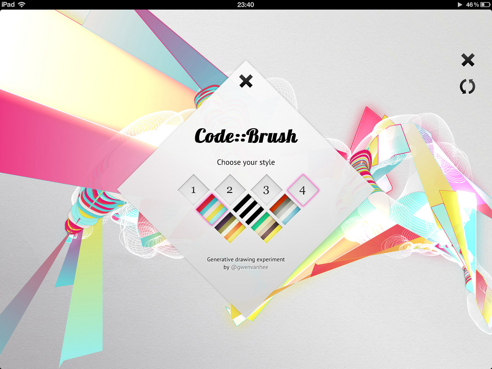
I came across revoid.be/codebrush/ a generative drawing experiement earlier today, and got a little bit hooked over lunch.
Its pretty simple, there are 4 different brushes and several colour options. Drawing is quite intuitive, the faster you move your cursor the larger the brush stroke. It does take a little working out, but after a while you can drawing with an idea of the outcome, although at first glance it looks entirely random.
And at the end, you can watch your drawing redraw itself.
Looking into it a bit more know whilst writing this, and seeing as its done in html5/css3 and javascript I see it works on mobile devices and supports multi touch as well, although I've not tried it on my iphone.
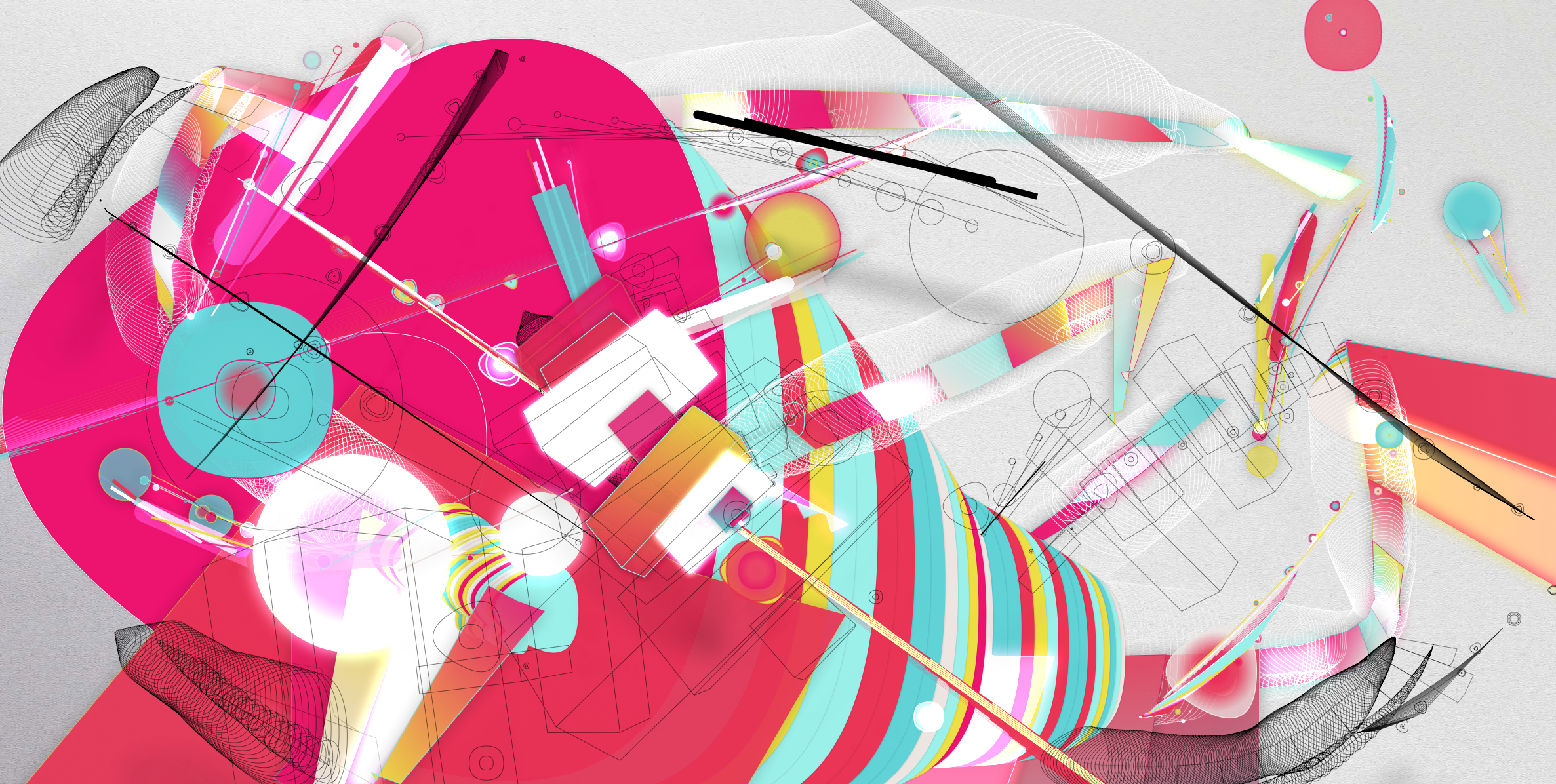
Gwen Vanhee has done a great job and its well worth a little play. Here is what I came up with:
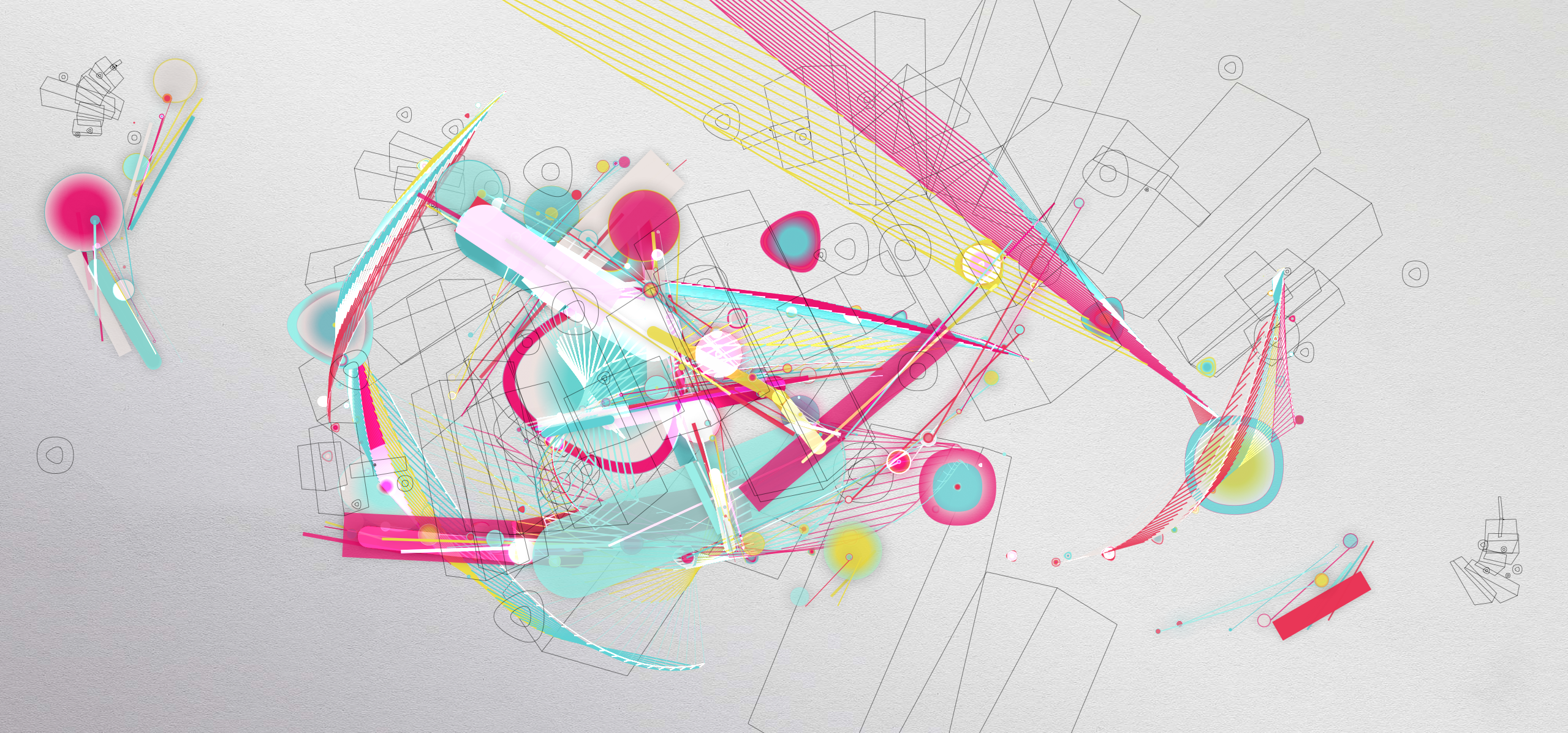
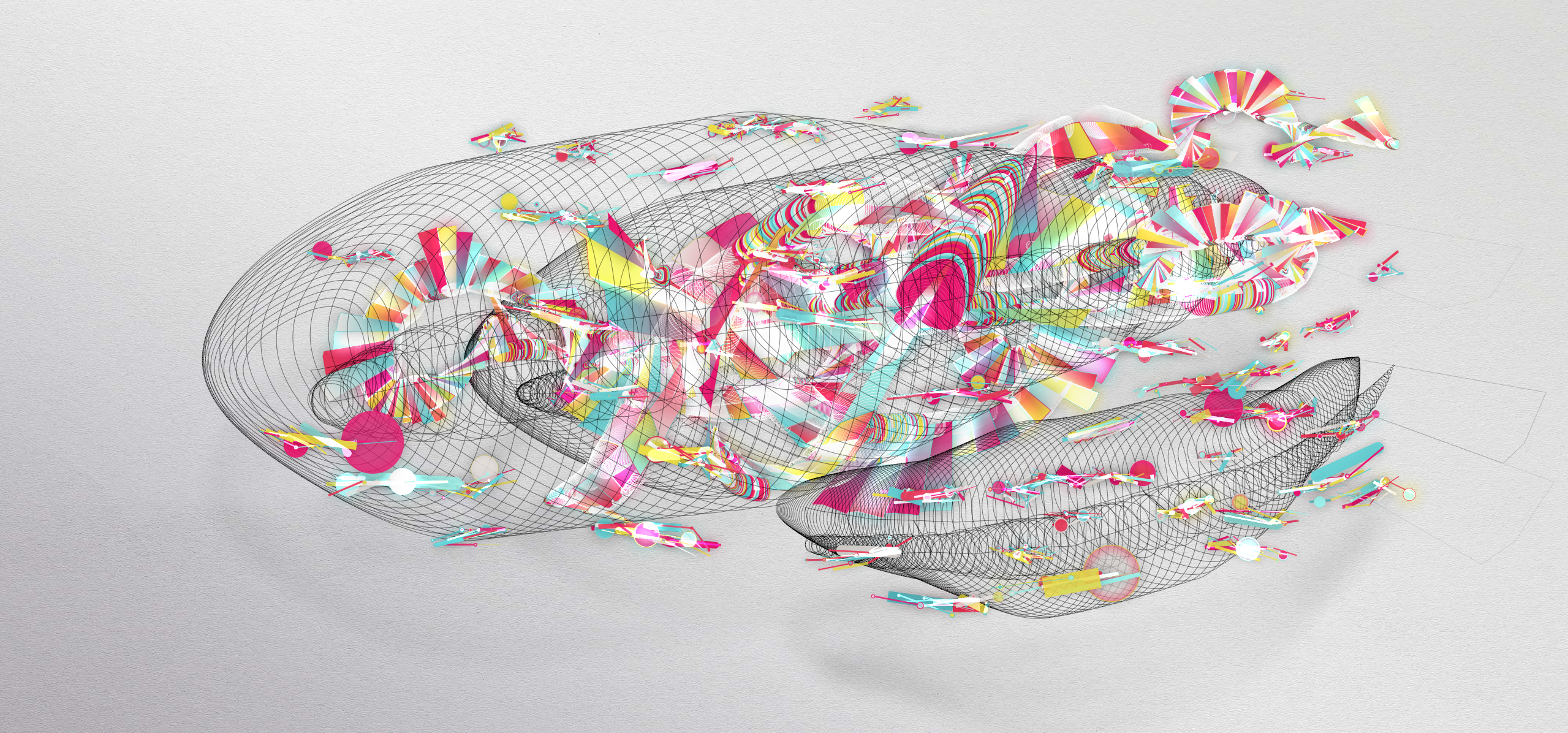
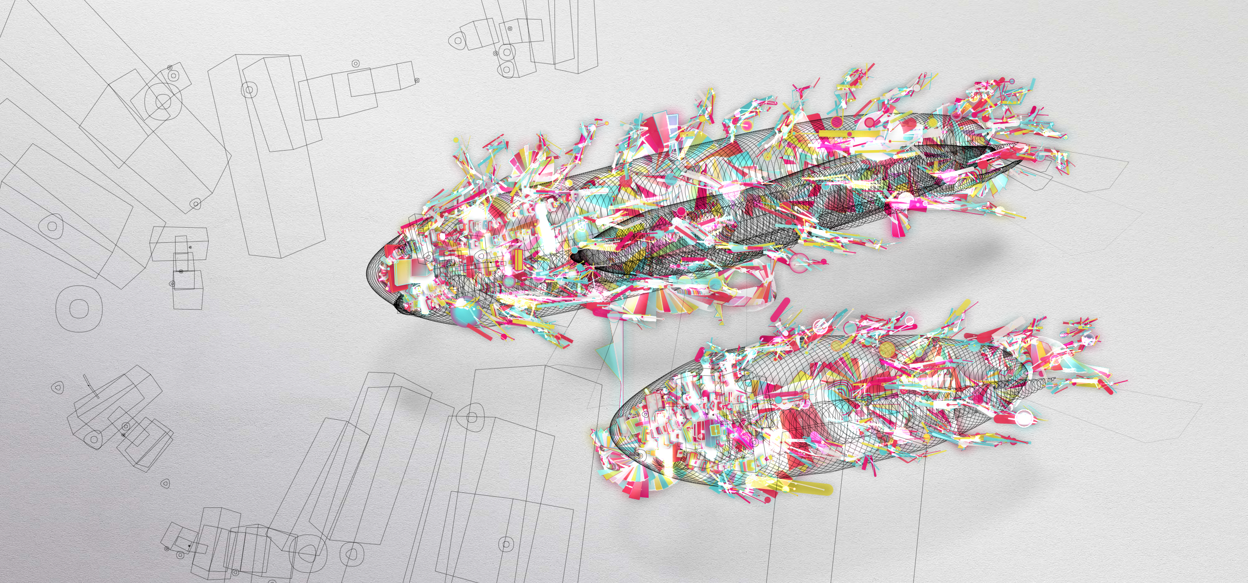
Sure, having an iPhone is pretty cool, but there are a couple of catches to it. Nico Ordozgoiti's designed these wallpapers to keep that in mind.


You can download them here: Obsolete / Friends / Clothes / Car / Drop
Cute little pixel iphone game, reminds a bit in styling and simplicity of canabalt.com.
rsbang.com
Download the game from the App store: itunes.apple.com/ gb/ app/ ready-steady-bang/ id447588618
Or for more information go to facebook.com/ readysteadybang
I've just got back from a week in the French Alps, and as usual I've taken loads of pictures. As well as taking loads on my proper camera I also used my trusty iPhone 3GS, and namely the Instagram and Hipstamatic apps. Since I've started using the instagram app, I've barely touched hipstamatic and the multitude of other camera apps I've got installed. But I thought this little trip away would be a good chance to revisit it (it cost me money after all) give them a little head-to-head and decide once and for all if one reigns supreme.
Here are the results:
Instagram.
Hipstamatic.
One point to note, is that all the instagram photos were taken on a sunny day, where as at least half the hipstamatic shots were taken in poor visibility and low light.
Interface
Generally I much prefer the instagram interface, not having to wait for the image to "develop" and the ability to try all the different filters out before selecting the best one. However the randomness of hipstamatic does sometimes produce nice and unexpetced results, but equally there are plenty of shots which could be much improved if there was a better viewfinder or if they could be applied retroactively. I also like the ability to edit the image in another app first (I use TiltShiftGen, quite often to tweak colours, saturation and contrast), before then applying the filters and thats before you even get onto the social aspect of instagram.
I'm not going to talk about the social aspect of instagram (which is great by the way, as you will know if you're familiar with the app), but merely comparing the usability and results as I had limited access to that whilst up in the Alps.
Results
The main difference in the actual shots/filters seems to be the level of contrast, with it being richer in instagram and more washed out and dreamy in hipstamtic. I tend to prefer the results instagram provides - being able to browse the various results means the best filter is always selected, maybe if the same was possible with hipstamtic I'd use it more as too often the results aren't quite what I hoped for.
But then I knew all this before, which is why I hadn't used it for donkeys. But it does produce some nice images, and combining the two apps also gives some interesting and different results. So maybe I will use it a bit more from now on, if only to make my photos slightly different from all the instagram'd ones flying about.
If you want to check out my photos I'm sure I will get them on flickr soon or you can browse my instagram shots here (requires login) or here.
If you want to follow me on instagram my username is bentopliss.
hipstamaticapp.com
itunes.apple.com/us/app/hipstamatic/id342115564?mt=8
instagr.am
itunes.apple.com/us/app/instagram/id389801252?mt=8
artandmobile.com/tiltshift
itunes.apple.com/app/tiltshift-generator-fake-miniature/id327716311?mt=8
Last Thursday, I attended New Adventures in Web Design, a new web design conference taking place in Nottingham organised by Simon Collison. I was fortunate enough to win my ticket back in October whilst taking part in the Creative Cup (check my post about that here), and so on Thursday morning I set off towards Nottingham.
Now getting to Nottingham from Manchester isn't the most straight forward of journeys, especially via public transport and the morning after moving out of my flat. Nevertheless I made onto the first of four of trains I would be taking that day, at 5.50am changing in Sheffield. Below are a couple of my early morning snaps.
I'd not been to a conference like this before, and after heading down on my own it was a welcome relief to see quite a few familer faces throughout the day. Now onto the talks. I'm only going to give a brief summary as other people have already summed up the talks very well, and probably much better than me. I thoroughly recommend reading Jake Smith's review or Bluegg Creative's review.
As a designer who works on both online and offline projects I was pleased when most of the talks dicussed a much broader level of design and its principals than I had anticipated, there was also very little technical talk, which also suited me down to the ground.
![]()
![]()
![]() Some rights reserved by jontangerine
Some rights reserved by jontangerine
The day got underway to an interesting start with Dan Rubin and Mark Boulton both questioning the evolution of design and its terminology, whilst asking the wider design community to seek to amend them and "create a new canon". The main theme I took away from this is that on the web there "are no pages and there are no edges". Digital is a new and evolving industry and we should question our process until the best practice can be established.
I really enjoyed the talk given next by Elliot Jay Stocks, again it crossed over from digital to print and back again. He talked about the benefits of varying disciplines (something which I believe very strongly about), even if its only to make you realise by switching how much you prefer the thing you spend most of your time doing. He then went onto talk about the pitfalls of using design cliches and trends, as well as the necessity of focusing on the tiny details when using things like drop shadows, highlights, bevels if you must go for that whole web 2.0 aesthetic.
For me the talks which focused on personal work I found to less inspiring then the those which covered broader subjects. Although they all covered interesting points, I found harder to engage with as it was just confirming (for me) the process of desiging I go through every day on projects and I didn't feel like I learning unlike in the talks of the morning. Saying that, there wasn't a talk all day I didn't take something away from.
Towards the end of the day my early start was slowly but surely catching up with me, but the final two talks from Andy Clarke and Brendan Dawes certainly did enough to keep my attention going strong right until the end of the day. Both are strong and confident speakers who took interesting angles on design. Andy Clarke spoke about westerns and comic books, relating the production, direction and illustration techniques of the formats to the rhymn and art direction of good website design.
Whilst Brendan Dawes focussed on the beauty of product design (again a subject I feel close to after studying it whilst at university), and making things - design shouldn't be constrained, its about questioning things and learning quite often through play. I liked how this linked back to the points in the morning about the redfinition and questioning what we do.
After a great day of talks (and once I'd recovered from a serious numb bum) I managed to hang around for a few hours and grab a few beers before heading back on the last train(s) back to Manchester. Unfortunately due to the poor transport links between Manchester and Nottingham I couldn't stay on and drink into the night, next time I'll book a hotel room and take the next day off work.
As far as I m concerned it was a great day, where the little details made all the difference, even if it was a particularly long one getting home 20 hours after I intially left in the early hours of the morning before. The name card/shedule lanyards were nicely designed, as were all the other little bits in the goodie bags such as the bookmark, pin badge as well as the New Adventures paper which is a great read, which you should all buy by the way.
![]()
![]()
![]() Some rights reserved by jontangerine
Some rights reserved by jontangerine
Below are a few snaps from my iPhone 3GS, hence the poor quality.
newadventuresconf.com
flickr.com/groups/naconf
creative-cup.com
colly.com
As of next Tuesday (1st June), I'll be starting my new job as designer at TBWA\Manchester. I'm really excited about the opportunity and can't wait to get to work.
After a year and a half, its time to say goodbye to this...
(This an advert from the dizzy heights of 1999! Amazing,)
and hello to...

Over the past couple of months I’ve been working on re-designing my website. Whatever I have had up before has either been a bit of a bodge job or rushed up in time for something happening. The result was a bit of a mess, and a nightmare to update.
So with this new site should hopefully fix all the issues with the old one, and hopefully my work is now portrayed in an easy and accessible way, with a smooth flow around the site and between sections. And hopefully it looks ok too… but I suppose that is for everyone else to decide.
A few further site updates will be coming at a later date.
Anyway, I’d love to know what you think.
Ben. x
ps. try refreshing the page a couple of times too.
Contact.
ben[@]bentopliss.com
+44 (0) 7825 814797
Graphic Design & Creative Direction.
© 2023.
All work displayed remains the property of either Ben Topliss,
the agencies and/or the clients
it was created for.


![Reebok – NBA All Star Event [2022]](https://i0.wp.com/bentopliss.com/assets/2022/03/Project_panel_480x328px__0007_ALLSTAR.jpg?fit=480%2C328)


![Reebok x Jurassic Park [Pitch]](https://i0.wp.com/bentopliss.com/assets/2022/03/Project_panel_480x328px__0006_JP.jpg?fit=480%2C328)


