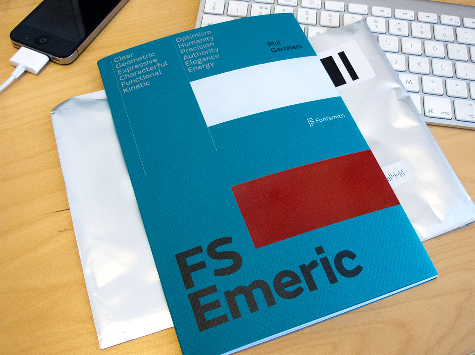
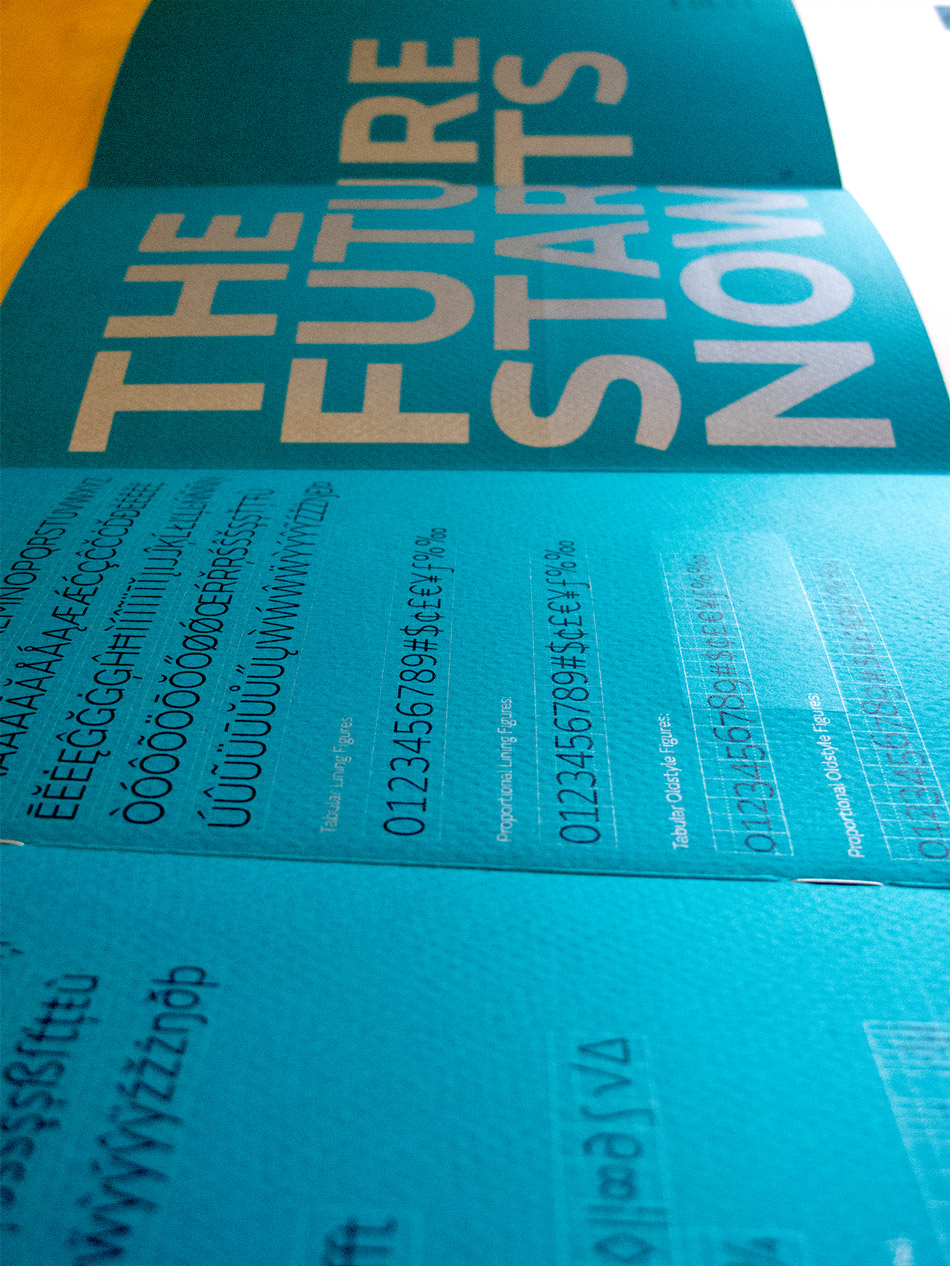
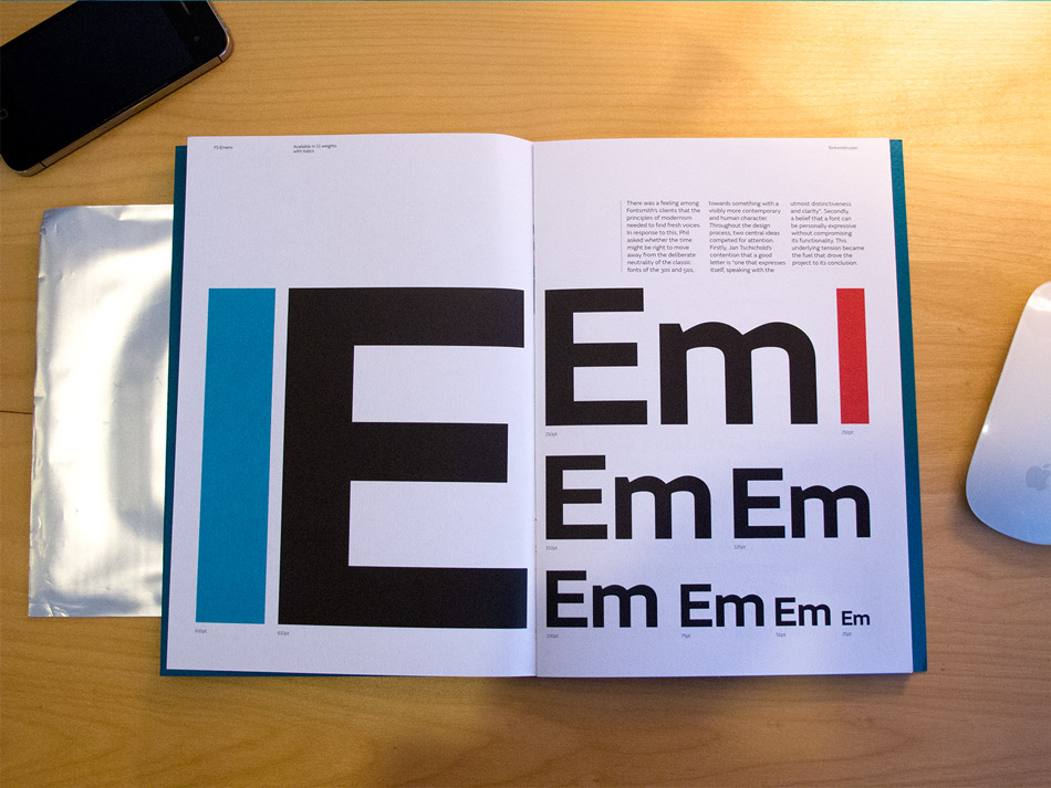
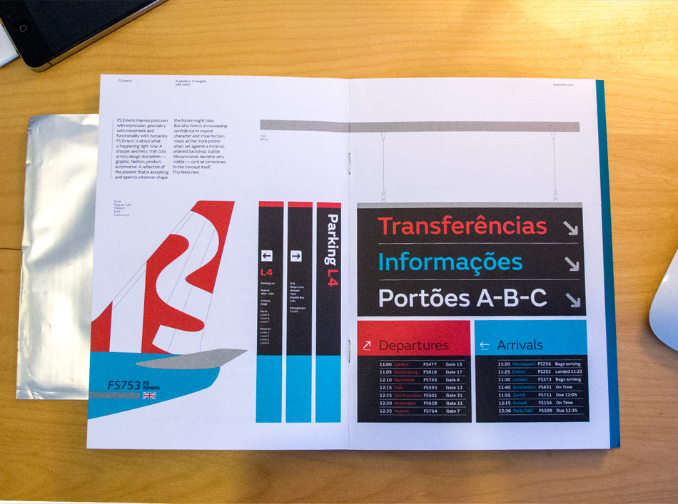
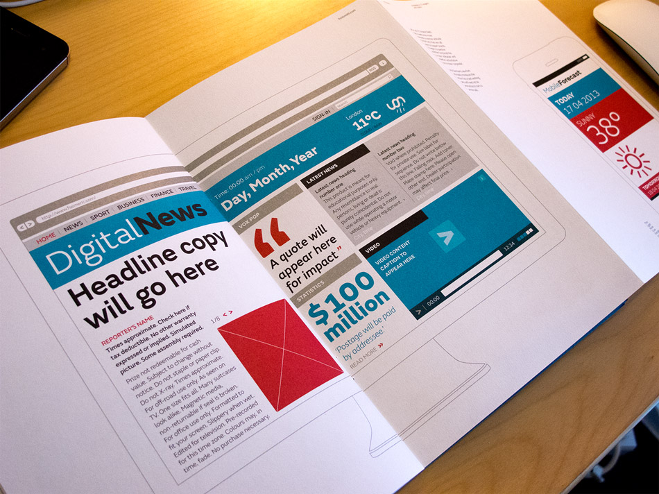
Fontsmith have designed a new face FS Emeric, and a copy of the type specimen booklet (printed beautifully in four spot colours with two foils on GF Smith paper), landed on my desk today. Designed by Believe In, it does a great job of showing off the typeface in various situations from online and in iPhone apps, to print spreads and wayfinding. Its a really versatile typeface made up of eleven weights - Thin, Extra Light, Light, Book, Regular, Core, Medium, Semi Bold, Bold, Extra Bold and Heavy - each with a corresponding italic.
“Emeric is a kinetic type. An optimistic typeface which marries precision with expression, geometry with movement and functionality with humanity — a classic working sans serif with a distinct and individual character, open to whatever shape the future may take.”
FS Emeric is the result of over two years work by Fontsmith's type design director, Phil Garnham, who set out to create a humanist alternative to classic modernist fonts. "The timeless alphabets of the fifties have a deliberate neutrality born out of an unfaltering mechanical solidity in each line and curve," he says. "FS Emeric has been designed to share this sense of structure and universality but it also introduces a new approach, intuitively informed by a sense of today, one of progress and optimism."
Phil also asked eleven of his heroes to create a poster, each using a different weight of the typeface. Contributors include Build, Studio Dumbar, Pentagram, Non-Format, Manual and Bibliothèque, all screen-printed on Colorplan by Dan Mather in a limited run of 50. You can see the whole set here. Lucky customers buying two or more weights of FS Emeric will receive one randomly selected poster (while stocks last).
Published by: Ben in Typography


![Reebok – NBA All Star Event [2022]](https://i0.wp.com/bentopliss.com/assets/2022/03/Project_panel_480x328px__0007_ALLSTAR.jpg?fit=480%2C328)


![Reebok x Jurassic Park [Pitch]](https://i0.wp.com/bentopliss.com/assets/2022/03/Project_panel_480x328px__0006_JP.jpg?fit=480%2C328)


