


![Reebok – NBA All Star Event [2022]](https://i0.wp.com/bentopliss.com/assets/2022/03/Project_panel_480x328px__0007_ALLSTAR.jpg?fit=480%2C328)


![Reebok x Jurassic Park [Pitch]](https://i0.wp.com/bentopliss.com/assets/2022/03/Project_panel_480x328px__0006_JP.jpg?fit=480%2C328)


All Posts in Illustration
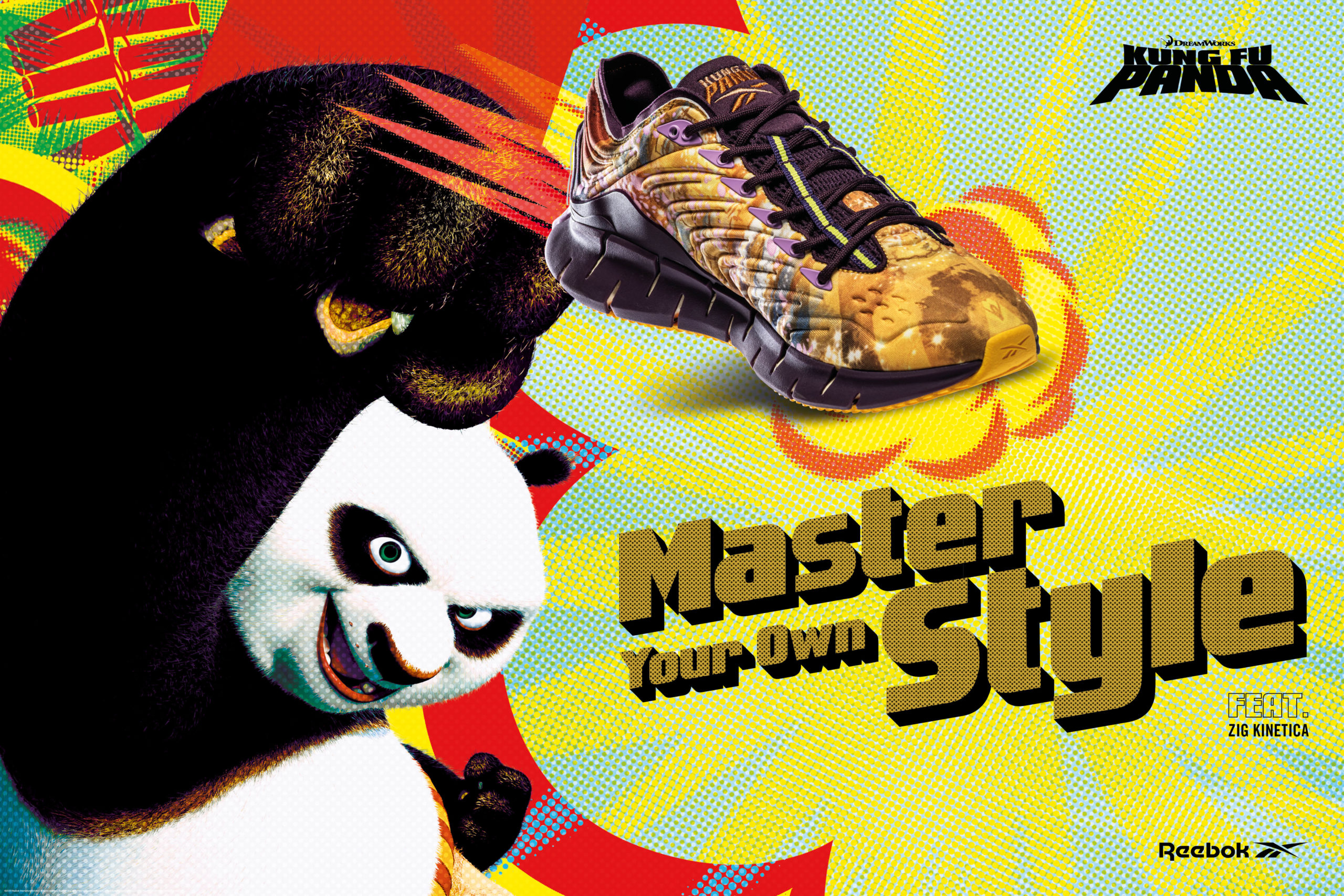
Leveraging the graphic language of old Kung-Fu movie posters, graphic novels and the humour of the film franchise, creating the key visuals for the Reebok and KFP collab was a fun project work on.
Starting with a teaser social story campaign based around Chinese New Year before leading into the graphic poster inspired key campaign.


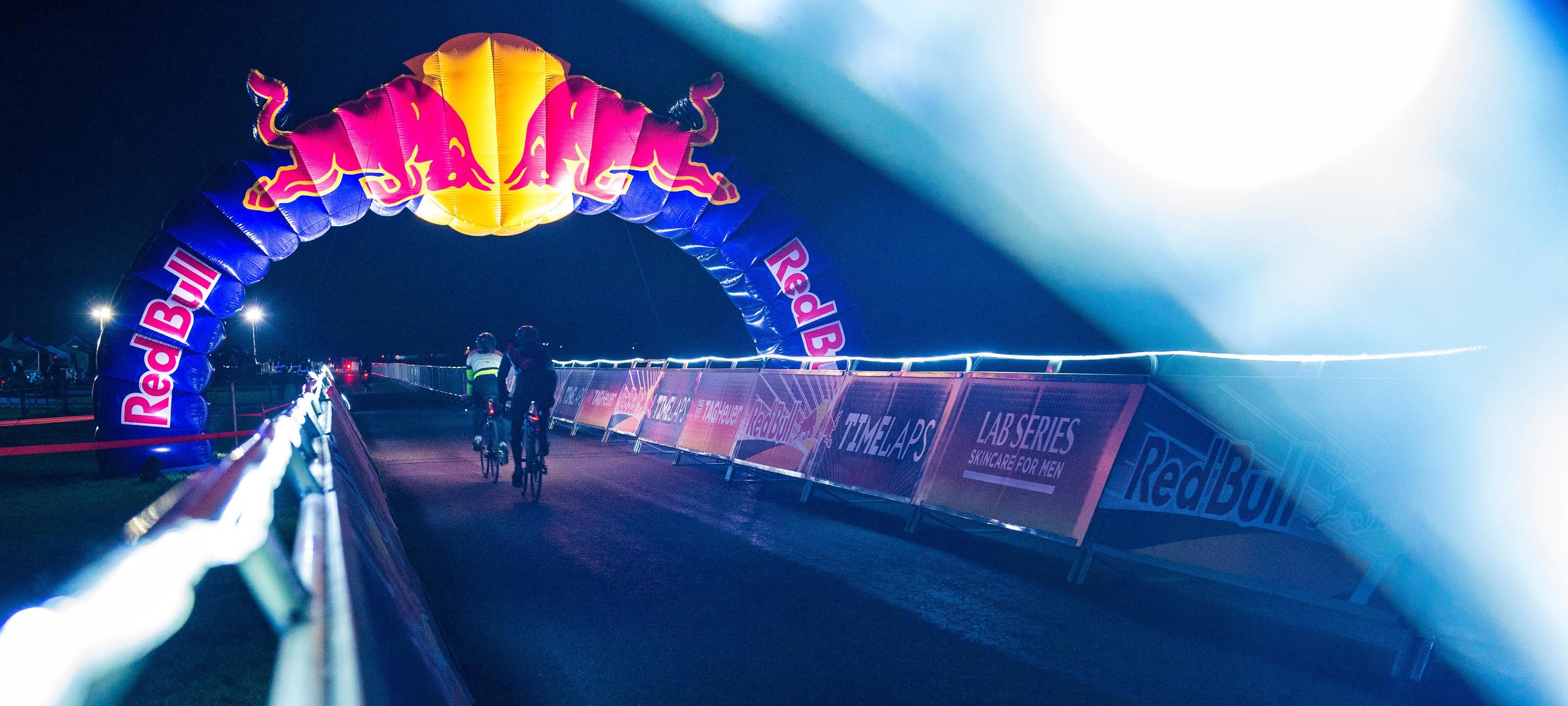
Last year I was lucky enough to work on a number of projects with drinks brand Red Bull. The first one to go live was the branding and visual identity for Red Bulls first foray into road cycling, Red Bull Timelaps. The event saw teams of 4 battle it over a 25 hour endurance race on 28th October 2017 at Great Windsor Park as the clocks went back (that's where the extra hour came in).
Whilst I put together a full case study here are a few shots from the event for which I was lucky enough to attend. It was a great day and night all round and everyone seemed to enjoy it. The weather even held out which, for an outdoor event in October is amazing!


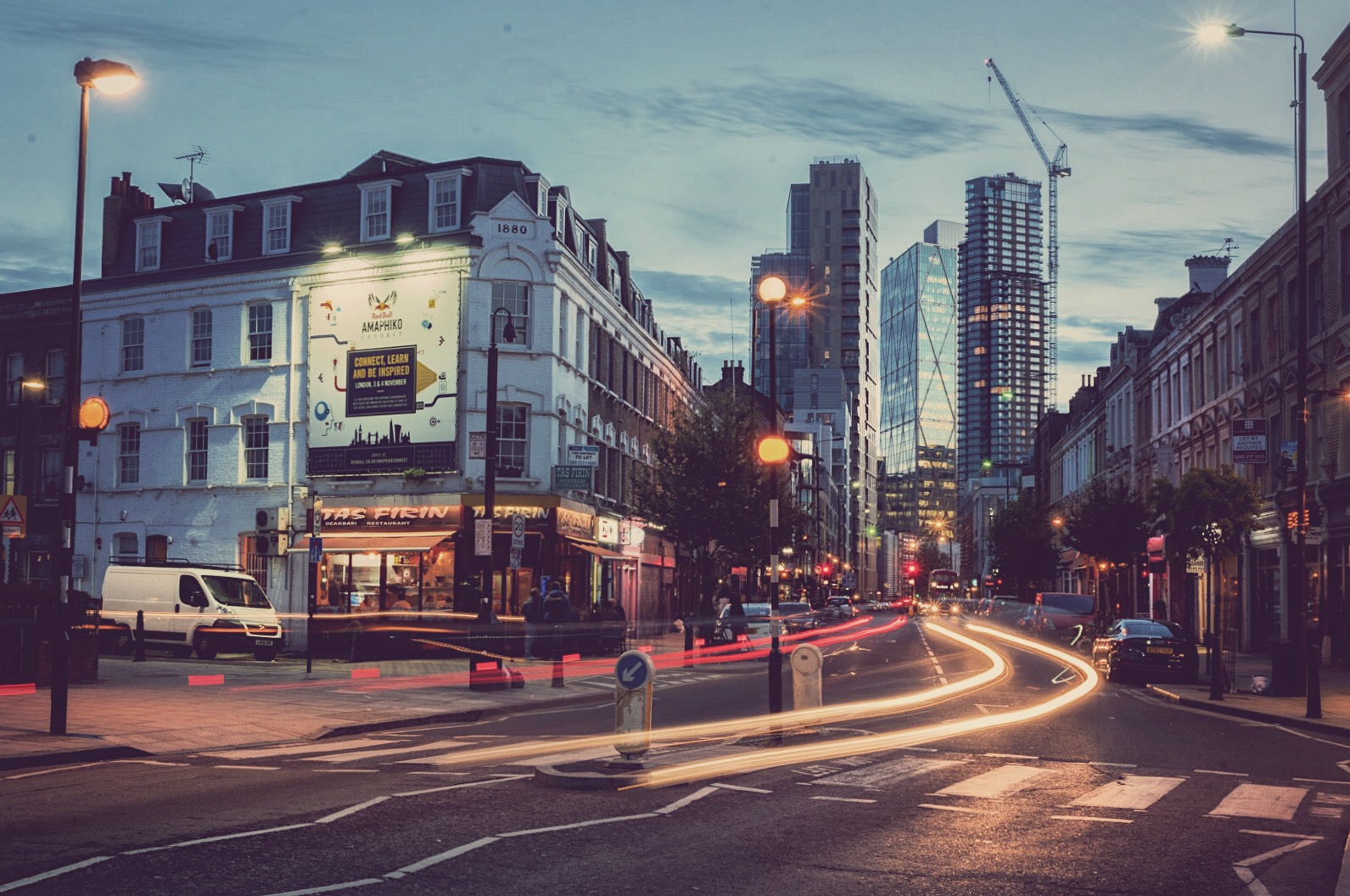
Participants compete during Red Bull Timelaps in Windsor Great Park, London UK, on October 28, 2017


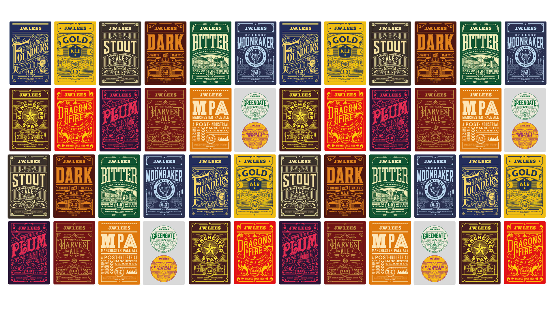
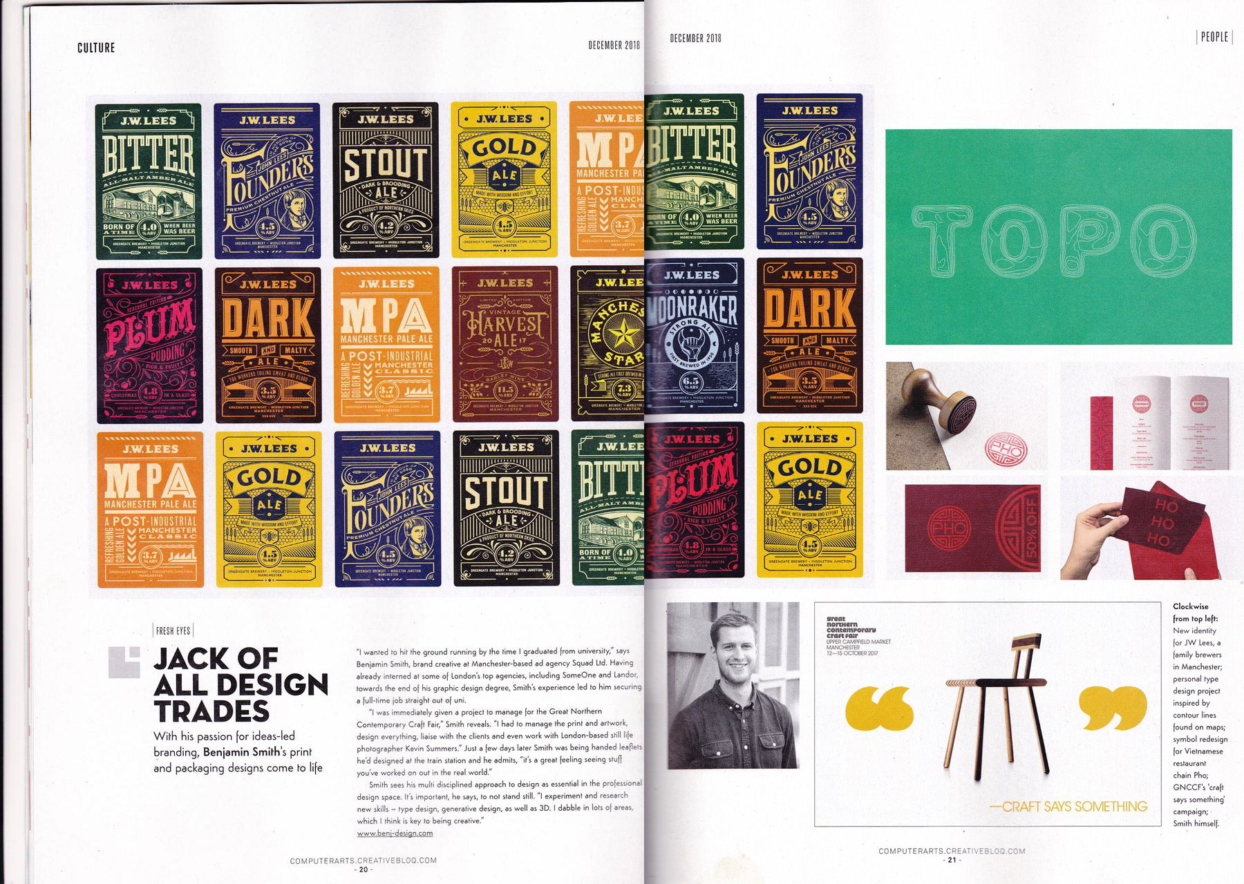
A full case study to come once everything has fully launched, but in the mean time it was a real pleasure to work on the rebrand and redesign of the JW Lees Brewery portfolio of beers whilst freelancing at Manchester agency Squad.
Working alongside Squad Creative Director David Barraclough, with Manchunian master typographer Daren Newman we created a suite of beers that each tell their own story in a different way and brings them right up-to-date, whilst still retaining an element JW Lees heritage.
It was a great project to be involved with and I look forward to sharing more of the project once its fully out in the wild.


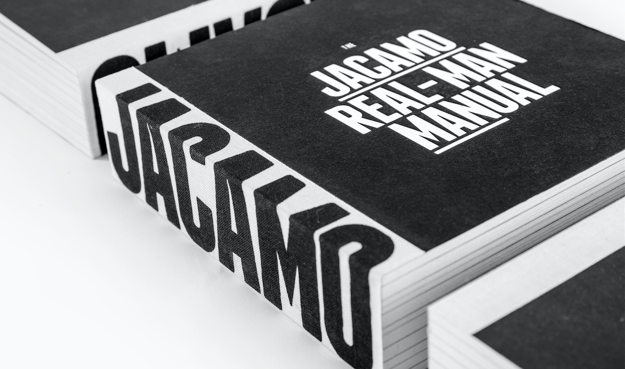

I'm proud to have been involved in the Jacamo re-brand project which last week won 2 pencils at the D&AD awards in London. The 'Real-Man Manual' took away two pencils - a graphite for 'Brand Expression for Print' & wood in 'Branding'.
Congrats to the whole LOVE Jacamo team; Gary, Rory, Laffers, Pat and Myers.
About the project and re-inventing the Jacamo brand.
We knew we needed to raise brand awareness for Jacamo but, at the same time, consider how we could shift opinions of those who had negative, and often unfair, perceptions of what Jacamo was all about. Fundamentally, it’s great-fitting and stylish clothes for men.
From sizes S to 5XL, Jacamo offers clothes for every man. Well, every real man. And real men aren’t that keen on the frills and fuss when it comes to shopping. So we created a brand that offers a shopping experience for men who want to look and feel great without any of the
hassle. Our brand proposition was born – Jacamo. Outfitters For The Real Man.
The Jacamo Real-Man Manual
We created the ‘Jacamo Real-Man Manual’ to lay down in black and white (literally) all those nitty-gritty details of the brand’s reinvention. The manual combines our new, humorous tone of voice with a series of comical illustrations to create a brand book that inspires and entertains in equal measure. Used as both an internal rallying cry and an external opinion changer, the book has served as a catalyst for a year of change at Jacamo.


View the project here, whilst I get round to adding to the work section.
This vinyl for the composer Allan Madsen Gravgaard was designed by Danish designer Michael Hansen.


For me, the most interesting thing about the Comedy Carpet (one of the UK’s biggest ever pieces of public art which opened yesterday), is the typography and its actual production.
Collaborative artist, Gordon Young was inspired and supported in researching the content for the carpet by Blackpool-based comedy expert, Barry Band and historian and writer Graham Mccann, and on the typography and layout by graphic designer Andy Altmann of why not associates.

image: blackpool council
Production
Five years in the making: one of the most complex pieces of public art ever commissioned at first sight, the comedy carpet looks as if the text is painted, but in fact each of the 160,000+ letters has been individually cut from 30mm solid granite or cobalt blue concrete, arranged into over 300 slabs and then cast into high quality, gleaming white concrete panels. The letters range in size from a few centimetres to over a metre so viewers can enjoy it both close up and from the glass viewing platform in the blackpool tower eye.
The scale and incredibly complex nature of the work meant that comedy carpet team even had to set up its own bespoke studio to make the artwork. after several months of research with input from chemists and engineers the comedy carpet team devised new techniques and recipes for production including a special mix to produce the hardest and whitest of concrete and the perfect blue that won’t fade. The process of making each of the 320 slabs involved many complex stages from cutting, sorting, fettling, and laying out each of the letters, to a 3-stage casting process, curing, trimming, grinding and polishing. and that’s before it was transported to Blackpool for the installation on the headland.

gordon young selects letters for a part of the comedy carpet
image: blackpool council

image: blackpool council

image: blackpool council

image: blackpool council

section of the 'carpet' being cleaned
image: bbc

image: bbc

image: bbc
Created as part of the major regeneration of the promenade, the comedy carpet was commissioned by blackpool council, with part of a £4m grant from cabe’s seachange programme. catchphrases, jokes and songs from more than a 1000 comedians are now immortalised in concrete and granite artwork which is situated at the foot of blackpool tower.
Artist Gordon Young has been working in the public realm for over 20 years creating pieces that mine rich seams of social history, engage communities and extend the relationships between art and architecture. at the heart of all gordon’s young’s work is language - words that entice, fascinate and on the comedy carpet, amuse. titter ye not, just like that, oooo-er matron, nudge, nudge wink, wink, oh betty! suit you sir, yeah but no but, what’s on the stick vic? , in the comedy carpet young has created a giant 'giggle map' immortalising the UK’s favourite comedians and comic writers fromthe hey day of music hall to 21st century stand up.
A nice joint project from de Groot and Dennis Nalden, reducing the best known characters to simple geometric shapes and colours. The series entitled "Bare Essentials" features 50 illustrations.
from Fubiz™ http://bit.ly/n8LpjD
Continuing on from yesterdays street art post, this is Street Art View. A collaborative collection of Google’s Street View locations showcasing street art all over the globe. Tag your favourite spot, share it with friends and help build the biggest art collection in the world.


